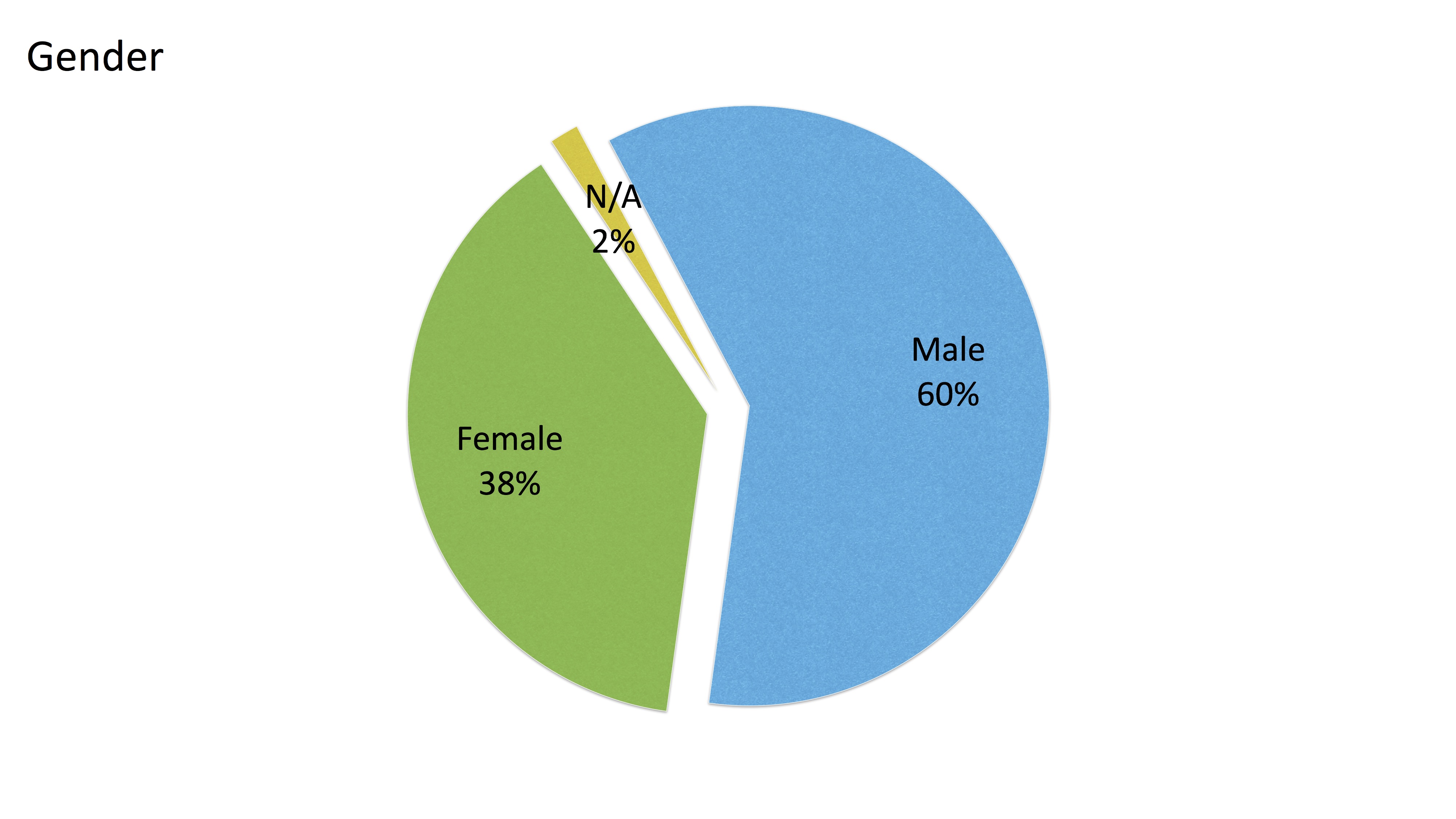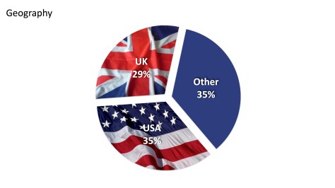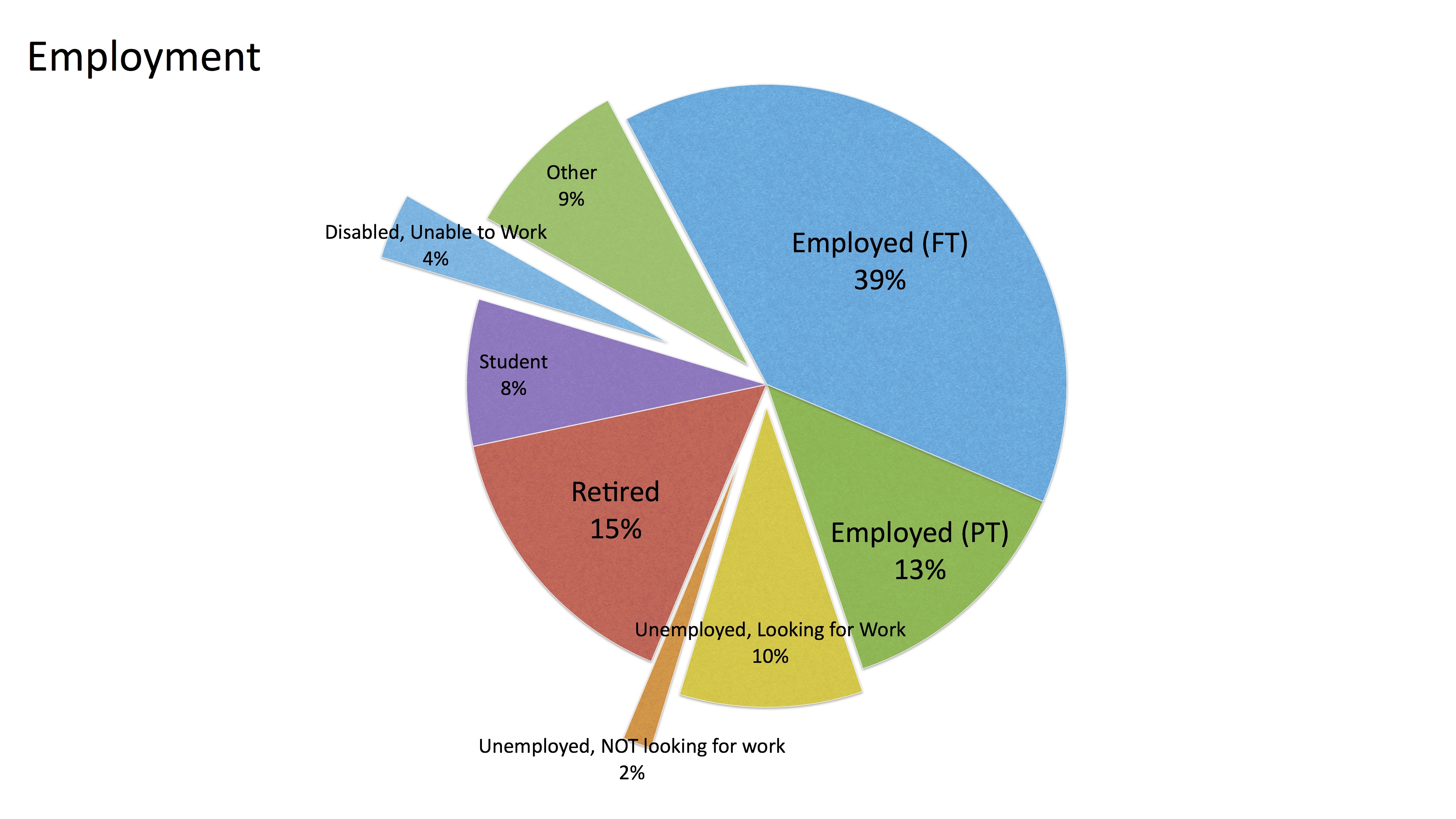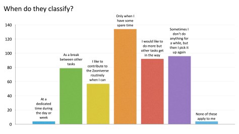

We are incredibly grateful to the many individuals who volunteer through Zooniverse to fulfill service hour requirements for graduation, scholarships, and more. This is a fantastic way to meet your requirements while contributing to significant research and discoveries, helping teams worldwide better understand ourselves and the universe.
Below are instructions for participants (students), followed by instructions for Organization Leads supporting students in these efforts.
Instructions for Participants:
Step 1: Share this opportunity with your Organization
Contact your organization to see if participating in Zooniverse can fulfill your volunteering or other participation requirements. A good approach is to share this blog post with your organization so they understand what you will do and how you will document your participation. We strongly recommend checking with your organization before you start to ensure your efforts are recognized.
Step 2: Register at Zooniverse.org
Create a Zooniverse account by clicking ‘Register’ in the upper-right corner of the Zooniverse.org homepage. Only your name and email are captured, and we do not share email addresses outside of Zooniverse.
Note: Registration is not required to participate in Zooniverse, but it is useful in this case to create a volunteer certificate documenting the number of hours you spent classifying and the number of classifications you did. Volunteer certificates are often required documentation for service learning hours.
Step 3: Participate!
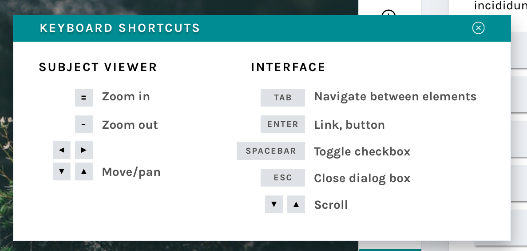
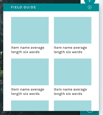
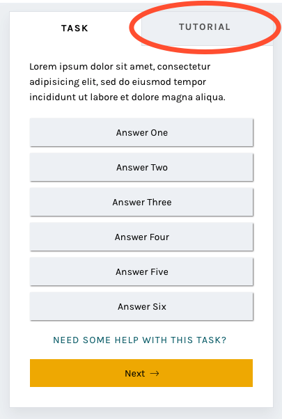
Dive into any project and start classifying! There are typically over 80 active projects listed at zooniverse.org/projects. You can filter by different disciplines (history, space, nature, climate, etc.) to find projects that align with your interests. Every project’s ‘classify’ page has a brief tutorial to guide you on what to do and how to do it.
Be sure to be logged in while you participate so that your stats and hours of participation are recorded and can be included in your certificate.
Step 4: Generate your Volunteer Certificate
Go to zooniverse.org, sign in, and click ‘More Stats’. Use the drop-down options on the upper-right of the stats bar cart to filter to a specific time period and/or project of interest. Then click on ‘Generate Volunteer Certificate’ (the button to the bottom-right of your stats bar chart).
Share your Certificate with your Organization. We’d love it if you continue participating!
By following these steps, you can fulfill your service hour requirements while making meaningful contributions to scientific research. Happy classifying!
For details on how hours are calculated, please see notes at the bottom of this post.

Instructions for Organization Leads:
Step 1: Get to know the Zooniverse
When sharing this opportunity with your volunteer community, we recommend emphasizing the benefits volunteers gain beyond just contributing time and classifications. Instead of creating busy work, encourage participants to reflect on how their efforts (and the community’s collective efforts) contribute to our understanding of the world and the broader universe.
Watch this brief introduction and video for more context about the Zooniverse, the world’s largest platform for people-powered research, with dozens of active projects and millions of participants worldwide.
Each Zooniverse project is led by a different research team, covering a wide range of subjects:
- Identify planets around distant stars – Planet Hunters TESS
- Study the impact of climate change on animals – Snapshot Safari and the ocean – Plankton Portal
- Help in understanding biological functions – Science Scribbler
- Transcribe handwritten documents – Deciphering Secrets: Unlocking the Manuscripts of Medieval Spain
- …and more!
The collective efforts of Zooniverse projects have resulted in hundreds of research publications to date.
Step 2: Share Zooniverse with your Network
Share the instructions above for the simple steps on how to participate and generate a certificate.
If you need to reference a 501(c)(3): Chicago’s Adler Planetarium, one of the hosts of the Zooniverse Team, is a 501(c)(3). Organizations that need to link explicitly to a 501(c)(3) for their volunteering efforts use the Adler Planetarium as the reference. Documentation of the Adler Planetarium’s 501(c)(3) status is provided here. Note: Zooniverse is a program within Adler, Oxford, and the University of Minnesota; it is not a 501(c)3 of its own.
Step 3: Create a Group
If you’re interested in tracking your participants’ engagement, setting group goals, and more easily telling your story of collective impact, check out this blog post for details and instructions.
Step 4: Share your Stories of Impact with Us
We’d love to hear about your experience and share your stories of impact with the broader Zooniverse community to spark ideas and inspiration in others. See this Daily Zooniverse post as an example. Email us at contact@zooniverse.org with your stories, and don’t hesitate to email us if you have any questions or need additional information.
By following these steps, you can include Zooniverse in your volunteer opportunities and help your participants fulfill their service hour requirements while making meaningful contributions to scientific research. Thank you for including Zooniverse in your offerings!
How we calculate ‘Hours’ within Zooniverse Stats:
The hours displayed in the personal stats page are calculated based on the start and end times of your classification efforts. Hours posted there do not reflect time spent on Talk. Talk-based effort is deeply valued and important for Zooniverse projects – it’s where community is built and where many critical discoveries across the disciplines have been made. But within the scope of this phase of developing the new stats and group pages, we only built out views for hours spent classifying.
A little more detail on how the classification time is calculated. Over the years, Zooniverse has updated its infrastructure for robustness and sustainability. In 2015, we built and launched onto our current infrastructure, ‘Panoptes’, and its associated database. At that time in 2015, we started recording both the start and end times for each classification. This means that for all classifications 2015 and beyond, the calculation for time spent on each classification is a straightforward subtraction: finished_at – started_at. We then add up all these values to get the number of hours you’ve spent classifying.
When we made the choice to use the simple ‘finished_at – started_at’ we knew that that could lead to an overestimate of time spent classifying (i.e., you might step away from your computer after starting a classification and then come back to it later). We wanted to keep things as simple as possible and we didn’t want to make assumptions about what someone is doing during the time between ‘finished_at’ and ‘started_at’. We also preferred to err on the side of overestimating rather than underestimating – we’re just so grateful for people’s participation and want to celebrate that.
We do set a 3-hour cap on a single classification to mitigate the impact of ‘stepping away’ on the calculation of your stats. Volunteer tasks on Zooniverse vary widely in complexity—some are quick, like answering yes/no questions, while others, like detailed transcriptions, take more time. Analyzing classification durations across projects, we found that most average between 0–30 minutes, some exceed 30 minutes, with the longest averaging over 3 hours. We ran simulations testing different caps, from 15 minutes to 20 hours, discussed the findings, and decided on a 3-hour cap to fairly credit longer tasks while reducing the impact of idle time.
If you are required to list contact information:
If your program requires that you list contact information for the Zooniverse, please use the following:
Dr. Laura Trouille, Zooniverse Principal Investigator, Adler Planetarium, 1300 South DuSable Lake Shore Dr., Chicago, IL 60605, contact@zooniverse.org
Again, please keep in mind that we unfortunately do not have the capacity to fill out and/or sign individual forms. If your organization is not able to use the automatically generated signed Volunteer Certificate (see notes above), best to find an alternate volunteer opportunity.