For the second year in a row, we’re honoring the hundreds of thousands of contributors, research teams, educators, Talk moderators, and more who make Zooniverse possible. This second edition of Into the Zooniverse highlights another 40 of the many projects that were active on the website and app in the 2019 – 20 academic year.
In that year, the Zooniverse has launched 65 projects, volunteers have submitted more than 85 million classifications, research teams have published 35 papers, and hundreds of thousands of people from around the world have taken part in real research. Wow!
To get your copy of Into the Zooniverse: Vol II, download a free pdf here or order a hard copy on Blurb.com. Note that the cost of the book covers production and shipping; Zooniverse does not receive profit through sales. According to the printer, printing and binding take 4-5 business days, then your order ships. To ensure that you receive your book before December holidays, you can use this tool to calculate shipping times.
If you, like many of us here at Zooniverse, have found yourself on more Zoom calls than ever these days, you may be looking for suitable images to use as Virtual Backgrounds. Look no further! We’ve compiled some of our favorite images from across the Zooniverse in a Zooniverse Collection.
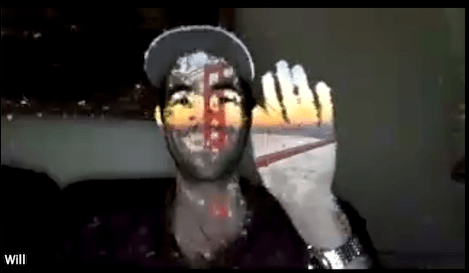
We’ve had fun learning how to enable backgrounds, as demonstrated by developer Will Granger.
Or, get creative and simulate a Zoom background like developer Shaun Noordin.
Lead Designer Becky Rother had a hard time choosing her favorite image.
How to do it
On Zooniverse During classification on Zooniverse, If you’ve come across a subject image (or video!) that you’d like to use in your Zoom background, finish your classification and choose Done & Talk. You can also add it to your Favorites or a Collection. You cannot save an image directly from the classification interface; images may only be saved from a subject’s Talk page (i.e. https://www.zooniverse.org/projects/michiganzoomin/michigan-zoomin/talk/subjects/9185490), so make sure you’re in the right place. Once there, you can right-click or control-click and choose Save Image As.
On Zoom In Zoom, sign in to your account and open Settings. Click ‘Virtual Background’ from the list on the left side. There, you’ll be able to upload your own images from your computer with the plus icon on the right side of the dialog box. Unless you actually have a green screen, leave the ‘I have a green screen’ tickbox un-ticked. Here’s a document from Zoom in case you’re having trouble.
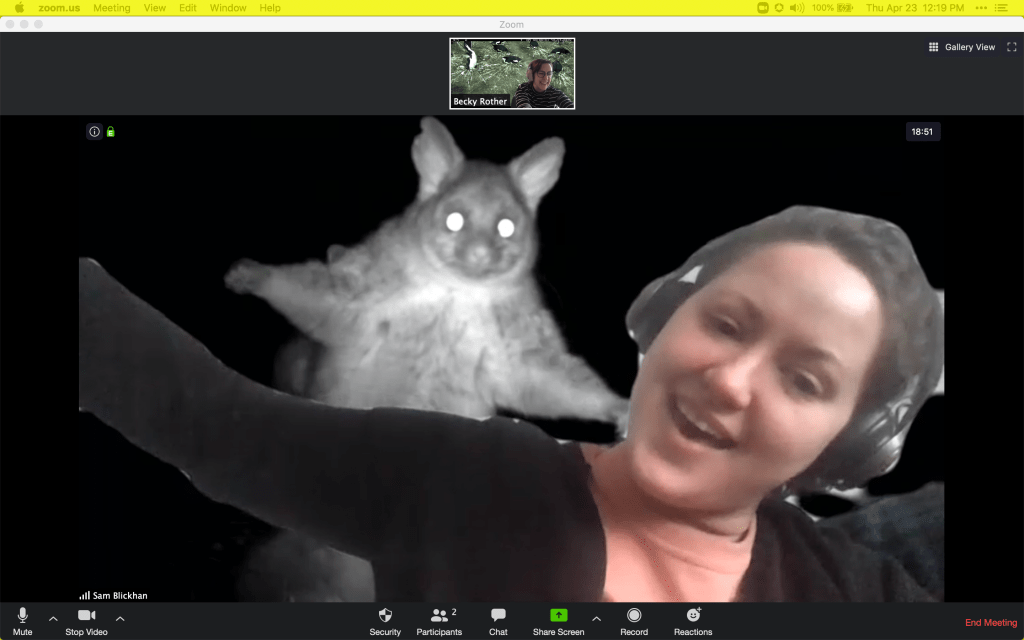
The images range from impressive and educational to downright silly, as demonstrated by Humanities Research Lead Sam Blickhan.
Let us know!
We would love to see your Zooni-Zoom backgrounds in use! Send us an email at contact@zooniverse.org with the subject line ‘Zooni-Zoom!’, or mention us in your photos on Twitter, Facebook, or Instagram.
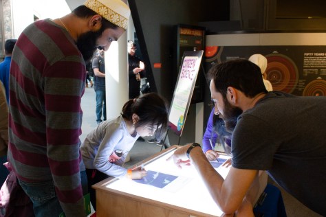
The Chicago Zooniverse team had a great time celebrating Earth Day with members of the community at the Adler Planetarium and Chicago Botanic Garden.
At the Adler Planetarium’s EarthFest celebration on Saturday, April 13, guests were able to participate in an in-real-life version of Floating Forests, tracing areas of kelp from a satellite image onto tracing paper to see how a consensus result might be reached in the online version. Online at https://www.zooniverse.org/projects/zooniverse/floating-forests, you’ll be able to do this same activity, helping researchers learn how Giant Kelp forests change over time.
Tracing Giant Kelp forests at the Adler’s Earth Fest celebration
Learning about Zooniverse during Adler’s Earth Fest celebration
The next day at the Chicago Botanic Garden’s UnEarth Science Festival, visitors learned about the parts of a plant though a matching activity that segued into Rainforest Flowers, a Zooniverse project helping researchers at the Field Museum in Chicago to create a database of images of plants from the tropical forests of Central and South America.
Sharing Zooniverse at Chicago Botanic Garden’s UnEarth Science Festival
Learning about parts of a plant
Talking to visitors about volunteer opportunities
Sharing the Zooniverse app, suitable for all ages
We love meeting the community! If you missed us this time, keep your eye on this blog for our next event.
To celebrate Citizen Science Day 2019, which is this coming Saturday 13th April, a different member of the Zooniverse team will be posting each day this week to share with you some of our all-time favourite Zooniverse projects. Today, Zooniverse Lead Designer Becky Rother.
Let me start by saying that I am not an astronomer. While I’ve always had an interest in space, I went to school for journalism and design and never considered that there might be a way I would contribute to real astronomy research.
This is where I get SO EXCITED about Zooniverse – it’s a chance for anyone to be able to see the same data that astronomers see and actually make useful contributions to research.
One of my favorite recent astronomy-related projects is Local Group Cluster Search, a project looking for star clusters – groups of hundreds to millions of stars that were born at the same time – to help astronomers understand the origins of the universe. The project has been broken down into a manageable task, and there’s tons of help text to help non-astronomers like me feel comfortable.
This project builds on one of Zooniverse’s legacy projects, Andromeda Project, which was completed in 2013 and resulted in 2,753 identified star clusters. The resulting catalog represents an unprecedented census of star clusters, providing a sample that is currently unmatched in terms of mass completeness and age precision. All thanks to the hundreds of volunteerswho contributed 1.82 million classifications over the course of the project’s life!
You can participate in Local Group Cluster Search both on Zooniverse.org and on our mobile app, available for iOS and Android.
To celebrate Earth Day 2019, members of the Zooniverse team will be at two events in Chicago the weekend of April 13 and 14.
First, visit us at the Adler Planetarium’s Earthfest on Saturday, April 13. Participate in a real-life version of our Floating Forests project, pick up some cool Zooniverse swag, and talk to members of the Zooniverse team about their work. The event is free with Adler admission and we’ll be there between 10 am and 4 pm.
If you can’t make it to the Adler, join us at the Chicago Botanic Garden for the Unearth Science Festival on Sunday April 14. There, we’ll be talking about all the fantastic Zooniverse projects you can contribute to online or via our app, as well as taking an in-depth look at the anatomy of flowers via the Rainforest Flowers project.
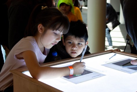
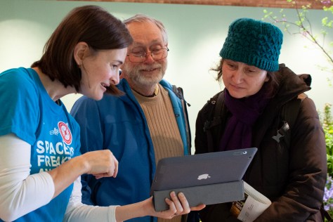
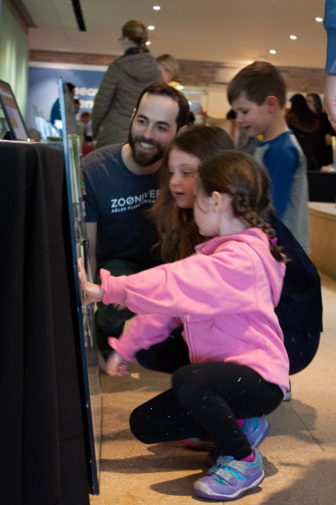
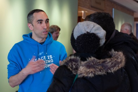
We had a blast hanging out with Chicago-area volunteers and Adler Members at last month’s Adler Members’ Night! Visitors were able to try out potential new Zooniverse projects and Adler exhibits, including a constellation-themed project in collaboration with the Adler’s collections department, as well as U!Scientist, our NSF-supported touch table installation which features Galaxy Zoo.
Adler Members’ Night
Adler Members’ Night
Adler Members’ Night
Adler Members’ Night
Adler Members’ Night
Adler Members’ Night
Northwestern University researchers shook it up demonstrating why earthquakes behave in different ways based on plate friction, registered jumps on a seismograph and quizzed guests on seismograms from jumping second graders, storms and different earthquakes. Their Zooniverse project Earthquake Detective is currently in beta and is set to launch soon.
Once again, we’re hosting a meetup for our Chicago-area Zooniverse volunteers during Adler’s Members’ Night.
Visit us at the Adler Planetarium in Chicago where you’ll be able to:
Meet Zooniverse team members
Talk to researchers from Northwestern University about an upcoming project
Preview new projects
Help us beta test a new exhibit for the Adler
The event is free for all Zooniverse volunteers – at the door, just show your Zooniverse profile either on a mobile device or printed out. You’ll be able to participate in all of the Adler’s Members’ Night activities and tour the planetarium after hours.
Adler Planetarium Members’ Night Friday, October 26 6:00-10:00 pm Free!
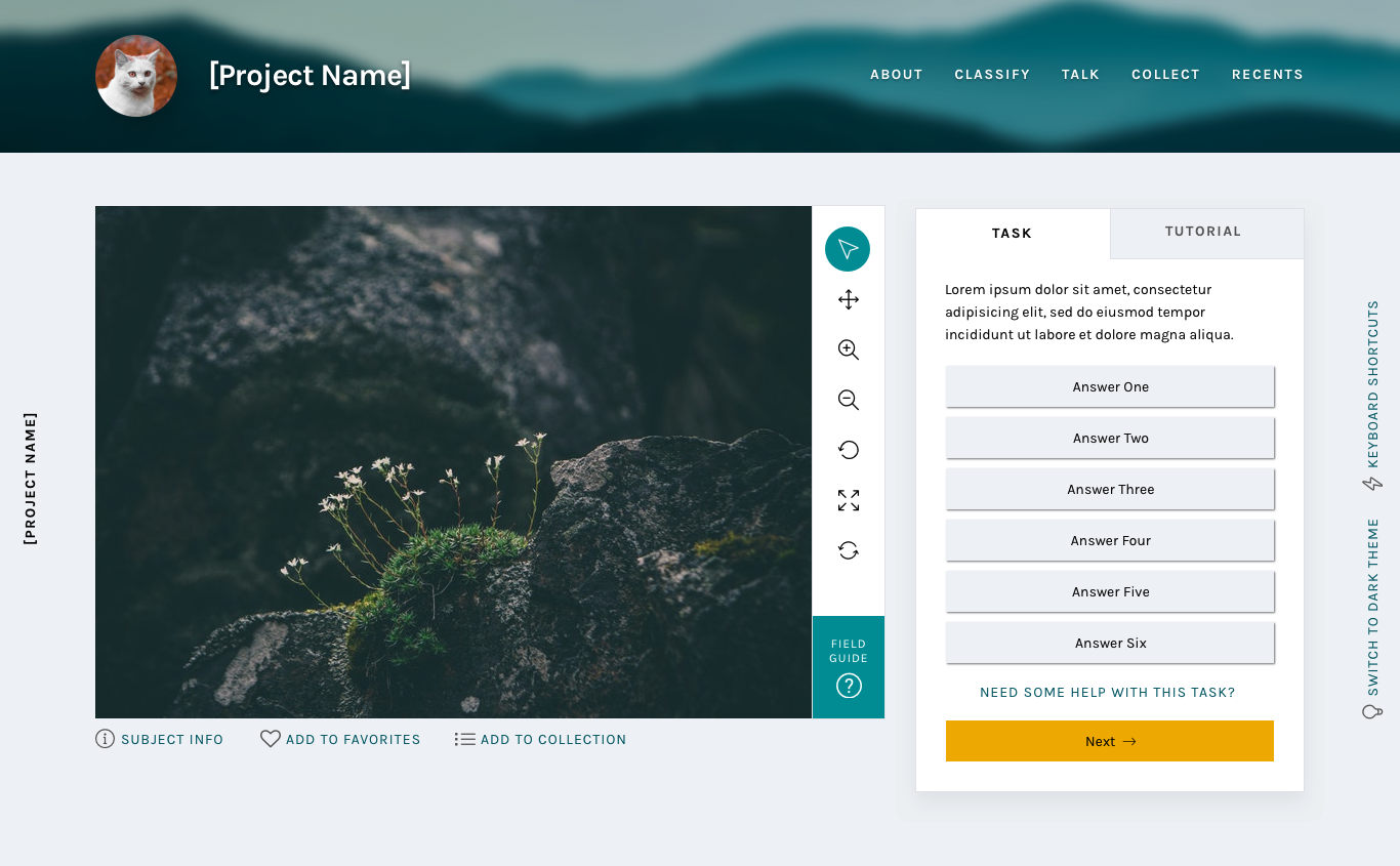
Part three in a multi-part series exploring the visual and UX changes to the Zooniverse classify interface
Coming soon!
Today we’ll be going over a couple of visual changes to familiar elements of the classify interface and new additions we’re excited to premier. These updates haven’t been implemented yet, so nothing is set in stone. Please use this survey to send me feedback about these or any of the other updates to the Zooniverse.
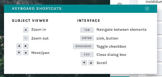
Keyboard shortcut modal
New modals
Many respondents to my 2017 design survey requested that they be able to use the keyboard to make classifications rather than having to click so many buttons. One volunteer actually called the classifier “a carpal-tunnel torturing device”. As a designer, that’s hard to hear – it’s never the goal to actively injure our volunteers.
We actually do support keyboard shortcuts! This survey helped us realize that we need to be better at sharing some of the tools our developers have built. The image above shows a newly designed Keyboard Shortcut information modal. This modal (or “popup”) is a great example of a few of the modals we’re building – you can leave it open and drag it around the interface while you work, so you’ll be able to quickly refer to it whenever you need.
This behavior will be mirrored in a few of the modals that are currently available to you:
Add to Favorites
Add to Collection / Create a New Collection
Subject Metadata
“Need Help?”
It will also be applied to a few new ones, including…
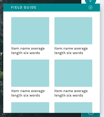
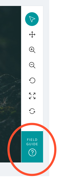
Field Guide
New field guide layout
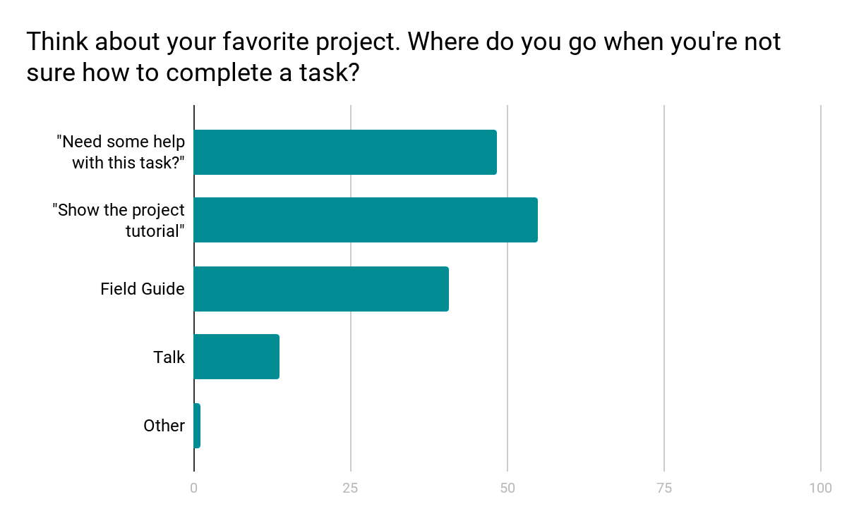
Another major finding from the design survey was that users did not have a clear idea where to go when they needed help with a task (see chart below).
Survey results show a mix of responses
We know research teams often put a lot of effort into their help texts, and we wanted to be sure that work was reaching the largest possible audience. Hence, we moved the Field Guide from a small button on the right-hand side of the screen – a place that can become obscured by the browser’s scrollbar – and created a larger, more prominent button in the updated toolbar:
By placing the Field Guide button in a more prominent position and allowing the modal to stay open during classifications, we hope this tool will be taken advantage of more than it currently is.
The layout was the result of the audit of every live project I conducted in spring 2017:
Field Guide
Mode item count
5
Mode label word count
2
Min item count
2
Min label word count
2
Max items count
45
Max label word count
765
Using the mode gave me the basis on which to design; however, there’s quite a disparity between min and max amounts. Because of this disparity, we’ll be giving project owners with currently active projects a lot of warning before switching to the new layout, and they’ll have the option to continue to use the current Field Guide design if they’d prefer.
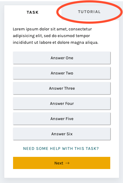
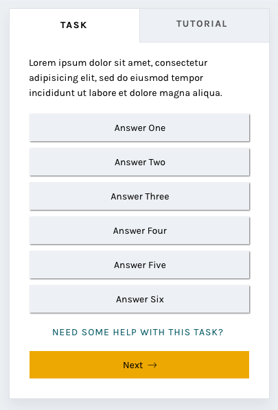
Tutorial
Another major resource Zooniverse offers its research teams and volunteers is the Tutorial. Often used to explain project goals, welcome new volunteers to the project, and point out what to look for in an image, the current tutorial is often a challenge because its absolute positioning on top of the subject image.
No more!
In this iteration of the classify interface, the tutorial opens once as a modal, just as it does now, and then lives in a tab in the task area where it’s much more easily accessible. You’ll be able to switch to the Tutorial tab in order to compare the example images and information with the subject image you’re looking at, rather than opening and closing the tutorial box many times.
A brand-new statistics section
Another major comment from the survey was that volunteers wanted more ways to interact with the Zooniverse. Thus, you’ll be able to scroll down to find a brand-new section! Features we’re adding will include:
Your previous classifications with Add to Favorites or Add to Collection buttons
Interesting stats, like the amount of classifications you’ve done and the amount of classifications your community have done
Links to similar projects you might be interested in
Links to the project’s blog and social media to help you feel more connected to the research team
Links to the project’s Talk boards, for a similar purpose
Possibly: A way to indicate that you’re finished for the day, giving you the option to share your experience on social media or find another project you’re interested in.
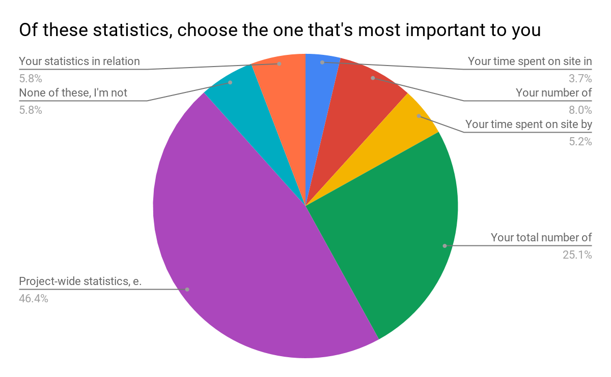
The statistics we chose were directly related to the responses from the survey:
Survey results
Respondents were able to choose more than one response; when asked to rank them in order of importance, project-wide statistics were chosen hands-down:
Project-wide statistics are the most important
We also heard that volunteers sometimes felt disconnected from research teams and the project’s accomplishments:
“In general there is too less information about the achievement of completed projects. Even simple facts could cause a bit of a success-feeling… how many pictures in this project over all have been classified? How much time did it take? How many hours were invested by all participating citizens? Were there any surprising things for the scientists? Things like that could be reported long before the task of a project is completely fullfilled.”
Research teams often spend hours engaged in dialog with volunteers on Talk, but not everyone who volunteers on Zooniverse is aware or active on Talk. Adding a module on the classify page showing recent Talk posts will bring more awareness to this amazing resource and hopefully encourage more engagement from volunteers.
Templates for different image sizes and dimensions
When the project builder was created, we couldn’t have predicted the variety of disparate topics that would become Zooniverse projects. Originally, the subject viewer was designed for one common image size, roughly 2×3, and other sizes have since been shoehorned in to fit as well as they can.
Now, we’d like to make it easier for subjects with extreme dimensions, multimedia subjects, and multi-image subjects to fit better within the project builder. By specifically designing templates and allowing project owners to choose the one that best fits their subjects, volunteers and project owners alike will have a better experience.
Very wide subjects will see their toolbar moved to the bottom of the image rather than on the right, to give the image as much horizontal space as possible. Tall subjects will be about the same width as they have been, but the task/tutorial box will stay fixed on the screen as the image scrolls, eliminating the need to scroll up and down as often when looking at the bottom of the subject.
Wide and tall subjects
Let’s get started!
I’m so excited for the opportunity to share a preview of these changes with you. Zooniverse is a collaborative project, so if there’s anything you’d like us to address as we implement this update, please use this survey to share your thoughts and suggestions. Since we’re rolling these out in pieces, it will be much easier for us to be able to iterate, test, and make changes.
We estimate that the updates will be mostly in place by early 2019, so there’s plenty of time to make sure we’re creating the best possible experience for everyone.
Thank you so much for your patience and understanding as we move forward. In the future, we’ll be as open and transparent as possible about this process.
Part two in a multi-part series exploring the visual and UX changes to the Zooniverse classify interface
The breakdown
Today and in the next post, we’ll take a look at the reasoning behind specific changes to the classifier that we’ve already started to roll out over the past few months. We’ve had good discussions on Talk about many of the updates, but I wanted to reiterate those conversations here so there’s just one source of information to refer back to in the future.
In case you missed it, the first blog post in this series previews the complete new classify layout.
As a reminder, if you have feedback about these changes or anything else on the site you’d like to see addressed, please use this survey link.
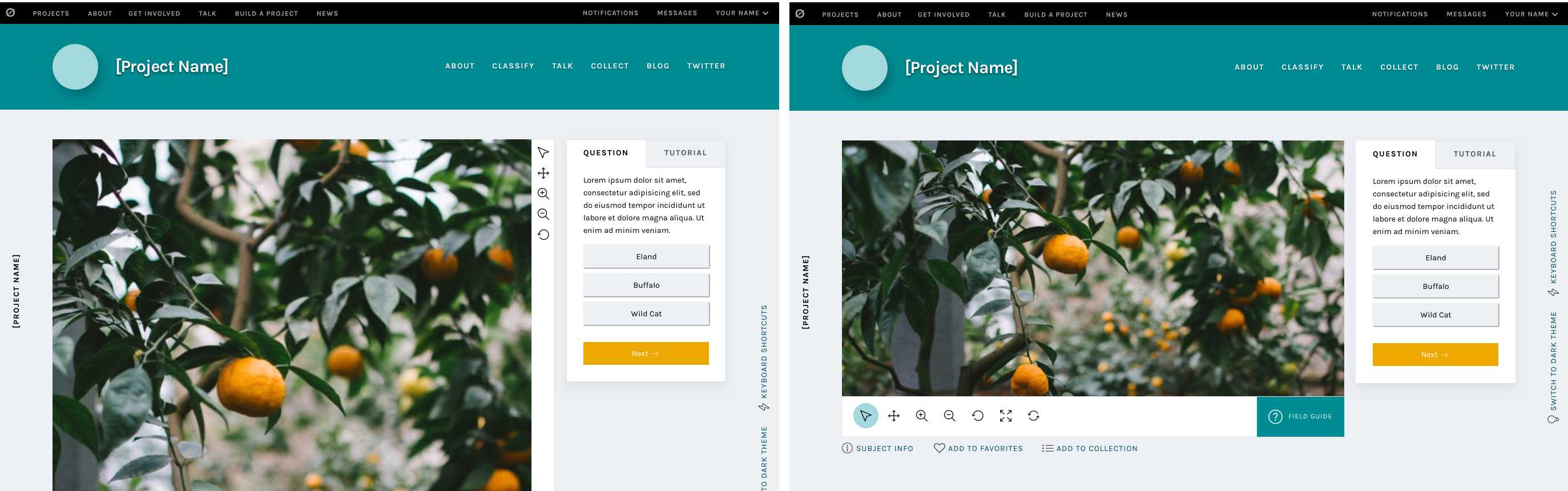
Navigation bar
Updated navigation bar
We started with a rethinking of each project’s navigation bar. The new design features cleaner typography, a more prominent project title, and visual distinction from the sitewide navigation. It also includes the project’s home page background image, giving the project visual distinction while keeping the classify interface itself clean and legible. It’s also responsive: on smaller screen heights, the height of the navigation bar adjusts accordingly.
The most important goal we solved in making this change was to separate the project navigation from the site navigation. During my initial site research and in talking to colleagues and volunteers, many found it difficult to distinguish between the two navigations. Adding a background, a distinct font style, and moving the options to the right side of the page accomplishes this goal.
Neutral backgrounds
Classify interface with neutral background
In conjunction with adding the background image to the navigation bar, the background image was removed from the main classify interface. It was replaced with a cool light grey, followed quickly by the dark grey of the Dark Theme.
Legibility is one of the main goals of any web designer, and it was the focus of this update. By moving to clean greys, all of the focus is now on the subject and task. There are some really striking subject images on Zooniverse, from images of the surface of Mars to zebras in their natural habitat. We want to make sure these images are front and center rather than getting lost within the background image.
The Dark Theme was a suggestion from a Zooniverse researcher – they pointed out that some subject images are similar in tone to the light grey, so a darker theme was added to make sure contrast would be enough to make the image “pop”. We love suggestions like this! While the team strives to be familiar with every Zooniverse project, the task is sometimes beyond us, so we rely on our researchers and volunteers to point out anomalies like this. If you find something like this, you can use this survey to bring it to my attention.
Another great suggestion from a Zooniverse volunteer was the addition of the project name on the left side of the screen. This hasn’t been implemented yet, but it’s a great way to help with wayfinding if the interface is scrolled to below the navigation bar.
Updated task section
New task section
By enclosing the task and its responses in a box rather than leaving it floating in space, the interface gives a volunteer an obvious place to look for the task across every project. Adjusting the typography elevates the interface and helps it feel more professional.
One of the most frequent comments we heard in the 2017 survey was that the interface had far too much scrolling – either the subject image or the task area was too tall. The subject image height will be addressed at a later date, but this new task area was designed specifically with scrolling in mind.
I used the averages I found in my initial project audit and the average screen height (643 px) based on Google Analytics data from the same time period to design a task area that would comfortably fit on screen without scrolling. It’s important to note that there are always outliers in large-scale sites like Zooniverse. While using averages is the best way to design for most projects, we know we can’t provide the most optimal experience for every use case.
You’ll also notice the secondary “Tutorial” tab to the right of the “Task” label. This is a feature that’s yet to be implemented, and I’ll talk more about it in the next post.
And more to come
The next installments in this series will address the additional updates we have planned, like updated modals and a whole new stats section.
Part one in a multi-part series exploring the visual and UX changes to the Zooniverse classify interface
First, an introduction.
Zooniverse began in 2007, with a galaxy-classifying project called Galaxy Zoo. The project was wildly successful, and one of the lead researchers, Chris Lintott, saw an opportunity to help other researchers accomplish similar goals. He assembled a team of developers and set to work building custom projects just like Galaxy Zoo for researchers around the world.
And things were good.
But the team started to wonder: How can we improve the process to empower researchers to build their own Zooniverse projects, rather than relying on the team’s limited resources to build their projects for them?
In the first year of its inception, the number of projects available to citizen scientist volunteers nearly doubled. Popularity spread, the team grew, and things seemed to be going well.
That’s where I come in. * Record scratch *
Three years after the project builder’s debut, I was hired as the Zooniverse designer. With eight years’ experience in a variety of design roles from newspaper page design to user experience for mobile apps to web design, I approached the new project builder-built projects with fresh eyes, taking a hard look at what was working and what areas could be improved.
Over the next week, I’ll be breaking down my findings and observations, and talking through the design changes we’re making, shedding more light on the aims and intentions behind these changes and how they will affect your experience on the Zooniverse platform.
If you take one thing away from this series it’s that this design update, in following with the ethos of Zooniverse, is an iterative, collaborative process. These posts represent where we are now, in June 2018, but the final product, after testing and hearing your input, may be different. We’re learning as we go, and your input is hugely beneficial as we move forward.
Here’s a link to an open survey in case you’d like to share thoughts, experiences, or opinions at any point.
Let’s dive in.
Part one: Research
My first few weeks on the job were spent exploring Zooniverse, learning about the amazing world of citizen science, and examining projects with similar task types from across the internet.
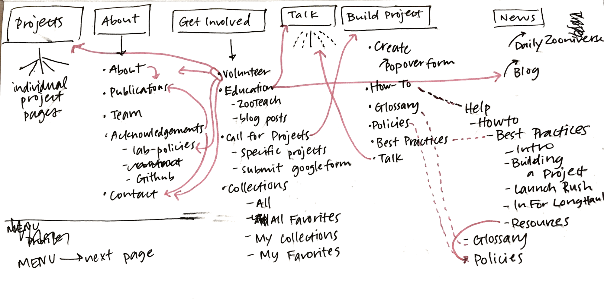
I did a large-scale analysis of the site in general, going through every page in each section and identifying areas with inconsistent visual styles or confusing user experiences.
Current site map, March 2017
Analysis of current template types
After my initial site analysis, I created a list of potential pages or sections that were good candidates for a redesign. The classify interface stood out as the best place to start, so I got to work.
Visual design research
First, I identified areas of the interface that could use visual updates. My main concerns were legibility, accessibility, and varying screen sizes. With an audience reaching to the tens of thousands per week, the demographic diversity makes for an interesting design challenge.
Next, I conducted a comprehensive audit of every project that existed on the Zooniverse in March 2017 (79 in total, including custom projects like Galaxy Zoo), counting question/task word count, the max number of answers, subject image dimensions, field guide content, and a host of other data points. That way, I could accurately design for the medians rather than choosing arbitrarily. When working on this scale, it’s important to use data like these to ensure that the largest possible group is well designed for.
Here are some selected data:
Task type: Drawing
20
Answers
Average number of possible answers
2
Answer average max word count
4.5
Min number
1
Answer max max word count
10
Max number
7
Answer min max word count
2
Median number
1
Answer median max word count
1
Number with thumbnail images
1
Task type: Question
9
Answers
Average number of possible answers
6
Answer average max word count
6
Min number
2
Answer max max word count
18
Max number
9
Answer min max word count
1
Median number
3.5
Answer median max word count
4
Number with thumbnail images
3
Task type: Survey
9
Answers
Average number of possible answers
31
Answer average max word count
4
Min number
6
Answer max max word count
7
Max number
60
Answer min max word count
3
Median number
29
Answer median max word count
4
Number with thumbnail images
9
Even More Research
Next, I focused on usability. To ensure that I understood issues from as many perspectives as possible, I sent a design survey to our beta testers mailing list, comprising about 100,000 volunteers (if you’re not already on the list, you can opt in via your Zooniverse email settings). Almost 1,200 people responded, and those responses informed the decisions I made and helped prioritize areas of improvement.
Here are the major findings from that survey:
No consensus on where to go when you’re not sure how to complete a task.
Many different destinations after finishing a task.
Too much scrolling and mouse movement.
Lack of keyboard shortcuts.
Would like the ability to view previous classifications.
Translations to more languages.
Need for feedback when doing classifications.
Finding new projects that might also be interesting.
Larger images.
In the next few blog posts, I’ll be breaking down specific features of the update and showing how these survey findings help inform the creation of many of the new features.
Without further ado
Basic classify template
Some of these updates will look familiar, as we’ve already started to implement style and layout adjustments. I’ll go into more detail in subsequent posts, but at a high level, these changes seek to improve your overall experience classifying on the site no matter where you are, what browser you’re using, or what type of project you’re working on.
Visually, the site is cleaner and more professional, a reflection of Zooniverse’s standing in the citizen science community and of the real scientific research that’s being done. Studieshaveshown that good, thoughtful design influences a visitor’s perceptions of a website or product, sometimes obviously, sometimes at a subliminal level. By making thoughtful choices in the design of our site, we can seek to positively affect audience perceptions about Zooniverse, giving volunteers and researchers even more of a reason to feel proud of the projects they’re passionate about.
It’s important to note that this image is a reflection of our current thought, in June 2018, but as we continue to test and get feedback on the updates, the final design may change. One benefit to rolling updates out in pieces is the ability to quickly iterate ideas until the best solution is found.
The timeline
We estimate that the updates will be mostly in place by early 2019.
This is due in part to the size of our team. At most, there are about three people working on these updates while also maintaining our commitments to other grant-funded projects and additional internal projects. The simple truth is that we just don’t have the resources to be able to devote anyone full-time to this update.
The timeline is also influenced in a large part by the other half of this update: A complete overhaul of the infrastructure of the classifier. These changes aren’t as visible, but you’ll notice an improvement in speed and functionality that is just as important as the “facelift” portion of the update.
Stay tuned!
We’ve seen your feedback on Talk, via email, and on Github, and we’re happy to keep a dialog going about subsequent updates. To streamline everything and make sure your comments don’t get missed, please only use this survey link to post thoughts moving forward.
The world's largest and most popular platform for people-powered research. This research is made possible by volunteers—millions of people around the world who come together to assist professional researchers.