Part one in a multi-part series exploring the visual and UX changes to the Zooniverse classify interface
First, an introduction.
Zooniverse began in 2007, with a galaxy-classifying project called Galaxy Zoo. The project was wildly successful, and one of the lead researchers, Chris Lintott, saw an opportunity to help other researchers accomplish similar goals. He assembled a team of developers and set to work building custom projects just like Galaxy Zoo for researchers around the world.
And things were good.
But the team started to wonder: How can we improve the process to empower researchers to build their own Zooniverse projects, rather than relying on the team’s limited resources to build their projects for them?
Thus, the project builder (zooniverse.org/lab) was born.
In the first year of its inception, the number of projects available to citizen scientist volunteers nearly doubled. Popularity spread, the team grew, and things seemed to be going well.
That’s where I come in. * Record scratch *
Three years after the project builder’s debut, I was hired as the Zooniverse designer. With eight years’ experience in a variety of design roles from newspaper page design to user experience for mobile apps to web design, I approached the new project builder-built projects with fresh eyes, taking a hard look at what was working and what areas could be improved.
Over the next week, I’ll be breaking down my findings and observations, and talking through the design changes we’re making, shedding more light on the aims and intentions behind these changes and how they will affect your experience on the Zooniverse platform.
If you take one thing away from this series it’s that this design update, in following with the ethos of Zooniverse, is an iterative, collaborative process. These posts represent where we are now, in June 2018, but the final product, after testing and hearing your input, may be different. We’re learning as we go, and your input is hugely beneficial as we move forward.
Here’s a link to an open survey in case you’d like to share thoughts, experiences, or opinions at any point.
Let’s dive in.
Part one: Research
My first few weeks on the job were spent exploring Zooniverse, learning about the amazing world of citizen science, and examining projects with similar task types from across the internet.
I did a large-scale analysis of the site in general, going through every page in each section and identifying areas with inconsistent visual styles or confusing user experiences.
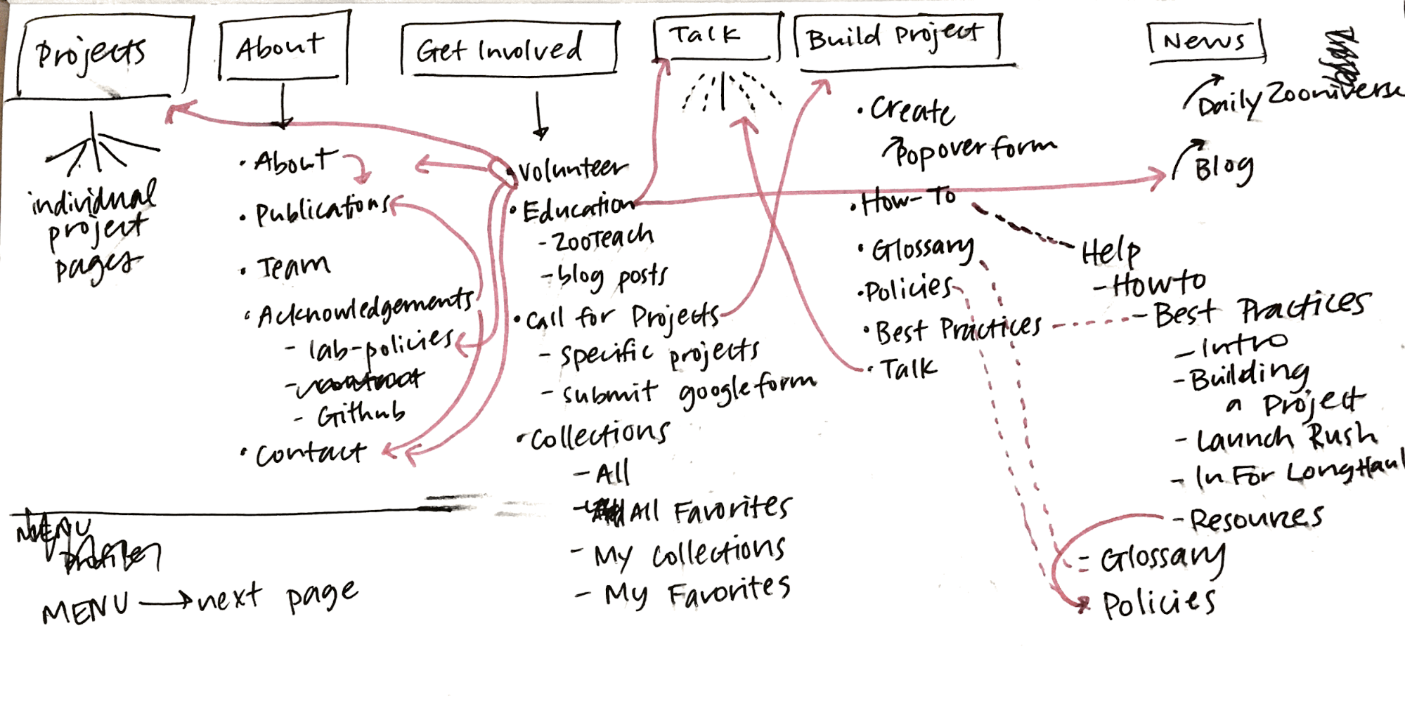
 Current site map, March 2017
After my initial site analysis, I created a list of potential pages or sections that were good candidates for a redesign. The classify interface stood out as the best place to start, so I got to work.
Visual design research
First, I identified areas of the interface that could use visual updates. My main concerns were legibility, accessibility, and varying screen sizes. With an audience reaching to the tens of thousands per week, the demographic diversity makes for an interesting design challenge.
Next, I conducted a comprehensive audit of every project that existed on the Zooniverse in March 2017 (79 in total, including custom projects like Galaxy Zoo), counting question/task word count, the max number of answers, subject image dimensions, field guide content, and a host of other data points. That way, I could accurately design for the medians rather than choosing arbitrarily. When working on this scale, it’s important to use data like these to ensure that the largest possible group is well designed for.
Here are some selected data:
| Task type: Drawing | 20 | |||
| Answers | ||||
| Average number of possible answers | 2 | Answer average max word count | 4.5 | |
| Min number | 1 | Answer max max word count | 10 | |
| Max number | 7 | Answer min max word count | 2 | |
| Median number | 1 | Answer median max word count | 1 | |
| Number with thumbnail images | 1 | |||
| Task type: Question | 9 | |||
| Answers | ||||
| Average number of possible answers | 6 | Answer average max word count | 6 | |
| Min number | 2 | Answer max max word count | 18 | |
| Max number | 9 | Answer min max word count | 1 | |
| Median number | 3.5 | Answer median max word count | 4 | |
| Number with thumbnail images | 3 | |||
| Task type: Survey | 9 | |||
| Answers | ||||
| Average number of possible answers | 31 | Answer average max word count | 4 | |
| Min number | 6 | Answer max max word count | 7 | |
| Max number | 60 | Answer min max word count | 3 | |
| Median number | 29 | Answer median max word count | 4 | |
| Number with thumbnail images | 9 | |||
Even More Research
Next, I focused on usability. To ensure that I understood issues from as many perspectives as possible, I sent a design survey to our beta testers mailing list, comprising about 100,000 volunteers (if you’re not already on the list, you can opt in via your Zooniverse email settings). Almost 1,200 people responded, and those responses informed the decisions I made and helped prioritize areas of improvement.
Here are the major findings from that survey:
- No consensus on where to go when you’re not sure how to complete a task.
- Many different destinations after finishing a task.
- Too much scrolling and mouse movement.
- Lack of keyboard shortcuts.
- Would like the ability to view previous classifications.
- Translations to more languages.
- Need for feedback when doing classifications.
- Finding new projects that might also be interesting.
- Larger images.
In the next few blog posts, I’ll be breaking down specific features of the update and showing how these survey findings help inform the creation of many of the new features.
Without further ado

Some of these updates will look familiar, as we’ve already started to implement style and layout adjustments. I’ll go into more detail in subsequent posts, but at a high level, these changes seek to improve your overall experience classifying on the site no matter where you are, what browser you’re using, or what type of project you’re working on.
Visually, the site is cleaner and more professional, a reflection of Zooniverse’s standing in the citizen science community and of the real scientific research that’s being done. Studies have shown that good, thoughtful design influences a visitor’s perceptions of a website or product, sometimes obviously, sometimes at a subliminal level. By making thoughtful choices in the design of our site, we can seek to positively affect audience perceptions about Zooniverse, giving volunteers and researchers even more of a reason to feel proud of the projects they’re passionate about.
It’s important to note that this image is a reflection of our current thought, in June 2018, but as we continue to test and get feedback on the updates, the final design may change. One benefit to rolling updates out in pieces is the ability to quickly iterate ideas until the best solution is found.
The timeline
We estimate that the updates will be mostly in place by early 2019.
This is due in part to the size of our team. At most, there are about three people working on these updates while also maintaining our commitments to other grant-funded projects and additional internal projects. The simple truth is that we just don’t have the resources to be able to devote anyone full-time to this update.
The timeline is also influenced in a large part by the other half of this update: A complete overhaul of the infrastructure of the classifier. These changes aren’t as visible, but you’ll notice an improvement in speed and functionality that is just as important as the “facelift” portion of the update.
Stay tuned!
We’ve seen your feedback on Talk, via email, and on Github, and we’re happy to keep a dialog going about subsequent updates. To streamline everything and make sure your comments don’t get missed, please only use this survey link to post thoughts moving forward.

This is exciting! I recently tried to dive back in and do a few classifications here and there after having been away for several years, and I think your conclusions from the survey are spot-on! That’s a really nice update!