We’re pleased to announce a new kind of partnership, with a group led by old friend and collaborator Mike Walmsley at the University of Toronto. Mike is part of the Galaxy Zoo and Space Warps research teams, among others.
As you know, we take great care in testing any project which appears here on Zooniverse – thanks to expert review and our valuable volunteer panel of beta reviewers — to make sure that it works for a broad range of volunteers and our supported browsers. We believe in this process and remain committed to supporting and advancing the Zooniverse platform and its projects. But sometimes there’s a need for a more experimental approach – for trying out new modes of interaction, for complex projects that integrate machine learning, or just for doing something new. So we’re partnering with Mike’s *Experiment* to provide Zooniverse volunteers with the chance to take part in projects beyond the core Zooniverse platform. Such projects will be run by people we trust, and the goals of any project we link to will be the same as any other Zooniverse project – to provide insight through working with a distributed crowd of volunteers. But it may be that the tech is a little less robust or the projects look less polished than you’re used to. Projects may also come and go much more rapidly than is common in the Zooniverse. Wherever we mention such a project on the Zooniverse site, we’ll clearly tell you that we’re linking to an Experiment Project outside of the Zooniverse platform.
So, welcome Experiment. They have four small projects up already, where you can use a new brush tool to mark features of galaxies from the Euclid space telescope, and there’s more to come. We hope you’ll enjoy this new way of participating in projects.
FAQ
Who built Experiment and who runs and maintains Experiment? Mike Walmsley and his team at the University of Toronto.
What data will Zooniverse share with Experiment? We’re enabling log in with your Zooniverse account. If you choose to use the Zooniverse login this will share only your Zooniverse username and email address with the Experiment project team. You’ll be asked explicitly to approve this before this happens.
Does Experiment share data with the Zooniverse platform? All data submitted via Experiment is outside the Zooniverse platform, is not shared with Zooniverse, and is not subject to the Zooniverse user agreement and privacy policy. You can see the terms of service and privacy policy for Experiment here: Experiment Terms of Service and Privacy Policy
Can I track my classifications? Because data is stored outside the Zooniverse platform, participation in Experiment projects is not captured in Zooniverse’s database and will not be included in your Zooniverse stats.
How do I give feedback? For these initial Experiment projects, please share your thoughts on the Talk pages for Galaxy Zoo and Stellar Streams, and the researchers leading each Experiment project will respond. For anything else, you’re always welcome to get in touch with the Zooniverse team: contact@zooniverse.org.
Over the years, one of the most common requests from educators has been for tools to support group engagement in Zooniverse and better tell your story of collective impact. We’re so grateful for a grant from NASA enabling us to build these new tools to meet those needs.
Whether you’re a library or museum educator, a camp counselor, or a classroom teacher, read on to discover how Zooniverse can enhance your educational goals.
Zooniverse is the world’s largest platform for people-powered research, with millions of participants and dozens of active projects across various disciplines. By using Zooniverse, you join a global network of educators offering students often their first opportunity to engage in real research. From classifying galaxies and tagging penguins to transcribing historic documents and marking the structure of cells for cancer research, Zooniverse projects span a wide array of research fields.
For a list of curricular resources for educators, including lesson plans, instructor guides, and more, check out zooniverse.org/get-involved/education.
Tracking Individual and Collective Impact
Zooniverse offers easy ways to track both individual and collective impact, making it easy to use in educational settings. You can assign tasks, motivate participation, set up friendly competitions between classes, and more.
Personal Stats
When logged into Zooniverse, each individual sees their own stats, including classification counts and hours spent. A valuable feature for fulfilling service hour requirements is the ability to generate a signed volunteer certificate.
Group Stats
Groups in Zooniverse can view their collective impact, set shared goals, and celebrate milestones. These tools empower educators to engage students in new ways.
Step 1: Create Your Group
Go to zooniverse.org, sign in, and scroll down to ‘My Groups’. Click ‘Create New Group.’ Name your group appropriately, such as “Hammond’s 4th Period Biology” or “Davis County Public Library.”
As the admin, you can decide if the group stats page will be publicly viewable or only accessible to group members. Additionally, you can choose whether to display individual stats or only aggregate results. For example, if your group stats page is public, you can set it so that only you can see individual stats, or you can allow other group members or everyone to see them. Through the admin pop-up, you can update your group settings or remove group members at any time.
For additional Group details/features, see this blog post.
Step 2: Invite Participants to Join Your Group
Have your students or program participants create a Zooniverse account by clicking ‘Register’ in the upper-right corner of zooniverse.org. To invite them to join your group, click the ‘Copy Join Link’ on your group’s page and share it via email or other preferred means, such as creating a QR code.
Once they click the join link, all classifications they do on any Zooniverse project will be included in your group stats page, contributing to your group’s collective impact.
Step 3: View/Share Your Group Stats
When viewing your group stats page, you can use the drop-down options on the upper-right of the stats bar chart to filter to a specific time period and/or project of interest. Another helpful feature is the ‘See detailed stats’ option, where you can view all group contributors’ stats and generate a .CSV file for further analysis. A future feature will be the ability to filter to specific time periods within this detailed stats page.
Members of your group will also be able to view the group stats page. Depending on the choices you’ve made in the admin settings, group members will either be able to only view the aggregate stats OR they’ll be able to view both the aggregate and individual stats.
If you’ve set your group visibility settings to ‘public’, you’ll have the ‘Share Group’ option at the top of your group’s stats page. Clicking ‘Share group’ will copy a link to the public-facing view of your group’s stats page. This is different from a ‘Join Link’. Anyone with the ‘Share Group’ link will simply be able to view the group’s stats, but will not be added as a member of the group.
Celebrating Milestones
A few Zooniverse project teams have created short thank you videos, which are great rewards to share with your students after reaching a collective milestone.
Example: STEM Club at a Public Library
Imagine you lead a STEM club at your local public library. You create a group, set the settings to public but only for aggregate results (i.e, not showing individual stats publicly), copy the join link, and share it with your group members. You set a classification challenge for the week, share recommended projects (see zooniverse.org/projects for the full list), and encourage free choice. Throughout the week, you update your group on progress toward your goal. At your next meeting, you celebrate reaching the goal with a thank you video and highlight top contributors with special rewards. Then, you set the next week’s challenge to keep the momentum going.
Other Use Cases
Friendly competition among class periods
Extra credit opportunities for your students
Extension activity after a museum field trip experience
Summer camp group tracking independent research time
Share your Stories of Impact with Us
We’d love to hear about your experience and share your stories of impact with the broader Zooniverse community to spark ideas and inspiration in others. See this Daily Zooniverse post as an example. Email us at contact@zooniverse.org with your stories!
Get in Touch
If you have questions or need advice, join the conversation in our dedicated Talk discussion forum around Education and the Zooniverse or email us at contact@zooniverse.org.
On behalf of Zooniverse, we are incredibly grateful that you choose to use participatory science in your educational programs and hope to continue fostering this innovative community of educators around the world.
Thank you for including Zooniverse in your educational efforts!
The Zooniverse has come a long way since beginning our journey together in 2009 – from the launch of the Project Builder to supporting diverse task types across the disciplines, including transcription, tagging, and marking. This fall, we’re continuing our frontend codebase migration and design evolution with a fresh, modern redesign to some of our main pages – this update focuses on freshening up our homepage.
What’s New?
Your Stats: Now, you can more easily track your progress and goals. See all your classification stats on one page and filter by project or time frame.
Volunteer Recognition: We heard you! Create personalized volunteer certificates right on the homepage. Perfect for students needing proof of volunteer hours!
Group Engagement: Create your group, set up goals and see the impact you’re making together. Great for families, teams, classrooms, or friends working on projects together.
Easy Navigation: Click the Zooniverse logo in the upper-left corner of any page to return to your homepage easily.
Read on for more details.
The zooniverse.org homepage serves a broad audience of new and returning volunteers, educators, and researchers. We believe the homepage should be a central hub where these different audiences can find the tools they need to make their Zooniverse experience satisfying and worthwhile. Now you’ll be able to pick up where you left off classifying, see your stats at a glance, and follow up on your last classifications to add them to a collection, favorite, or comment.
A common request over the years has been better tools for capturing individual and group impact. Thanks to support from NASA, we’ve been working hard to implement improved personal stats and new features that allow you to see the collective impact of your groups – whether you’re a family, a corporate team, a classroom, or simply a group of friends passionate about participating in projects together. We’ve made significant strides in bringing these functionalities to life.
Key features of your new homepage:
Personalized Statistics: We’re making it a little easier to keep track of your progress and goals. Now all of your real-time classification stats can be found on one page and you can filter by project or by a specific time frame. Access detailed information about your contributions, including the number of classifications, projects you’ve worked on, and your impact over time.
A foundational step in this effort was a complete overhaul of our stats infrastructure to ensure greater reliability and stability. Moving forward, zooniverse.org personal stats will pull data exclusively from our updated stats server, reflecting contributions from 2007 onwards.
Volunteer Recognition: Generate personalized volunteer certificates right from your Zooniverse homepage! Customizable to specific time periods and projects. An often requested feature for students fulfilling volunteer service hour requirements.
Group Engagement: A new way to create and share group goals and tell the story of your collective impact. Read this blog post for more details.
Streamlined Navigation: Enjoy an easier flow by clicking the Zooniverse logo in the upper-left on any page to return to your homepage.
We value your feedback! We launched the new homepage in September of 2024. If you encounter any difficulties or have questions as you’re using the new homepage, please share them in this Talk thread and mention @support.
The Community Catalog (https://community-catalog.zooniverse.org) is a custom tool to offer Zooniverse project participants the opportunity to explore a project dataset, and to allow our team to experiment with creating new pathways into classifying.
We wanted to create a digital space that would facilitate not only sharing, but also discovery of participants’ contributions alongside institutional information (i.e. metadata) about the subjects being classified. The result was a data exploration app connected to specific Zooniverse crowdsourcing projects (How Did We Get Here?and Stereovision) that allows users to search and explore each project’s photo dataset based on participant-generated hashtags as well as the institutional metadata provided by project teams.
The Home Page of the Stereovision project in the Community Catalog.
The app includes a home page (shown above) with search/browsing capabilities, as well as an individual page for each photograph included in the project. The subject page (shown below) displays any available institutional metadata, participant-generated hashtags, and Talk comments. A ‘Classify this subject’ button allows users exploring the data to go directly to the Zooniverse project and participate in whatever type of data collection is taking place (transcription, labeling, generating descriptive text, etc.).
The Subject Page of the Community Catalog, displaying a subject with multiple Talk comments and community-generated hashtags.
Combined with the Talk (and QuickTalk) features, we’re hoping that this tool will encourage participants to share their experiences, memories, questions, and thoughts about the project photos, the historical events depicted, and the importance of the collection. The Community Catalog offers an approach where a participant can allow their interest in a specific item to lead them to take part in a classification task, rather than classification to Talk being a one-way street.
How Did We Get Here? was the pilot project for the Community Catalog, and is now complete. We have just launched the second project to use the Catalog, Stereovision, which you can participate in either via the Community Catalog site, or by visiting the Zooniverse project here: Stereovision.
The Community Catalog is not available for re-use by other projects in this exact form (i.e. as a standalone app), but we’re planning to incorporate some of its features into the Talk section of the Zooniverse platform in 2025. If you have any questions or would like to share your thoughts about this app, please feel free to reply to this post, or email us at contact@zooniverse.org.
The Community Catalog was developed as part of the AHRC-funded project Communities and Crowds. This project is run in collaboration with volunteer researchers and staff at the National Science and Media Museum in Bradford, United Kingdom, and National Museums Scotland, as well as with the Zooniverse teams at Oxford University and the Adler Planetarium in Chicago.
We’re pleased to update you on an important development as we undergo a migration to a new frontend codebase over the course of 2024-2025. This transition brings a fresh and improved experience to our platform.
From a participant’s perspective, the primary changes involve project layout and styling, resulting in a more user-friendly interface. Importantly, these updates don’t impact your stats (e.g,. classification count), Collections, Favorites, etc.
To offer you a sneak peek, check out the updated design and layout on projects that have already migrated, such as:
If a project has a design similar to the examples above, it has migrated. Conversely, if it resembles the old design, like the Milky Way Project, it hasn’t migrated yet.
We value your feedback! If you encounter any difficulties or have suggestions as you’re participating in a project, please share them in the respective project’s Talk or within this general Announcements Talk thread and mention @support.
Wondering about the motivation behind this change? We built the new frontend codebase in order to ensure the robustness and stability of the Zooniverse platform, with key updates enhancing code maintenance, accessibility, and overall sustainability.
Here’s a breakdown of some of the improvements:
Breaking up the Code: We’ve modularized our code into independent, reusable libraries to enhance maintenance and overall sustainability.
Next.js for Server Side Rendering: By utilizing Next.js, we’re improving accessibility for participants worldwide, particularly those with lower internet speeds and bandwidth.
Classify Page Code Updates: We’ve refined elements such as workflows and the subject viewer to ensure improved robustness and sustainability of our codebase.
Authentication Library Updates: Keeping up with the latest standards, we’ve updated our authentication libraries to enhance security and user experience.
Integrated Code Testing: To maintain the long-term health of our technical products, we’ve integrated code testing throughout our development process. This mitigates against updates introducing bugs or other issues into the codebase, adhering to standard practices.
Thank you for being part of the Zooniverse community! Looking forward to many more groundbreaking discoveries and advances in research. Your classifications and participation in Talk make all of this possible. Thank you!
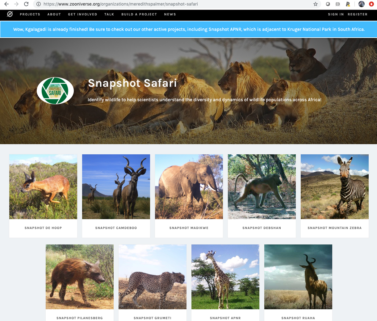
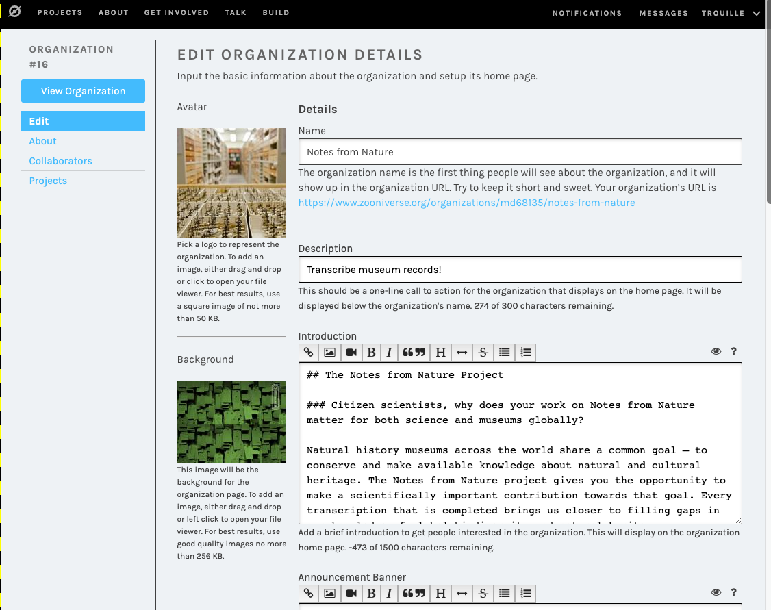
We recently deployed new functionality on the Zooniverse platform supporting ‘Organizations’; the ability to have a single landing page for multiple projects.
The above screenshot of the Snapshot Safari Organization illustrates the look and feel of an Organization landing page. The page provides a brief overview, information about the team leading the effort, and quick access to the 8+ related projects (e.g., Snapshot Serengeti, Snapshot De Hoop, etc.). The page also displays a few aggregated statistics across the projects: total number of projects within the Organization, total number of subjects, total number of classifications, and the total number of completed subjects. In 2020 we’ll provide a page linked to each Organization with more complete listing of its projects’ statistics, mirroring the information available through each individual project’s statistics page (e.g., https://www.zooniverse.org/projects/shuebner729/snapshot-de-hoop/stats).
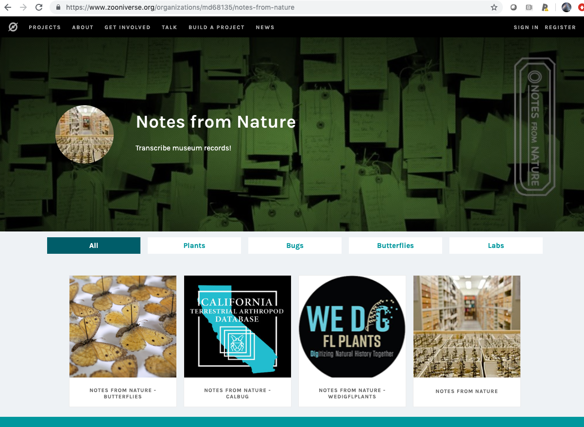
The above screenshot of the Notes from Nature Organization landing page illustrates an additional ‘filter’ functionality that some Organizations will find useful. By clicking on the ‘Plants’, ‘Bug’, etc. buttons, you can filter down to just projects tagged with those keywords.
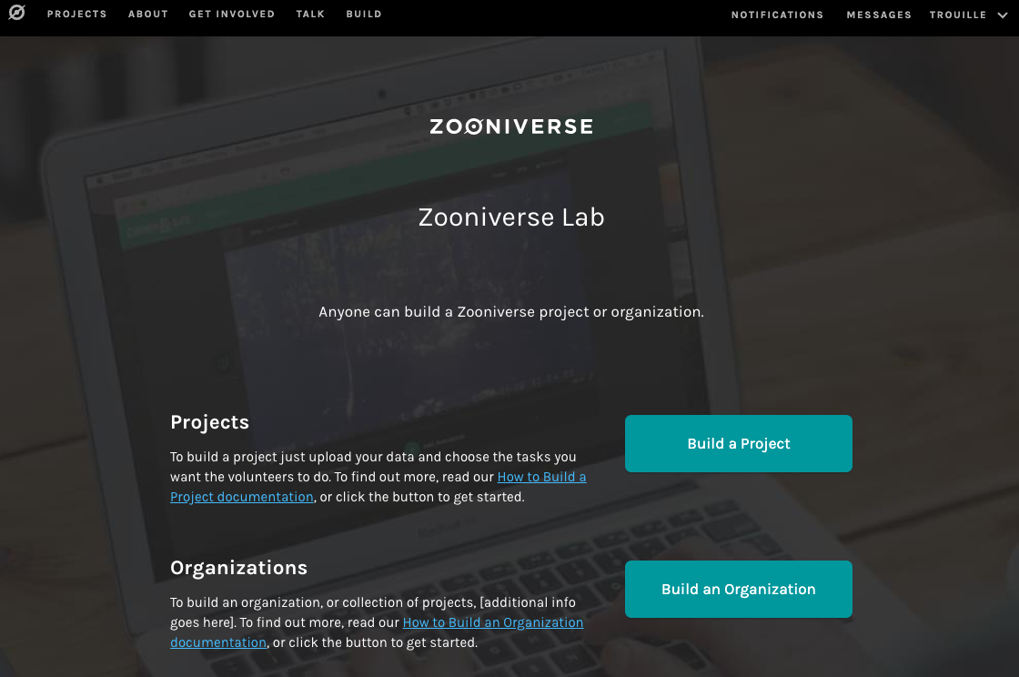
https://lab.zooniverse.org provides access to the editor interface for building Projects and building Organizations.
Within the Organization Editor Interface, the Organization owner and their collaborators can upload text and image content and link Projects to their Organization.
Which projects can be linked into an Organization?
You can only link projects for which you’re an owner or collaborator.
Only ‘launch approved’ projects will appear in the public view of your Organization landing page.
When linking a project to your Organization, the interface indicates whether that project is ‘launch approved’ or not.
As an Organization owner or collaborator, you can link a project to your Organization that isn’t yet launch approved and you can see how that project will look in your Organization landing page. By clicking on ‘volunteer’ view, you will then see only the ‘launch approved’ projects (i.e., the public view). This was put in place as a way for owners and collaborators to ‘preview’ a new project under development within a live Organizing landing page.
Once you are ready for your Organization landing page to be a publicly accessible URL, send an email to contact@zooniverse.org for the Zooniverse team to review and list it as public. We have slated development time in 2020 to add a new component within https://www.zooniverse.org/projects/ listing all live Organizations.
If you have questions about setting up an Organization, please post within the ‘Building an Organization’ thread within the ‘Project Building’ Discussion Forum (https://www.zooniverse.org/talk/18).
One of the big efforts for the mobile app right now is to make the project building experience for mobile feel about the same as it does for web. For the most part, the experiences were very similar. In fact, they were almost identical besides the limitations we put on what workflows mobile projects can have. There was, however, a very large limiting factor for mobile project builders. There was no formal path from creating a project to getting that project to release on the app.
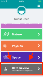
Introducing Beta Mode for mobile!
Now project builders who want their workflows to be enabled on mobile can have them reviewed on mobile as well. Here’s how it works:
When a project that has a mobile workflow is approved to go to beta, it will appear in the “Beta Review” section on the main page of the app.
From there, users will be able to view and test all of the beta projects that are currently live.
We are launching this feature with (of course) Galaxy Zoo Mobile. It is available now for all our users, so go ahead and check it out!
Like beta review on web-based projects, we will collect feedback from volunteer testers and give that back to project owners. This new process will lead to better, clearer mobile workflows in the future.
Stay tuned for more notes about upcoming mobile features!
Hi all, I am Coleman Krawczyk and for the past year I have been working on tools to help Zooniverse research teams work with their data exports. The current version of the code (v1.3.0) supports data aggregation for nearly all the project builder task types, and support will be added for the remaining task types in the coming months.
What does this code do?
This code provides tools to allow research teams to process and aggregate classifications made on their project, or in other words, this code calculates the consensus answer for a given subject based on the volunteer classifications.
The code is written in python, but it can be run completely using three command line scripts (no python knowledge needed) and a project’s data exports.
Configuration
The first script is the uses a project’s workflow data export to auto-configure what extractors and reducers (see below) should be run for each task in the workflow. This produces a series of `yaml` configuration files with reasonable default values selected.
Extraction
Next the extraction script takes the classification data export and flattens it into a series of `csv` files, one for each unique task type, that only contain the data needed for the reduction process. Although the code tries its best to produce completely “flat” data tables, this is not always possible, so more complex tasks (e.g. drawing tasks) have structured data for some columns.
Reduction
The final script takes the results of the data extraction and combine them into a single consensus result for each subject and each task (e.g. vote counts, clustered shapes, etc…). For more complex tasks (e.g. drawing tasks) the reducer’s configuration file accepts parameters to help tune the aggregation algorithms to best work with the data at hand.
A full example using these scripts can be found in the documentation.
Future for this code
At the moment this code is provided in its “offline” form, but we testing ways for this aggregation to be run “live” on a Zooniverse project. When that system is finished a research team will be able to enter their configuration parameters directly in the project builder, a server will run the aggregation code, and the extracted or reduced `csv` files will be made available for download.
Part three in a multi-part series exploring the visual and UX changes to the Zooniverse classify interface
Coming soon!
Today we’ll be going over a couple of visual changes to familiar elements of the classify interface and new additions we’re excited to premier. These updates haven’t been implemented yet, so nothing is set in stone. Please use this survey to send me feedback about these or any of the other updates to the Zooniverse.
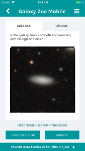
Keyboard shortcut modal
New modals
Many respondents to my 2017 design survey requested that they be able to use the keyboard to make classifications rather than having to click so many buttons. One volunteer actually called the classifier “a carpal-tunnel torturing device”. As a designer, that’s hard to hear – it’s never the goal to actively injure our volunteers.
We actually do support keyboard shortcuts! This survey helped us realize that we need to be better at sharing some of the tools our developers have built. The image above shows a newly designed Keyboard Shortcut information modal. This modal (or “popup”) is a great example of a few of the modals we’re building – you can leave it open and drag it around the interface while you work, so you’ll be able to quickly refer to it whenever you need.
This behavior will be mirrored in a few of the modals that are currently available to you:
Add to Favorites
Add to Collection / Create a New Collection
Subject Metadata
“Need Help?”
It will also be applied to a few new ones, including…
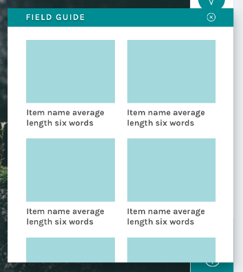
Field Guide
New field guide layout
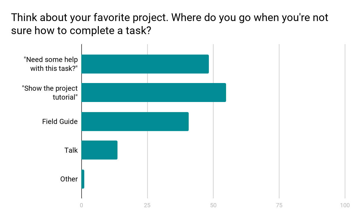
Another major finding from the design survey was that users did not have a clear idea where to go when they needed help with a task (see chart below).
Survey results show a mix of responses
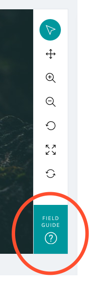
We know research teams often put a lot of effort into their help texts, and we wanted to be sure that work was reaching the largest possible audience. Hence, we moved the Field Guide from a small button on the right-hand side of the screen – a place that can become obscured by the browser’s scrollbar – and created a larger, more prominent button in the updated toolbar:
By placing the Field Guide button in a more prominent position and allowing the modal to stay open during classifications, we hope this tool will be taken advantage of more than it currently is.
The layout was the result of the audit of every live project I conducted in spring 2017:
Field Guide
Mode item count
5
Mode label word count
2
Min item count
2
Min label word count
2
Max items count
45
Max label word count
765
Using the mode gave me the basis on which to design; however, there’s quite a disparity between min and max amounts. Because of this disparity, we’ll be giving project owners with currently active projects a lot of warning before switching to the new layout, and they’ll have the option to continue to use the current Field Guide design if they’d prefer.
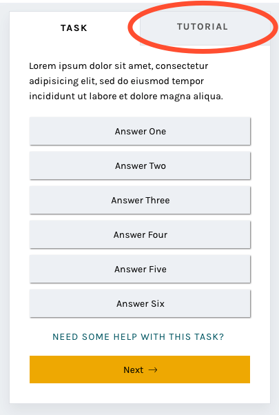
Tutorial
Another major resource Zooniverse offers its research teams and volunteers is the Tutorial. Often used to explain project goals, welcome new volunteers to the project, and point out what to look for in an image, the current tutorial is often a challenge because its absolute positioning on top of the subject image.
No more!
In this iteration of the classify interface, the tutorial opens once as a modal, just as it does now, and then lives in a tab in the task area where it’s much more easily accessible. You’ll be able to switch to the Tutorial tab in order to compare the example images and information with the subject image you’re looking at, rather than opening and closing the tutorial box many times.
A brand-new statistics section
Another major comment from the survey was that volunteers wanted more ways to interact with the Zooniverse. Thus, you’ll be able to scroll down to find a brand-new section! Features we’re adding will include:
Your previous classifications with Add to Favorites or Add to Collection buttons
Interesting stats, like the amount of classifications you’ve done and the amount of classifications your community have done
Links to similar projects you might be interested in
Links to the project’s blog and social media to help you feel more connected to the research team
Links to the project’s Talk boards, for a similar purpose
Possibly: A way to indicate that you’re finished for the day, giving you the option to share your experience on social media or find another project you’re interested in.
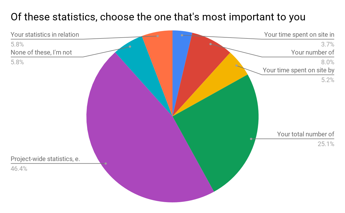
The statistics we chose were directly related to the responses from the survey:
Survey results
Respondents were able to choose more than one response; when asked to rank them in order of importance, project-wide statistics were chosen hands-down:
Project-wide statistics are the most important
We also heard that volunteers sometimes felt disconnected from research teams and the project’s accomplishments:
“In general there is too less information about the achievement of completed projects. Even simple facts could cause a bit of a success-feeling… how many pictures in this project over all have been classified? How much time did it take? How many hours were invested by all participating citizens? Were there any surprising things for the scientists? Things like that could be reported long before the task of a project is completely fullfilled.”
Research teams often spend hours engaged in dialog with volunteers on Talk, but not everyone who volunteers on Zooniverse is aware or active on Talk. Adding a module on the classify page showing recent Talk posts will bring more awareness to this amazing resource and hopefully encourage more engagement from volunteers.
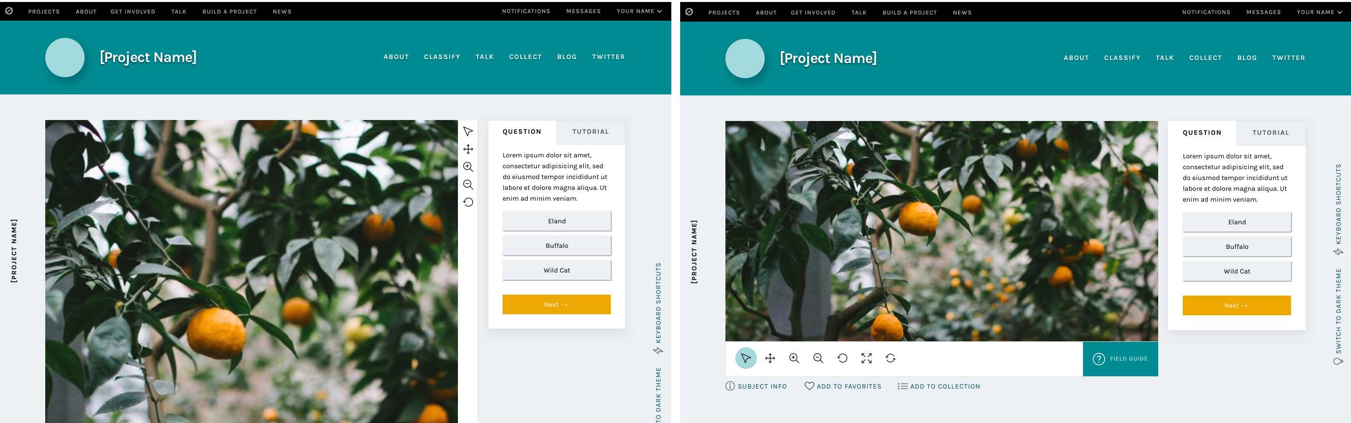
Templates for different image sizes and dimensions
When the project builder was created, we couldn’t have predicted the variety of disparate topics that would become Zooniverse projects. Originally, the subject viewer was designed for one common image size, roughly 2×3, and other sizes have since been shoehorned in to fit as well as they can.
Now, we’d like to make it easier for subjects with extreme dimensions, multimedia subjects, and multi-image subjects to fit better within the project builder. By specifically designing templates and allowing project owners to choose the one that best fits their subjects, volunteers and project owners alike will have a better experience.
Very wide subjects will see their toolbar moved to the bottom of the image rather than on the right, to give the image as much horizontal space as possible. Tall subjects will be about the same width as they have been, but the task/tutorial box will stay fixed on the screen as the image scrolls, eliminating the need to scroll up and down as often when looking at the bottom of the subject.
Wide and tall subjects
Let’s get started!
I’m so excited for the opportunity to share a preview of these changes with you. Zooniverse is a collaborative project, so if there’s anything you’d like us to address as we implement this update, please use this survey to share your thoughts and suggestions. Since we’re rolling these out in pieces, it will be much easier for us to be able to iterate, test, and make changes.
We estimate that the updates will be mostly in place by early 2019, so there’s plenty of time to make sure we’re creating the best possible experience for everyone.
Thank you so much for your patience and understanding as we move forward. In the future, we’ll be as open and transparent as possible about this process.
Part two in a multi-part series exploring the visual and UX changes to the Zooniverse classify interface
The breakdown
Today and in the next post, we’ll take a look at the reasoning behind specific changes to the classifier that we’ve already started to roll out over the past few months. We’ve had good discussions on Talk about many of the updates, but I wanted to reiterate those conversations here so there’s just one source of information to refer back to in the future.
In case you missed it, the first blog post in this series previews the complete new classify layout.
As a reminder, if you have feedback about these changes or anything else on the site you’d like to see addressed, please use this survey link.
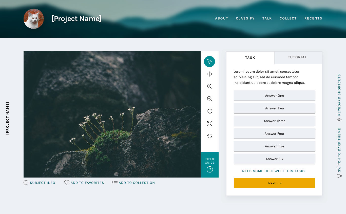
Navigation bar
Updated navigation bar
We started with a rethinking of each project’s navigation bar. The new design features cleaner typography, a more prominent project title, and visual distinction from the sitewide navigation. It also includes the project’s home page background image, giving the project visual distinction while keeping the classify interface itself clean and legible. It’s also responsive: on smaller screen heights, the height of the navigation bar adjusts accordingly.
The most important goal we solved in making this change was to separate the project navigation from the site navigation. During my initial site research and in talking to colleagues and volunteers, many found it difficult to distinguish between the two navigations. Adding a background, a distinct font style, and moving the options to the right side of the page accomplishes this goal.
Neutral backgrounds
Classify interface with neutral background
In conjunction with adding the background image to the navigation bar, the background image was removed from the main classify interface. It was replaced with a cool light grey, followed quickly by the dark grey of the Dark Theme.
Legibility is one of the main goals of any web designer, and it was the focus of this update. By moving to clean greys, all of the focus is now on the subject and task. There are some really striking subject images on Zooniverse, from images of the surface of Mars to zebras in their natural habitat. We want to make sure these images are front and center rather than getting lost within the background image.
The Dark Theme was a suggestion from a Zooniverse researcher – they pointed out that some subject images are similar in tone to the light grey, so a darker theme was added to make sure contrast would be enough to make the image “pop”. We love suggestions like this! While the team strives to be familiar with every Zooniverse project, the task is sometimes beyond us, so we rely on our researchers and volunteers to point out anomalies like this. If you find something like this, you can use this survey to bring it to my attention.
Another great suggestion from a Zooniverse volunteer was the addition of the project name on the left side of the screen. This hasn’t been implemented yet, but it’s a great way to help with wayfinding if the interface is scrolled to below the navigation bar.
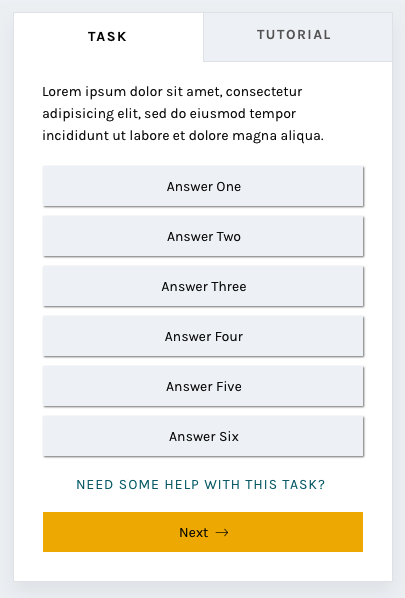
Updated task section
New task section
By enclosing the task and its responses in a box rather than leaving it floating in space, the interface gives a volunteer an obvious place to look for the task across every project. Adjusting the typography elevates the interface and helps it feel more professional.
One of the most frequent comments we heard in the 2017 survey was that the interface had far too much scrolling – either the subject image or the task area was too tall. The subject image height will be addressed at a later date, but this new task area was designed specifically with scrolling in mind.
I used the averages I found in my initial project audit and the average screen height (643 px) based on Google Analytics data from the same time period to design a task area that would comfortably fit on screen without scrolling. It’s important to note that there are always outliers in large-scale sites like Zooniverse. While using averages is the best way to design for most projects, we know we can’t provide the most optimal experience for every use case.
You’ll also notice the secondary “Tutorial” tab to the right of the “Task” label. This is a feature that’s yet to be implemented, and I’ll talk more about it in the next post.
And more to come
The next installments in this series will address the additional updates we have planned, like updated modals and a whole new stats section.
Check back soon!
The world's largest and most popular platform for people-powered research. This research is made possible by volunteers—millions of people around the world who come together to assist professional researchers.