Part three in a multi-part series exploring the visual and UX changes to the Zooniverse classify interface
Coming soon!
Today we’ll be going over a couple of visual changes to familiar elements of the classify interface and new additions we’re excited to premier. These updates haven’t been implemented yet, so nothing is set in stone. Please use this survey to send me feedback about these or any of the other updates to the Zooniverse.

New modals
Many respondents to my 2017 design survey requested that they be able to use the keyboard to make classifications rather than having to click so many buttons. One volunteer actually called the classifier “a carpal-tunnel torturing device”. As a designer, that’s hard to hear – it’s never the goal to actively injure our volunteers.
We actually do support keyboard shortcuts! This survey helped us realize that we need to be better at sharing some of the tools our developers have built. The image above shows a newly designed Keyboard Shortcut information modal. This modal (or “popup”) is a great example of a few of the modals we’re building – you can leave it open and drag it around the interface while you work, so you’ll be able to quickly refer to it whenever you need.
This behavior will be mirrored in a few of the modals that are currently available to you:
- Add to Favorites
- Add to Collection / Create a New Collection
- Subject Metadata
- “Need Help?”
It will also be applied to a few new ones, including…
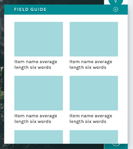
Field Guide
Another major finding from the design survey was that users did not have a clear idea where to go when they needed help with a task (see chart below).
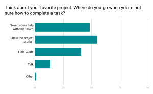
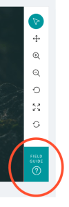
We know research teams often put a lot of effort into their help texts, and we wanted to be sure that work was reaching the largest possible audience. Hence, we moved the Field Guide from a small button on the right-hand side of the screen – a place that can become obscured by the browser’s scrollbar – and created a larger, more prominent button in the updated toolbar:
By placing the Field Guide button in a more prominent position and allowing the modal to stay open during classifications, we hope this tool will be taken advantage of more than it currently is.
The layout was the result of the audit of every live project I conducted in spring 2017:
| Field Guide | |||
| Mode item count | 5 | Mode label word count | 2 |
| Min item count | 2 | Min label word count | 2 |
| Max items count | 45 | Max label word count | 765 |
Using the mode gave me the basis on which to design; however, there’s quite a disparity between min and max amounts. Because of this disparity, we’ll be giving project owners with currently active projects a lot of warning before switching to the new layout, and they’ll have the option to continue to use the current Field Guide design if they’d prefer.
Tutorial
Another major resource Zooniverse offers its research teams and volunteers is the Tutorial. Often used to explain project goals, welcome new volunteers to the project, and point out what to look for in an image, the current tutorial is often a challenge because its absolute positioning on top of the subject image.
No more!
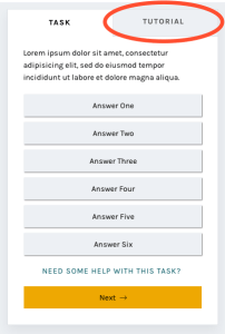
In this iteration of the classify interface, the tutorial opens once as a modal, just as it does now, and then lives in a tab in the task area where it’s much more easily accessible. You’ll be able to switch to the Tutorial tab in order to compare the example images and information with the subject image you’re looking at, rather than opening and closing the tutorial box many times.
A brand-new statistics section
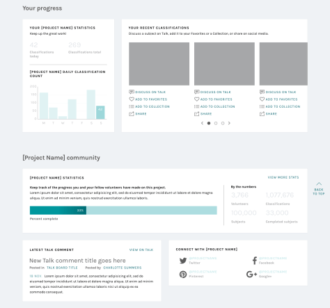
Another major comment from the survey was that volunteers wanted more ways to interact with the Zooniverse. Thus, you’ll be able to scroll down to find a brand-new section! Features we’re adding will include:
- Your previous classifications with Add to Favorites or Add to Collection buttons
- Interesting stats, like the amount of classifications you’ve done and the amount of classifications your community have done
- Links to similar projects you might be interested in
- Links to the project’s blog and social media to help you feel more connected to the research team
- Links to the project’s Talk boards, for a similar purpose
- Possibly: A way to indicate that you’re finished for the day, giving you the option to share your experience on social media or find another project you’re interested in.
The statistics we chose were directly related to the responses from the survey:
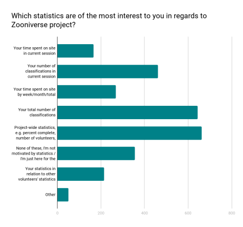
Respondents were able to choose more than one response; when asked to rank them in order of importance, project-wide statistics were chosen hands-down:
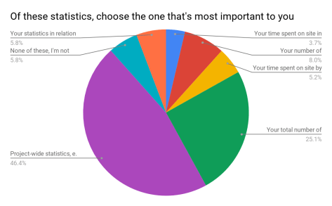
We also heard that volunteers sometimes felt disconnected from research teams and the project’s accomplishments:
“In general there is too less information about the achievement of completed projects. Even simple facts could cause a bit of a success-feeling… how many pictures in this project over all have been classified? How much time did it take? How many hours were invested by all participating citizens? Were there any surprising things for the scientists? Things like that could be reported long before the task of a project is completely fullfilled.”
Research teams often spend hours engaged in dialog with volunteers on Talk, but not everyone who volunteers on Zooniverse is aware or active on Talk. Adding a module on the classify page showing recent Talk posts will bring more awareness to this amazing resource and hopefully encourage more engagement from volunteers.
Templates for different image sizes and dimensions
When the project builder was created, we couldn’t have predicted the variety of disparate topics that would become Zooniverse projects. Originally, the subject viewer was designed for one common image size, roughly 2×3, and other sizes have since been shoehorned in to fit as well as they can.
Now, we’d like to make it easier for subjects with extreme dimensions, multimedia subjects, and multi-image subjects to fit better within the project builder. By specifically designing templates and allowing project owners to choose the one that best fits their subjects, volunteers and project owners alike will have a better experience.
Very wide subjects will see their toolbar moved to the bottom of the image rather than on the right, to give the image as much horizontal space as possible. Tall subjects will be about the same width as they have been, but the task/tutorial box will stay fixed on the screen as the image scrolls, eliminating the need to scroll up and down as often when looking at the bottom of the subject.

Let’s get started!
I’m so excited for the opportunity to share a preview of these changes with you. Zooniverse is a collaborative project, so if there’s anything you’d like us to address as we implement this update, please use this survey to share your thoughts and suggestions. Since we’re rolling these out in pieces, it will be much easier for us to be able to iterate, test, and make changes.
We estimate that the updates will be mostly in place by early 2019, so there’s plenty of time to make sure we’re creating the best possible experience for everyone.
Thank you so much for your patience and understanding as we move forward. In the future, we’ll be as open and transparent as possible about this process.

