Category Archives: Science

Adler Zooniverse Summer Intern Experience: Lola Fash & NASA GLOBE Cloud Gaze

By Lola Fash, Guest Writer and Adler Zooniverse Summer ’22 Teen Intern

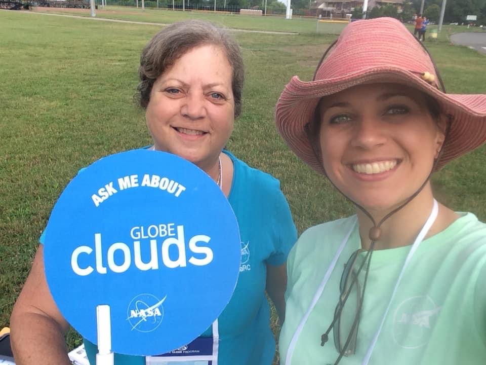
This summer I had the opportunity to be a Zooniverse intern at the Adler Planetarium in Chicago, with two other interns, Tasnova and Dylan.  As a group, we carried out a series of interviews with researchers leading Zooniverse projects. My focus project was the NASA GLOBE Cloud Gaze on Zooniverse. I led the interview with  NASA scientist Marilé Colón Robles, the principal investigator for the project, and Tina Rogerson, the co-investigator and data analyst for the project. 

Marilé Colón Robles (right) and Tina Rogerson (left) outdoors working on GLOBE Clouds. Photo Credit: Tina Rogerson. 

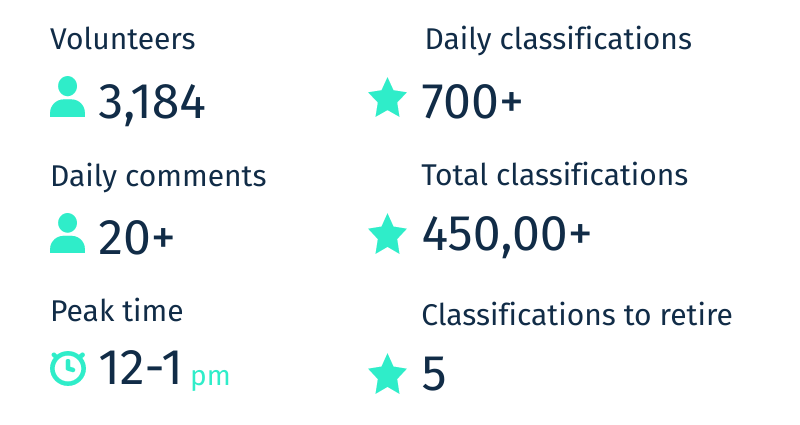
NASA GLOBE Cloud Gaze is a collaboration between the Global Learning and Observations to Benefit the Environment (GLOBE) Program, NASA’s largest citizen science program, and Zooniverse. When NASA began to study clouds to understand how they affect our climate, they launched about 20 satellites to collect data on Earth’s clouds.  Unfortunately, these satellites are limited to only collecting data from above the clouds, which only paints half of the picture for scientists. They needed data from the ground to complete the picture. In 2018, they launched the first ever cloud challenge on GLOBE Clouds, which asked people all over the world to submit observations of clouds and photographs of their sky through the GLOBE Observer app. People responded faster than expected, submitting over 50,000 observations across 99 different countries during the month-long challenge. Because of the high volume,  it would take months for researchers alone to go through each submission. So instead, they sought help, thus birthing the Zooniverse CLOUD GAZE project, where people help them classify these photos.  Zooniverse participants classify the photos by cloud cover (what percent of the sky is covered by clouds), what type of cloud is in the image, and if they see any other conditions like haze, fog, or dust.

Why are clouds so important? 

We see the immediate effects of these clouds in our atmosphere. For example, when you go out on a sunny day and the sun gets blocked by low altitude clouds, you feel cooler right away. But rather than looking at short-term effects, the CLOUD GAZE project is working to understand the long-term role clouds play on our climate. 

Clouds play a significant role in maintaining Earth’s climate. They control Earth’s energy budget, the balance between the energy the Earth receives from the Sun and the energy the Earth loses back into outer space, which determines Earth’s temperature. The effects clouds have varies by type, size, and altitude. 

Credit: NASA GLOBE CLOUD GAZE

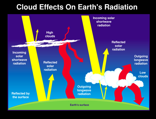
Cirrus, cirrostratus, and cirrocumulus clouds are high altitude clouds that allow incoming radiation to be absorbed by Earth, then trap it there, acting like an insulator and increasing Earth’s temperature. Low altitude clouds, such as stratus and cumulonimbus, keep our planet from absorbing incoming radiation, and allow it to radiate energy back into space.

The classifications made by Zooniverse participants are needed to determine the amount of solar radiation that is reflected or absorbed by clouds before reaching the surface of Earth and how that correlates to climate over time. 

In my interview, I had the honor to meet with NASA Scientists Marilé Colón Robles and Tina Rogerson, learn more about the NASA GLOBE Cloud Gaze effort, and hear their predictions for the future. 

Clip 1: Introductions

This first clip is of Marilé, Tina, and me introducing ourselves to one another. Note: The other participants you’ll see in the recordings are Sean Miller (Zooniverse designer and awesome mentor for us interns) and Dylan and Tasnova (my fellow interns).

Clip 2: What prompted you to start NASA GLOBE Cloud Gaze on Zooniverse? 

Quote from Tina from this Clip 2: “We have 1.8 million photographs of the sky. We want to know what’s in those photographs.”

Clip 3: What have your GLOBE participants been telling you about what they’re seeing in their local environments about the impacts of climate change?

What are your hopes and goals for this project? 

In the interview, I asked them about their hopes and broader goals for the project. They talked about how in order to really understand climate change, we need to gather the best data possible. The majority of the data we have on clouds are from the 20th century. One of the project goals was to update our databases on clouds in order to conduct proper research on climate change. Tina Rogerson, Cloud Gaze’s data analyst, gathers this information and compiles it into easily accessible files. The files include data from a range of different sources: satellites, Globe observations, and Zooniverse classifications (see https://observer.globe.gov/get-data). They give people a chance to analyze clouds at different points and connect the dots to analyze the whole.  

Scientist Marilé Colón Robles explained that one of the goals of the project is to make a climatology of cloud types based on the data they have collected. This would help us have a record on how the clouds have changed in a given location in relation to the climate of that area. We would have information on the entire world, every single continent, yes, including Antarctica.

Why did I pick this project to focus on? 

I chose this project because I wanted to challenge myself. I have always shied away from topics and conversations about climate change and global warming. I felt I could never fully comprehend it so I should instead avoid it by all means possible. My fellow interns and I had three projects to choose from: Transcribe Color Convention, Active Asteroids, and NASA GLOBE CLOUD GAZE. If it were any other day, I would have chosen one of the first two projects to be my focus but I wanted to change, to try something new. The only way to grow is to step out of your comfort zone and I am so glad I did. 

People make the mistake of believing that climate change can’t be helped and that after our Earth becomes inhabitable we can just pull a Lost In Space and find a different planet to live on. I had the chance to speak with Dr. Michelle B. Larson, CEO of Adler Planetarium, and we talked about how there isn’t another planet for us to go to if we mess this one up. Even if there was, it would take years and a lot of resources to ready the planet for ourselves. Those are resources and years that we could be spending on fixing our home. 

The CLOUD GAZE focused on one of the most important and understudied factors in Earth’s climate – clouds. People all over the world are helping in their own way to help save the planet. Some make sure to always recycle their garbage. Some take public transportation more often, and switch to electronic vehicles to cut down on their carbon footprint. You and I can help by taking pictures of our sky, submitting it in the GLOBE Observer app, and by going to the Zooniverse Cloud GAZE project, classifying as little as 10 images of clouds per day to multiply the data on clouds, which in turn helps further our research and our understanding of climate change.  

New Results for Milky Way Project Yellowballs!

What are “Yellowballs?” Shortly after the Milky Way Project (MWP) was launched in December 2010, volunteers began using the discussion board to inquire about small, roundish “yellow” features they identified in infrared images acquired by the Spitzer Space Telescope. These images use a blue-green-red color scheme to represent light at three infrared wavelengths that are invisible to our eyes. The (unanticipated) distinctive appearance of these objects comes from their similar brightness and extent at two of these wavelengths: 8 microns, displayed in green, and 24 microns, displayed in red. The yellow color is produced where green and red overlap in these digital images. Our early research to answer the volunteers’ question, “What are these `yellow balls’?” suggested that they are produced by young stars as they heat the surrounding gas and dust from which they were born. The figure below shows the appearance of a typical yellowball (or YB) in a MWP image.  In 2016, the MWP was relaunched with a new interface that included a tool that let users identify and measure the sizes of YBs. Since YBs were first discovered, over 20,000 volunteers contributed to their identification, and by 2017, volunteers catalogued more than 6,000 YBs across roughly 300 square degrees of the Milky Way. 

New star-forming regions. We’ve conducted a pilot study of 516 of these YBs that lie in a 20-square-degree region of the Milky Way, which we chose for its overlap with other large surveys and catalogs. Our pilot study has shown that the majority of YBs are associated with protoclusters – clusters of very young stars that are about a light-year in extent (less than the average distance between mature stars.) Stars in protoclusters are still in the process of growing by gravitationally accumulating gas from their birth environments. YBs that represent new detections of star-forming regions in a 6-square-degree subset of our pilot region are circled in the two-color (8 microns: green, 24 microns: red) image shown below. YBs present a “snapshot” of developing protoclusters across a wide range of stellar masses and brightness. Our pilot study results indicate a majority of YBs are associated with protoclusters that will form stars less than ten times the mass of the Sun.

YBs show unique “color” trends. The ratio of an object’s brightness at different wavelengths (or what astronomers call an object’s “color”) can tell us a lot about the object’s physical properties. We developed a semi-automated tool that enabled us to conduct photometry (measure the brightness) of YBs at different wavelengths. One interesting feature of the new YBs is that their infrared colors tend to be different from the infrared colors of YBs that have counterparts in catalogs of massive star formation (including stars more than ten times as massive as the Sun). If this preliminary result holds up for the full YB catalog, it could give us direct insight into differences between environments that do and don’t produce massive stars. We would like to understand these differences because massive stars eventually explode as supernovae that seed their environments with heavy elements. There’s a lot of evidence that our Solar System formed in the company of massive stars.

The figure below shows a “color-color plot” taken from our forthcoming publication. This figure plots the ratios of total brightness at different wavelengths (24 to 8 microns vs. 70 to 24 microns) using a logarithmic scale. Astronomers use these color-color plots to explore how stars’ colors separate based on their physical properties. This color-color plot shows that some of our YBs are associated with massive stars; these YBs are indicated in red. However, a large population of our YBs, indicated in black, are not associated with any previously studied object. These objects are generally in the lower right part of our color-color plot, indicating that they are less massive and cooler then the objects in the upper left. This implies there is a large number of previously unstudied star-forming regions that have been discovered by MWP volunteers. Expanding our pilot region to the full catalog of more than 6,000 YBs will allow us to better determine the physical properties of these new star-forming regions.

Volunteers did a great job measuring YB sizes!  MWP volunteers used a circular tool to measure the sizes of YBs. To assess how closely user measurements reflect the actual extent of the infrared emission from the YBs, we compared the user measurements to a 2D model that enabled us to quantify the sizes of YBs. The figure below compares the sizes measured by users to the results of the model for YBs that best fit the model. It indicates a very good correlation between these two measurements. The vertical green lines show the deviations in individual measurements from the average. This illustrates the “power of the crowd” – on average, volunteers did a great job measuring YB sizes!

Stay tuned…  Our next step is to extend our analysis to the entire YB catalog, which contains more than 6,000 YBs spanning the Milky Way. To do this, we are in the process of adapting our photometry tool to make it more user-friendly and allow astronomy students and possibly even citizen scientists to help us rapidly complete photometry on the entire dataset.

Our pilot study was recently accepted for publication in the Astrophysical Journal. Our early results on YBs were also presented in the Astrophysical Journal, and in an article in Frontiers for Young Minds, a journal for children and teens.

SuperWASP Variable Stars – Update

The following is an update from the SuperWASP Vairable Stars research team. Enjoy!

Welcome to the Spring 2020 update! In this blog, we will be sharing some updates and discoveries from the SuperWASP Variable Stars project.

What are we aiming to do?

We are trying to discover the weirdest variable stars!

Stars are the building blocks of the Universe, and finding out more about them is a cornerstone of astrophysics. Variable stars (stars which change in brightness) are incredibly important to learning more about the Universe, because their periodic changes allow us to probe the underlying physics of the stars themselves.

We have asked citizen scientists to classify variable stars based on their photometric light curves (the amount of light over time), which helps us to determine what type of variable star we’re observing. Classifying these stars serves two purposes: firstly to create large catalogues of stars of a similar type which allows us to determine characteristics of the population; and secondly, to identify rare objects displaying unusual behaviour, which can offer unique insights into stellar structure and evolution.

We have 1.6 million variable stars detected by the SuperWASP telescope to classify, and we need your help! By getting involved, we can build up a better idea of what types of stars are in the night sky.

What have we discovered so far?

We’ve done some initial analysis on the first 300,000 classifications to get a breakdown of how many of each type of star is in our dataset.

So far it looks like there’s a lot of junk light curves in the dataset, which we expected. The programme written to detect periods in variable stars often picks up exactly a day or a lunar month, which it mistakes for a real period. Importantly though, you’ve classified a huge number of real and exciting light curves!

We’re especially excited to do some digging into what the “unknown” light curves are… are there new discoveries hidden in there? Once we’ve completed the next batch of classifications, we’ll do some more to see whether the breakdown of types of stars changes.

An exciting discovery…

In late 2018, while building this Zooniverse project, we came across an unusual star. This Northern hemisphere object, TYC-3251-903-1, is a relatively bright object (V=11.3) which has previously not been identified as a binary system. Although the light curve is characteristic of an eclipsing contact binary star, the period is ~42 days, notably longer than the characteristic contact binary period of less than 1 day.

Spurred on by this discovery, we identified a further 16 candidate near-contact red giant eclipsing binaries through searches of archival data. We were excited to find that citizen scientists had also discovered 10 more candidates through this project!

Figure 1: Artist’s impression of a contact binary star [Mark A. Garlick] Over the past 18 months, we’ve carried out an observing campaign of these 27 candidate binaries using telescopes from across the world. We have taken multi-colour photometry using The Open University’s own PIRATE telescope, and the Las Cumbres Observatory robotic telescopes, and spectroscopy of Northern candidates with the Liverpool Telescope, and Southern candidates using SALT. We’ve also spent two weeks in South Africa on the 74-inch telescope to take further spectroscopy.

Of the 10 candidate binaries discovered by citizen scientists, we were happy to be able to take spectroscopic observations for 8 whilst in South Africa, and we have confirmed that at least 2 are, in fact, binaries! Thank you citizen scientists!

Why is this discovery important?

Figure 2: V838 Mon and its light echo [ESA/NASA]

The majority of contact or near-contact binaries consist of small (K/M dwarf) stars in close orbits with periods of less than 1 day. But for stars in a binary in a contact binary to have such long periods requires both the stars to be giant. This is a previously unknown configuration…

Interestingly, a newly identified type of stellar explosion, known as a red nova, is thought to be caused by the merger of a giant binary system, just like the ones we’ve discovered.

Red novae are characterised by a red colour, a slow expansion rate, and a lower luminosity than supernovae. Very little is known about red novae, and only one has been observed pre-nova, V1309 Sco, and that was only discovered through archival data. A famous example of a possible red nova is the 2002 outburst in V838 Mon. Astronomers believe that this was likely to have been a red nova caused by a binary star merger, forming the largest known star for a short period of time after the explosion.

So, by studying these near-contact red giant eclipsing binaries, we have an unrivalled opportunity to identify and understand binary star mergers before the merger event itself, and advance our understanding of red novae.

What changes have we made?

Since the SuperWASP Variable Stars Zooniverse project started, we’ve made a few changes to make the project more enjoyable. We’ve reduced the number of classifications needed to retire a target, and we’ve also reduced the number of classifications of “junk” light curves needed to retire it. This means you should see more interesting, real, light curves.

We’ve also started a Twitter account, where we’ll be sharing updates about the project, the weird and wacky light curves you find, and getting involved in citizen science and astronomy communities. You can follow us here: www.twitter.com/SuperWASP_stars

What’s next?

We still have thousands of stars to classify, so we need your help!

Once we have more classifications, we will be beginning to turn the results into a publicly available, searchable website, a bit like the ASAS-SN Catalogue of Variable Stars (https://asas-sn.osu.edu/variables). Work on this is likely to begin towards the end of 2020, but we’ll keep you updated.

We’re also working on a paper on the near-contact red giant binary stars, which will include some of the discoveries by citizen scientists. Expect that towards the end of 2020, too.

Otherwise, watch this space for more discoveries and updates!

We would like to thank the thousands of citizen scientists who have put time into this Zooniverse project. If you ever have any questions or suggestions, please get in touch.

Heidi & the SuperWASP Variable Stars team.

28 New Planet Candidates Discovered on Exoplanet Explorers

The team behind the Exoplanet Explorers project has just published a Research Note of the American Astronomical Society announcing the discovery of 28 new exoplanet candidates uncovered by Zooniverse volunteers taking part in the project.

Nine of these candidates are most likely rocky planets, with the rest being gaseous. The sizes of these potential exoplanets range from two thirds the size of Earth to twice the size of Neptune!

This figure shows the transit dips for all 28 exoplanet candidates. Zink et al., 2019

You can find out more about these exoplanet candidates in the actual research note at https://iopscience.iop.org/article/10.3847/2515-5172/ab0a02, and in this blog post by the Exoplanet Explorers research team http://www.jonzink.com/blogEE.html.

Finally, both the Exoplanet Explorers and Zooniverse teams would like to extend their deep gratitude to all the volunteers who took part in the project and made these amazing discoveries possible.

Exoplanet Explorers Discoveries – A Small Planet in the Habitable Zone

This post is by Adina Feinstein. Adina is a graduate student at the University of Chicago. Her work focuses on detecting and characterizing exoplanets. Adina became involved with the Exoplanet Explorers project through her mentor, Joshua Schlieder, at NASA Goddard through their summer research program.

Let me tell you about the newly discovered system – K2-288 – uncovered by volunteers on Exoplanet Explorers.

K2-288 has two low-mass M dwarf stars: a primary (K2-288A) which is roughly half the size of the Sun and a secondary (K2-288B) which is roughly one-third the size of the Sun. The capital lettering denotes a star in the planet-naming world. Already this system is shaping up to be pretty cool. The one planet in this system, K2-288Bb, hosts the smaller, secondary star. K2-288Bb orbits on a 31.3 day period, which isn’t very long compared to Earth, but this period places the planet in the habitable zone of its host star. The habitable zone is defined as the region where liquid water could exist on the planet’s surface. K2-288Bb has an equilibrium temperature -47°C, colder than the equilibrium temperature of Earth. It is approximately 1.9 times the radius of Earth, which places it in a region of planet radius space where we believe planets transition to volatile-rich sub-Neptunes, rather than being potentially habitable super-Earth. Planets of this size are rare, with only about a handful known to-date.

Artist’s rendering of the K2-288 system.

The story of the discovery of this system is an interesting one. When two of the reaction wheels on the Kepler spacecraft failed, the mission team re-oriented the spacecraft to allow observations to continue to happen. The re-orientation caused slight variations in the shape of the telescope and temperature of the instruments on board. As a consequence, the beginning of each observing campaign experienced extreme systematic errors and initially, when searching for exoplanet transits, we “threw out” or ignored the first days of observing. Then, when we were searching the data by-eye for new planet candidates, we came across this system and only saw 2 transits. In order for follow-up observations to proceed, we need a minimum of 3 transits, so we put this system on the back-burner. The light curve (the amount of light we see from a star over time) with the transits is shown below.

Later, we learned how to model and correct for the systematic errors at the beginning of each observing run and re-processed all of the data. Instead of searching it all by-eye again, as we had done initially, we outsourced it to Exoplanet Explorers and citizen scientists, who identified this system with three transit signals. The volunteers started a discussion thread about this planet because given initial stellar parameters, this planet would be around the same size and temperature as Earth. This caught our attention. As it turns out, there was an additional transit at the beginning of the observing run that we missed when we threw out this data! Makennah Bristow, a fellow intern of mine at NASA Goddard, identified the system again independently. With now three transits and a relatively long orbital period of 31.3 days, we pushed to begin the observational follow-up needed to confirm this planet was real.

First, we obtained spectra, or a unique chemical fingerprint of the star. This allowed us to place better constraints on the parameters of the star, such as mass, radius, temperature, and brightness. While obtaining spectra from the Keck Observatory, we noticed a potential companion star. We conducted adaptive optics observations to see if the companion was bound to the star or a background source. Most stars in the Milky Way are born in pairs, so it was not too surprising that this system was no different. After identifying a fainter companion, we made extra sure the signal was due to a real planet and not the companion; we convinced ourselves this was the case.

Finally, we had to determine which star the planet was orbiting. We obtained an additional transit using the Spitzer spacecraft. Using both the Kepler and Spitzer transits, we derived planet parameters for both when the planet orbits the primary and the secondary. The planet radius derived from both light curves was most consistent when the host star was the secondary. Additionally, we derived the stellar density from the observed planet transit and this better correlated to the smaller secondary star. To round it all off, we calculated the probability of the signal being a false positive (i.e. not a planet signal) when the planet orbits the secondary and it resulted in a false positive probability of roughly 10e-9, which indicates it most likely is a real signal.

The role of citizen scientists in this discovery was critical, which is why some of the key Zooniverse volunteers are included as co-authors on this publication. K2-288 was observed in K2 Campaign 4, which ran from April to September back in 2015. We scientists initially missed this system and it’s likely that even though we learned how to better model and remove spacecraft systematics, it would have taken years for us to go back into older data and find this system. Citizen scientists have shown us that even though there is so much new data coming out, especially with the launch of the Transiting Exoplanet Survey Satellite, the older data is still a treasure trove of new discoveries. Thank you to all of the Exoplanet volunteers who made this discovery possible and continue your great work!

The paper written by the team is available here. It should be open to all very shortly.

Exoplanet Explorers Discoveries – A Sixth Planet in the K2-138 System

This is the first of two guest posts from the Exoplanet Explorers research team announcing two new planets discovered by their Zooniverse volunteers. This post was written by Jessie Christiansen.

Hello citizen scientists! We are here at the 233rd meeting of the American Astronomical Society, the biggest astronomy meeting in the US of the year (around 3000 astronomers, depending on how many attendees are ultimately affected by the government shutdown). I’m excited to share that on Monday morning, we are making a couple of new exoplanet announcements as a result of your work here on Zooniverse, using the Exoplanet Explorers project!

Last year at the same meeting, we announced the discovery of K2-138. This was a system of five small planets around a K star (an orange dwarf star). The planets all have very short orbital periods (from 2.5 to 12.8 days! Recall that in our solar system the shortest period planet is Mercury, with a period of ~88 days) that form an unbroken chain of near-resonances. These resonances offer tantalizing clues as to how this system formed, a question we are still trying to answer for exoplanet systems in general. The resonances also beg the question – how far could the chain continue? This was the longest unbroken chain of near first-order resonances which had been found (by anyone, let alone citizen scientists!).

At the time, we had hints of a sixth planet in the system. In the original data analysed by citizen scientists, there were two anomalous events that could not be accounted for by the five known planets – events that must have been caused by at least one, if not more, additional planets. If they were both due to a single additional planet, then we could predict when the next event caused by that planet would happen – and we did. We were awarded time on the NASA Spitzer Space Telescope at the predicted time, and BOOM. There it was. A third event, shown below, confirming that the two previous events were indeed caused by the same planet, a planet for which we now knew the size and period.

So, without further ado, I’d like to introduce K2-138 g! It is a planet just a little bit smaller than Neptune (which means it is slightly larger than the other five planets in the system, which are all between the size of Earth and Neptune). It has a period of about 42 days, which means it’s pretty warm (400 degrees K) and therefore not habitable. Also, very interestingly, it is not on the resonant chain – it’s significantly further out than the next planet in the chain would be. In fact, it’s far enough out that there is a noticeable gap – a gap that is big enough to hide more planets on the chain. If these planets exist, they don’t seem to be transiting, but that doesn’t mean they couldn’t be detected in other ways, including by measuring the effect of their presence on the other planets that do transit. The planet is being published in a forthcoming paper that will be led by Dr Kevin Hardegree-Ullman, a postdoctoral research fellow at Caltech/IPAC.

In the meantime, astronomers are still studying the previously identified planets, in particular to try to measure their masses. Having tightly packed systems that are near resonance like K2-138 provides a fantastic test-bed for examining all sorts of planet formation and migration theories, so we are excited to see what will come from this amazing system discovered by citizen scientists on Zooniverse in years to come!

We are also announcing a second new exoplanet system discovered by Exoplanet Explorers, but I will let Adina Feinstein, the lead author of that paper, introduce you to that exciting discovery.

Experiments on the Zooniverse

Occasionally we run studies in collaboration with external  researchers in order to better understand our community and improve our platform. These can involve methods such as A/B splits, where we show a slightly different version of the site to one group of volunteers and measure how it affects their participation, e.g. does it influence how many classifications they make or their likelihood to return to the project for subsequent sessions?

One example of such a study was the messaging experiment we ran on Galaxy Zoo.  We worked with researchers from Ben Gurion University and Microsoft research to test if the specific content and timing of messages presented in the classification interface could help alleviate the issue of volunteers disengaging from the project. You can read more about that experiment and its results in this Galaxy Zoo blog post https://blog.galaxyzoo.org/2018/07/12/galaxy-zoo-messaging-experiment-results/.

As the Zooniverse has different teams based at different institutions in the UK and the USA, the procedures for ethics approval differ depending on who is leading the study. After recent discussions with staff at the University of Oxford ethics board, to check our procedure was up to date, our Oxford-based team will be changing the way in which we gain approval for, and report the completion of these types of studies. All future study designs which feature Oxford staff taking part in the analysis will be submitted to CUREC, something we’ve been doing for the last few years. From now on, once the data gathering stage of the study has been run we will provide all volunteers involved with a debrief message.

The debrief will explain to our volunteers that they have been involved in a study, along with providing information about the exact set-up of the study and what the research goals were. The most significant change is that, before the data analysis is conducted, we will contact all volunteers involved in the study allow a period of time for them to state that they would like to withdraw their consent to the use of their data. We will then remove all data associated with any volunteer who would not like to be involved before the data is analysed and the findings are presented. The debrief will also contain contact details for the researchers in the event of any concerns and complaints. You can see an example of such a debrief in our original post about the Galaxy Zoo messaging experiment here https://blog.galaxyzoo.org/2015/08/10/messaging-test/.

As always, our primary focus is the research being enabled by our volunteer community on our individual projects. We run experiments like these in order to better understand how to create a more efficient and productive platform that benefits both our volunteers and the researchers we support. All clicks that are made by our volunteers are used in the science outcomes from our projects no matter whether they are part of an A/B split experiment or not. We still strive never to waste any volunteer time or effort.

We thank you for all that you do, and for helping us learn how to build a better Zooniverse.

Why you should use Docker in your research

Last month I gave a talk at the Wetton Workshop in Oxford. Unlike the other talks that week, mine wasn’t about astronomy. I was talking about Docker – a useful tool which has become popular among people who run web services. We use it for practically everything here, and it’s pretty clear that researchers would find it useful if only more of them used it. That’s especially true in fields like astronomy, where a lot of people write their own code to process and analyse their data. If after reading this post you think you’d like to give Docker a try and you’d like some help getting started, just get in touch and I’ll be happy to help.

I’m going to give a brief outline of what Docker is and why it’s useful, but first let’s set the scene. You’re trying to run a script in Python that needs a particular version of NumPy. You install that version but it doesn’t seem to work. Or you already have a different version installed for another project and can’t change it. Or the version it needs is really old and isn’t available to download anymore. You spend hours installing different combinations of packages and eventually you get it working, but you’re not sure exactly what fixed it and you couldn’t repeat the same steps in the future if you wanted to exactly reproduce the environment you’re now working in. 

Many projects require an interconnected web of dependencies, so there are a lot of things that can go wrong when you’re trying to get everything set up. There are a few tools that can help with some of these problems. For Python you can use virtual environments or Anaconda. Some languages install dependencies in the project directory to avoid conflicts, which can cause its own problems. None of that helps when the right versions of packages are simply not available any more, though, and none of those options makes it easy to just download and run your code without a lot of tedious setup. Especially if the person downloading it isn’t already familiar with Python, for example.

If people who download your code today can struggle to get it running, how will it be years from now when the version of NumPy you used isn’t around anymore and the current version is incompatible? That’s if there even is a current version after so many years. Maybe people won’t even be using Python then.

Luckily there is now a solution to all of this, and it’s called software containers. Software containers are a way of packaging applications into their own self-contained environment. Everything you need to run the application is bundled up with the application itself, and it is isolated from the rest of the operating system when it runs. You don’t need to install this and that, upgrade some other thing, check the phase of the moon, and hold your breath to get someone’s code running. You just run one command and whether the application was built with Python, Ruby, Java, or some other thing you’ve never heard of, it will run as expected. No setup required!

Docker is the most well-known way of running containers on your computer. There are other options, such as Kubernetes, but I’m only going to talk about Docker here.

Using containers could seriously improve the reproducibility of your research. If you bundle up your code and data in a Docker image, and publish that image alongside your papers, anyone in the world will be able to re-run your code and get the same results with almost no effort. That includes yourself a few years from now, when you don’t remember how your code works and half of its dependencies aren’t available to install any more.

There is a growing movement for researchers to publish not just their results, but also their raw data and the code they used to process it. Containers are the perfect mechanism for publishing both of those together. A search of arXiv shows there have only been 40 mentions of Docker in papers across all fields in the past year. For comparison there have been 474 papers which mention Python, many of which (possibly most, but I haven’t counted) are presenting scripts and modules created by the authors. That’s without even mentioning other programming languages. This is a missed opportunity, given how much easier it would be to run all this code if the authors provided Docker images. (Some of those authors might provide Docker images without mentioning it in the paper, but that number will be small.)

Docker itself is open source, and all the core file formats and designs are standardised by the Open Container Initiative. Besides Docker, other OCI members include tech giants such as Amazon, Facebook, Microsoft, Google, and lots of others. The technology is designed to be future proof and it isn’t going away, and you won’t be locked into any one vendor’s products by using it. If you package your software in a Docker container you can be reasonably certain it will still run years, or decades, from now. You can install Docker for free by downloading the community edition.

So how might Docker fit into your workday? Your development cycle will probably look something like this: First you’ll probably outline an initial version of the code, and then write a Dockerfile containing the instructions for installing the dependencies and running the code. Then it’s basically the same as what you’d normally do. As you’re working on the code, you’d iterate by building an image and then running that image as a container to test it. (With more advanced usage you can often avoid building a new image every time you run it, by mounting the working directory into the container at runtime.) Once the code is ready you can make it available by publishing the Docker image.

There are three approaches to publishing the image: push the image to the Docker Hub or another Docker registry, publish the Dockerfile along with your code, or export the image as a tar file and upload that somewhere. Obviously these aren’t mutually exclusive. You should do at least the first two, and it’s probably also wise to publish the tar file wherever you’d normally publish your data.


The Docker Hub is a free registry for images, so it’s a good place to upload your images so that other Docker users can find them. It’s also where you’ll find a wide selection of ready-built Docker images, both created by the Docker project themselves and created by other users. We at the Zooniverse publish all of the Docker images we use for our own work on the Docker Hub, and it’s an important part of how we manage our web services infrastructure. There are images for many major programming languages and operating system environments.

There are also a few packages which will allow you to run containers in high performance computing environments. Two popular ones are Singularity and Shifter. These will allow you to develop locally using Docker, and then convert your Docker image to run on your HPC cluster. That means the environment it runs in on the cluster will be identical to your development environment, so you won’t run into any surprises when it’s time to run it. Talk to your institution’s IT/HPC people to find out what options are available to you.

Hopefully I’ve made the case for using Docker (or containers in general) for your research. Check out the Docker getting started guide to find out more, and as I said at the beginning, if you’re thinking of using Docker in your research and you want a hand getting started, feel free to get in touch with me and I’ll be happy to help you. 

The Universe Inside Our Cells

Below is the first in a series of guest blog posts from researchers working on one of our recently launched biomedical projects, Etch A Cell.

Read on to let Dr Martin Jones tell you about the work they’re doing to further understanding of the universe inside our cells!

– Helen


Having trained as a physicist, with many friends working in astronomy, I’ve been aware of Galaxy Zoo and the Zooniverse from the very early days. My early research career was in quantum mechanics, unfortunately not an area where people’s intuitions are much use! However, since I found myself working in biology labs, now at the Francis Crick Institute in London, I have been working in various aspects of microscopy – a much more visual enterprise and one where human analysis is still the gold standard. This is particularly true in electron microscopy, where the busy nature of the images means that many regions inside a cell look very similar. In order to make sense of the images, a person is able to assimilate a whole range of extra context and previous knowledge in a way that computers, for the most part, are simply unable to do. This makes it a slow and labour-intensive process. As if this wasn’t already a hard enough problem, in recent years it has been compounded by new technologies that mean the microscopes now capture images around 100 times faster than before.

Picture1
Focused ion beam scanning electron microscope


Ten years ago it was more or less possible to manually analyse the images at the same rate as they were acquired, keeping the in-tray and out-tray nicely balanced. Now, however, that’s not the case. To illustrate that, here’s an example of a slice through a group of cancer cells, known as HeLa cells:

Picture2

We capture an image like this and then remove a very thin layer – sometimes as thin as 5 nanometres (one nanometre is a billionth of a metre) – and then repeat… a lot! Building up enormous stacks of these images can help us understand the 3D nature of the cells and the structures inside them. For a sense of scale, this whole image is about the width of a human hair, around 80 millionths of a metre.

Zooming in to one of the cells, you can see many different structures, all of which are of interest to study in biomedical research. For this project, however, we’re just focusing on the nucleus for now. This is the large mostly empty region in the middle, where the DNA – the instruction set for building the whole body – is contained.

Picture3

By manually drawing lines around the nucleus on each slice, we can build up a 3D model that allows us to make comparisons between cells, for example understanding whether a treatment for a disease is able to stop its progression by disrupting the cells’ ability to pass on its genetic information.

Nucleus3D-1.gif

Animated gif of 3D model of a nucleus

However, images are now being generated so rapidly that the in-tray is filling too quickly for the standard “single expert” method – one sample can produce up to a terabyte of data, made up of more than a thousand 64 megapixel images captured overnight. We need new tricks!


Why citizen science?

With all of the advances in software that are becoming available you might think that automating image analysis of this kind would be quite straightforward for a computer. After all, people can do it relatively easily. Even pigeons can be trained in certain image analysis tasks! (http://journals.plos.org/plosone/article?id=10.1371/journal.pone.0141357). However, there is a long history of underestimating just how hard it is to automate image analysis with a computer. Back in the very early days of artificial intelligence in 1966 at MIT, Marvin Minsky (who also invented the confocal microscope) and his colleague Seymour Papert set the “summer vision project” which they saw as a simple problem to keep their undergraduate students busy over the holidays. Many decades later we’ve discovered it’s not that easy!

Picture4

(from https://www.xkcd.com/1425/)

Our project, Etch a Cell is designed to allow citizen scientists to draw segmentations directly onto our images in the Zooniverse web interface. The first task we have set is to mark the nuclear envelope that separates the nucleus from the rest of the cell – a vital structure where defects can cause serious problems. These segmentations are extremely useful in their own right for helping us understand the structures, but citizen science offers something beyond the already lofty goal of matching the output of an expert. By allowing several people to annotate each image, we can see how the lines vary from user to user. This variability gives insight into the certainty that a given pixel or region belongs to a particular object, information that simply isn’t available from a single line drawn by one person. Difference between experts is not unheard of unfortunately!

The images below show preliminary results with the expert analysis on the left and a combination of 5 citizen scientists’ segmentations on the right.

Screen Shot 2017-06-21 at 15.29.00
Example of expert vs. citizen scientist annotation

In fact, we can go even further to maximise the value of our citizen scientists’ work. The field of machine learning, in particular deep learning, has burst onto the scene in several sectors in recent years, revolutionising many computational tasks. This new generation of image analysis techniques is much more closely aligned with how animal vision works. The catch, however, is that the “learning” part of machine learning often requires enormous amounts of time and resources (remember you’ve had a lifetime to train your brain!). To train such a system, you need a huge supply of so-called “ground truth” data, i.e. something that an expert has pre-analysed and can provide the correct answer against which the computer’s attempts are compared. Picture it as the kind of supervised learning that you did at school: perhaps working through several old exam papers in preparation for your finals. If the computer is wrong, you tweak the setup a bit and try again. By presenting thousands or even millions of images and ensuring your computer makes the same decision as the expert, you can become increasingly confident that it will make the correct decision when it sees a new piece of data. Using the power of citizen science will allow us to collect the huge amounts of data that we need to train these deep learning systems, something that would be impossible by virtually any other means.

We are now busily capturing images that we plan to upload to Etch a cell to allow us to analyse data from a range of experiments. Differences in cell type, sub-cellular organelle, microscope, sample preparation and other factors mean the images can look different across experiments, so analysing cells from a range of different conditions will allow us to build an atlas of information about sub-cellular structure. The results from Etch a cell will mean that whenever new data arrives, we can quickly extract information that will help us work towards treatments and cures for many different diseases.

Studying the Impact of the Zooniverse

Below is a guest post from a researcher who has been studying the Zooniverse and who just published a paper called ‘Crowdsourced Science: Sociotechnical epistemology in the e-research paradigm’. That being a bit of a mouthful, I asked him to introduce himself and explain – Chris.

My name is David Watson and I’m a data scientist at Queen Mary University of London’s Centre for Translational Bioinformatics. As an MSc student at the Oxford Internet Institute back in 2015, I wrote my thesis on crowdsourcing in the natural sciences. I got in touch with several members of the Zooniverse team, who were kind enough to answer all my questions (I had quite a lot!) and even provide me with an invaluable dataset of aggregated transaction logs from 2014. Combining this information with publication data from a variety of sources, I examined the impact of crowdsourcing on knowledge production across the sciences.

Last week, the philosophy journal Synthese published a (significantly) revised version of my thesis, co-authored by my advisor Prof. Luciano Floridi. We found that Zooniverse projects not only processed far more observations than comparable studies conducted via more traditional methods—about an order of magnitude more data per study on average—but that the resultant papers vastly outperformed others by researchers using conventional means. Employing the formal tools of Bayesian confirmation theory along with statistical evidence from and about Zooniverse, we concluded that crowdsourced science is more reliable, scalable, and connective than alternative methods when certain common criteria are met.

In a sense, this shouldn’t really be news. We’ve known for over 200 years that groups are usually better than individuals at making accurate judgments (thanks, Marie Jean Antoine Nicolas de Caritat, aka Marquis de Condorcet!) The wisdom of crowds has been responsible for major breakthroughs in software development, event forecasting, and knowledge aggregation. Modern science has become increasingly dominated by large scale projects that pool the labour and expertise of vast numbers of researchers.

We were surprised by several things in our research, however. First, the significance of the disparity between the performance of publications by Zooniverse and those by other labs was greater than expected. This plot represents the distribution of citation percentiles by year and data source for articles by both groups. Statistical tests confirm what your eyes already suspect—it ain’t even close.

Influence of Zooniverse Articles

We were also impressed by the networks that appear in Zooniverse projects, which allow users to confer with one another and direct expert attention toward particularly anomalous observations. In several instances this design has resulted in patterns of discovery, in which users flag rare data that go on to become the topic of new projects. This structural innovation indicates a difference not just of degree but of kind between so-called “big science” and crowdsourced e-research.

If you’re curious to learn more about our study of Zooniverse and the site’s implications for sociotechnical epistemology, check out our complete article.