
Part two in a multi-part series exploring the visual and UX changes to the Zooniverse classify interface
The breakdown
Today and in the next post, we’ll take a look at the reasoning behind specific changes to the classifier that we’ve already started to roll out over the past few months. We’ve had good discussions on Talk about many of the updates, but I wanted to reiterate those conversations here so there’s just one source of information to refer back to in the future.
In case you missed it, the first blog post in this series previews the complete new classify layout.
As a reminder, if you have feedback about these changes or anything else on the site you’d like to see addressed, please use this survey link.
Navigation bar

We started with a rethinking of each project’s navigation bar. The new design features cleaner typography, a more prominent project title, and visual distinction from the sitewide navigation. It also includes the project’s home page background image, giving the project visual distinction while keeping the classify interface itself clean and legible. It’s also responsive: on smaller screen heights, the height of the navigation bar adjusts accordingly.
The most important goal we solved in making this change was to separate the project navigation from the site navigation. During my initial site research and in talking to colleagues and volunteers, many found it difficult to distinguish between the two navigations. Adding a background, a distinct font style, and moving the options to the right side of the page accomplishes this goal.
Neutral backgrounds
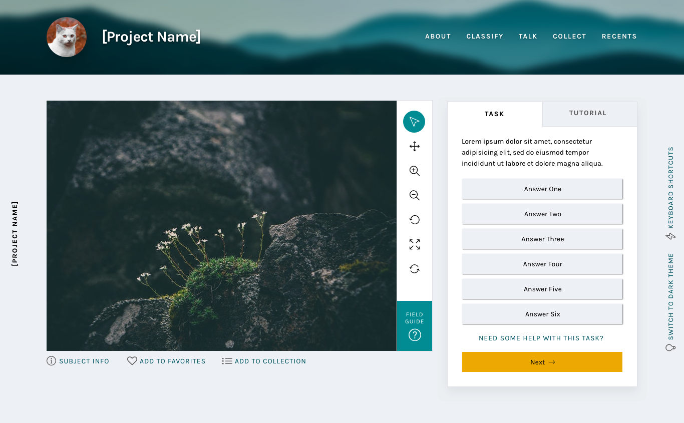
In conjunction with adding the background image to the navigation bar, the background image was removed from the main classify interface. It was replaced with a cool light grey, followed quickly by the dark grey of the Dark Theme.
Legibility is one of the main goals of any web designer, and it was the focus of this update. By moving to clean greys, all of the focus is now on the subject and task. There are some really striking subject images on Zooniverse, from images of the surface of Mars to zebras in their natural habitat. We want to make sure these images are front and center rather than getting lost within the background image.
The Dark Theme was a suggestion from a Zooniverse researcher – they pointed out that some subject images are similar in tone to the light grey, so a darker theme was added to make sure contrast would be enough to make the image “pop”. We love suggestions like this! While the team strives to be familiar with every Zooniverse project, the task is sometimes beyond us, so we rely on our researchers and volunteers to point out anomalies like this. If you find something like this, you can use this survey to bring it to my attention.
Another great suggestion from a Zooniverse volunteer was the addition of the project name on the left side of the screen. This hasn’t been implemented yet, but it’s a great way to help with wayfinding if the interface is scrolled to below the navigation bar.
Updated task section
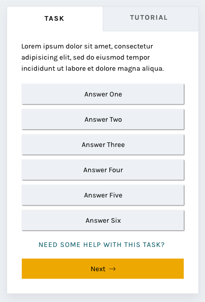
By enclosing the task and its responses in a box rather than leaving it floating in space, the interface gives a volunteer an obvious place to look for the task across every project. Adjusting the typography elevates the interface and helps it feel more professional.
One of the most frequent comments we heard in the 2017 survey was that the interface had far too much scrolling – either the subject image or the task area was too tall. The subject image height will be addressed at a later date, but this new task area was designed specifically with scrolling in mind.
I used the averages I found in my initial project audit and the average screen height (643 px) based on Google Analytics data from the same time period to design a task area that would comfortably fit on screen without scrolling. It’s important to note that there are always outliers in large-scale sites like Zooniverse. While using averages is the best way to design for most projects, we know we can’t provide the most optimal experience for every use case.
You’ll also notice the secondary “Tutorial” tab to the right of the “Task” label. This is a feature that’s yet to be implemented, and I’ll talk more about it in the next post.
And more to come
The next installments in this series will address the additional updates we have planned, like updated modals and a whole new stats section.
Check back soon!

Tried the survey link. Got this message: “This form can only be viewed by users in the owner’s organization.”
Thanks for pointing that out! I’ve changed the permissions so it should be accessible now.