All posts by Brooke Simmons

The Zooniverse responds to the Caribbean Hurricanes of 2017

The following post is by Dr Brooke Simmons, who has been leading the Zooniverse efforts to help in the aftermath of the recent Caribbean storms.

This year has seen a particularly devastating storm season. As Hurricane Irma was picking up steam and moving towards the Caribbean, we spoke to our disaster relief partners at Rescue Global and in the Machine Learning Research Group at Oxford and decided to activate the Planetary Response Network. We had previously worked with the same partners for our responses to the Nepal and Ecuador earthquakes in 2015 and 2016, and this time Rescue Global had many of the same needs: maps of expected and observed damage, and identifications of temporary settlements where displaced people might be sheltering.

The Planetary Response Network is a partnership with many people and organizations and which uses many sources of data; the Zooniverse volunteers are at its heart. The first cloud-free data available following the storm was of Guadeloupe, and our community examined pre-storm and post-storm images, marking building damage, flooding, impassable roads and signs of temporary structures. The response to our newsletter was so strong that the first set of data was classified in just 2 hours! And as more imaging has become available, we’ve processed it and released it on the project. By the time Hurricane Maria arrived in the Caribbean, Zooniverse volunteers had classified 9 different image sets from all over the Caribbean, additionally including Turks and Caicos, the Virgin Islands (US and British), and Antigua & Barbuda. That’s about 1.5 years’ worth of effort, if it was 1 person searching through these images as a full-time job. Even with a team of satellite experts it would still take much longer to analyze what the Zooniverse volunteers collectively have in just days. And there’s still more imaging: the storms aren’t over yet.

We’ve been checking in every day with Rescue Global and our Machine Learning collaborators to get feedback on how our classifications are being used and to refresh the priority list for the next set of image targets. As an example of one of those adjustments, yesterday we paused the Antigua & Barbuda dataset in order to get a rapid estimate of building density in Puerto Rico from images taken just before Irma and Maria’s arrival. We needed those because, while the algorithms used to produce the expected damage maps do incorporate external data like Census population counts and building information from OpenStreetMaps, some of that data can be incomplete or out of date (like the Census, which is an excellent resource but which is many years old now). Our volunteers collectively provided an urgently needed, uniformly-assessed and up-to-date estimate across the whole island in a matter of hours — and that data is now being used to make expected damage maps that will be delivered to Rescue Global before the post-Maria clouds have fully cleared.

Even though the project is still ongoing and we don’t have full results yet, I wanted to share some early results of the full process and the feedback we’ve been getting from responders on the ground. One of our earliest priorities was St. Thomas in the USVI, because we anticipated it would be damaged but other crowdsourcing efforts weren’t yet covering that area. From your classifications we made a raw map of damage markings. Here’s structural damage:

st_thomas_rawclicks_struct

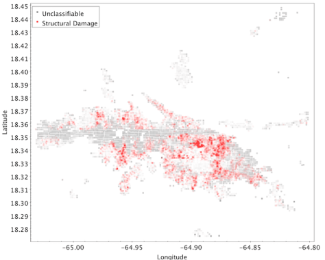
The gray stripe was an area of clouds and some artifacts. You can get an idea from this of where there is significant damage, but it’s raw and still needs further processing. For example, in the above map, damage marked as “catastrophic” is more opaque so will look redder, but more individual markings of damage in the same place will also stack to look redder, so it’s hard to tell the difference in this visualization between 1 building out of 100 that’s destroyed and 100 buildings that all have less severe damage. The areas that had clouds and artifacts also weren’t completely unclassifiable, so there are still some markings in there that we can use to estimate what damage might be lurking under the clouds. Our Machine Learning partners incorporate these classifications and the building counts provided by our project as well as by OpenStreetMaps into a code that produces a “heat map” of structural damage that helps responders understand the probability and proportion of damage in a given area as well as how bad the damage is:

st_thomas_structural_damage_heat_map

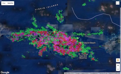
In the heat map, the green areas are where some damage was marked, but at a low level compared to how many buildings are in the area. In the red areas, over 60% of the buildings present were marked as damaged. (Pink areas are intermediate between these.)

With volunteer classifications as inputs, we were able to deliver maps like this (and similar versions for flooding, road blockage, and temporary shelters) for every island we classified. We also incorporated other efforts like those of Tomnod to map additional islands, so that we could keep our focus on areas that hadn’t yet been covered while still providing as much accurate information to responders as possible.

Feedback from the ground has been excellent. Rescue Global has been using the maps to help inform their resource allocation, ranging from where to deliver aid packages to where to fly aerial reconnaissance missions (fuel for flights is a precious commodity, so it’s critical to know in advance which areas most need the extra follow-up). They have also shared the heat maps with other organizations providing response and aid in the area, so Zooniverse volunteers’ classifications are having an extended positive effect on efforts in the whole region. And there has been some specific feedback, too. This message came several days ago from Rebekah Yore at Rescue Global:

In addition to supplying an NGO with satellite communications on St Thomas island, the team also evacuated a small number of patients with critical healthcare needs (including a pregnant lady) to San Juan. Both missions were aided by the heat maps.

To me, this illustrates what we can all do together. Everyone has different roles to play here, from those who have a few minutes a day to contribute to those spending hours clicking and analyzing data, and certainly including those spending hours huddled over a laptop in a temporary base camp answering our emailed questions about project design and priorities while the rescue and response effort goes on around them. Without all of them, none of this would be possible.

We’re still going, now processing images taken following Hurricane Maria. But we know it’s important that our community be able to share the feedback we’ve been receiving, so even though we aren’t finished yet, we still wanted to show you this and say: thank you.

Update:

Now that the project’s active response phase has completed, we have written a further description of how the maps our volunteers helped generate were used on the project’s Results page. Additionally, every registered volunteer who contributed at least 1 classification to the project during its active phase is credited on our Team page. Together we contributed nearly 3 years’ worth of full-time effort to the response, in only 3 weeks.

Further Acknowledgments

The Planetary Response Network has been nurtured and developed by many partners and is enabled by the availability of pre- and post-event imagery. We would like to acknowledge them:

  • Firstly, our brilliant volunteers. To date on this project we have had contributions from about 10,000 unique IP addresses, of which about half are from registered Zooniverse accounts.
  • The PRN has been supported by Imperative Space and European Space Agency as part of the Crowd4Sat programme. Any views expressed on this website shall in no way be taken to represent the official opinion of ESA.
  • The development of the current Zooniverse platform has been supported by a Google Global Impact award and the Alfred P. Sloan Foundation.
  • We are grateful to Patrick Meier and QCRI for their partnership in the development of PRN.
  • We are grateful to those whose counsel (and data!) we have been fortunate to receive over the years: the Humanitarian OpenStreetMap Team, the Standby Task Force, Tomnod.
  • We are grateful to our imagery providers:
    • Planet has graciously provided images to the PRN in each of our projects. (Planet Team 2017 Planet Application Program Interface: In Space For Life on Earth. San Francisco, CA. https://api.planet.com, License: CC-BY-SA)
    • DigitalGlobe provides high-resolution imagery as part of their Open Data Program (Creative Commons Attribution Non Commercial 4.0).
    • Thanks to the USGS for making Landsat 8 images publicly available.
    • Thanks to ESA for making Sentinel-2 images publicly available.
  • Thanks to Amazon Web Services’ Open Data program for hosting Sentinel-2 and Landsat 8 images, both of which were used in this project (and sourced via AWS’ image browser and servers);
  • We’d also like to thank several individuals:
    • Everyone at Rescue Global, but particularly Hannah Pathak and Rebekah Yore for patiently answering our questions and always keeping the lines of communication open;
    • Steve Reece in Oxford’s ML group for burning the midnight oil;
    • The Zooniverse team members, who are absolute stars for jumping in and helping out at a moment’s notice.

Measuring Success in Citizen Science Projects, Part 2: Results

In the previous post, I described the creation of the Zooniverse Project Success Matrix from Cox et al. (2015). In essence, we examined 17 (well, 18, but more on that below) Zooniverse projects, and for each of them combined 12 quantitative measures of performance into one plot of Public Engagement versus Contribution to Science:

Public engagement vs Contribution to science : the success matrix
Public Engagement vs Contribution to Science for 17 Zooniverse projects. The size (area) of each point is proportional to the total number of classifications received by the project. Each axis of this plot combines 6 different quantitative project measures.

The aim of this post is to answer the questions: What does it mean? And what doesn’t it mean?

Discussion of Results

The obvious implication of this plot and of the paper in general is that projects that do well in both public engagement and contribution to science should be considered “successful” citizen science projects. There’s still room to argue over which is more important, but I personally assert that you need both in order to justify having asked the public to help with your research. As a project team member (I’m on the Galaxy Zoo science team), I feel very strongly that I have a responsibility both to use the contributions of my project’s volunteers to advance scientific research and to participate in open, two-way communication with those volunteers. And as a volunteer (I’ve classified on all the projects in this study), those are the 2 key things that I personally appreciate.

It’s apparent just from looking at the success matrix that one can have some success at contributing to science even without doing much public engagement, but it’s also clear that every project that successfully engages the public also does very well at research outputs. So if you ignore your volunteers while you write up your classification-based results, you may still produce science, though that’s not guaranteed. On the other hand, engaging with your volunteers will probably result in more classifications and better/more science.

Surprises, A.K.A. Failing to Measure the Weather

Some of the projects on the matrix didn’t appear quite where we expected. I was particularly surprised by the placement of Old Weather. On this matrix it looks like it’s turning in an average or just-below-average performance, but that definitely seems wrong to me. And I’m not the only one: I think everyone on the Zooniverse team thinks of the project as a huge success. Old Weather has provided robust and highly useful data to climate modellers, in addition to uncovering unexpected data about important topics such as the outbreak and spread of disease. It has also provided publications for more “meta” topics, including the study of citizen science itself.

Additionally, Old Weather has a thriving community of dedicated volunteers who are highly invested in the project and highly skilled at their research tasks. Community members have made millions of annotations on log data spanning centuries, and the researchers keep in touch with both them and the wider public in multiple ways, including a well-written blog that gets plenty of viewers. I think it’s fair to say that Old Weather is an exceptional project that’s doing things right. So what gives?

There are multiple reasons the matrix in this study doesn’t accurately capture the success of Old Weather, and they’re worth delving into as examples of the limitations of this study. Many of them are related to the project being literally exceptional. Old Weather has crossed many disciplinary boundaries, and it’s very hard to put such a unique project into the same box as the others.

Firstly, because of the way we defined project publications, we didn’t really capture all of the outputs of Old Weather. The use of publications and citations to quantitatively measure success is a fairly controversial subject. Some people feel that refereed journal articles are the only useful measure (not all research fields use this system), while others argue that publications are an outdated and inaccurate way to measure success. For this study, we chose a fairly strict measure, trying to incorporate variations between fields of study but also requiring that publications should be refereed or in some other way “accepted”. This means that some projects with submitted (but not yet accepted) papers have lower “scores” than they otherwise might. It also ignores the direct value of the data to the team and to other researchers, which is pretty punishing for projects like Old Weather where the data itself is the main output. And much of the huge variety in other Old Weather outputs wasn’t captured by our metric. If it had been, the “Contribution to Science” score would have been higher.

Secondly, this matrix tends to favor projects that have a large and reasonably well-engaged user base. Projects with a higher number of volunteers have a higher score, and projects where the distribution of work is more evenly spread also have a higher score. This means that projects where a very large fraction of the work is done by a smaller group of loyal followers are at a bit of a disadvantage by these measurements. Choosing a sweet spot in the tradeoff between broad and deep engagement is a tricky task. Old Weather has focused on, and delivered, some of the deepest engagement of all our projects, which meant these measures didn’t do it justice.

To give a quantitative example: the distribution of work is measured by the Gini coefficient (on a scale of 0 to 1), and in our metric lower numbers, i.e. more even distributions, are better. The 3 highest Gini coefficients in the projects we examined were Old Weather (0.95), Planet Hunters (0.93), and Bat Detective (0.91); the average Gini coefficient across all projects was 0.82. It seems clear that a future version of the success matrix should incorporate a more complex use of this measure, as very successful projects can have high Gini coefficients (which is another way of saying that a loyal following is often a highly desirable component of a successful citizen science project).

Thirdly, I mentioned in part 1 that these measures of the Old Weather classifications were from the version of the project that launched in 2012. That means that, unlike every other project studied, Old Weather’s measures don’t capture the surge of popularity it had in its initial stages. To understand why that might make a huge difference, it helps to compare it to the only eligible project that isn’t shown on the matrix above: The Andromeda Project.

In contrast to Old Weather, The Andromeda Project had a very short duration: it collected classifications for about 4 weeks total, divided over 2 project data releases. It was wildly popular, so much so that the project never had a chance to settle in for the long haul. A typical Zooniverse project has a burst of initial activity followed by a “long tail” of sustained classifications and public engagement at a much lower level than the initial phase.

The Andromeda Project is an exception to all the other projects because its measures are only from the initial surge. If we were to plot the success matrix including The Andromeda Project in the normalizations, the plot looks like this:

success matrix with the andromeda project making all the others look like public engagement failures
And this study was done before the project’s first paper was accepted, which it has now been. If we included that, The Andromeda Project’s position would be even further to the right as well.

Because we try to control for project duration, the very short duration of the Andromeda Project means it gets a big boost. Thus it’s a bit unfair to compare all the other projects to The Andromeda Project, because the data isn’t quite the same.

However, that’s also true of Old Weather — but instead of only capturing the initial surge, our measurements for Old Weather omit it. These measurements only capture the “slow and steady” part of the classification activity, where the most faithful members contribute enormously but where our metrics aren’t necessarily optimized. That unfairly makes Old Weather look like it’s not doing as well.

In fact, comparing these 2 projects has made us realize that projects probably move around significantly in this diagram as they evolve. Old Weather’s other successes aren’t fully captured by our metrics anyway, and we should keep those imperfections and caveats in mind when we apply this or any other success measure to citizen science projects in the future; but one of the other things I’d really like to see in the future is a study of how a successful project can expect to evolve across this matrix over its life span.

Why do astronomy projects do so well?

There are multiple explanations for why astronomy projects seem to preferentially occupy the upper-right quadrant of the matrix. First, the Zooniverse was founded by astronomers and still has a high percentage of astronomers or ex-astronomers on the payroll. For many team members, astronomy is in our wheelhouse, and it’s likely this has affected decisions at every level of the Zooniverse, from project selection to project design. That’s starting to change as we diversify into other fields and recruit much-needed expertise in, for example, ecology and the humanities. We’ve also launched the new project builder, which means we no longer filter the list of potential projects: anyone can build a project on the Zooniverse platform. So I think we can expect the types of projects appearing in the top-right of the matrix to broaden considerably in the next few years.

The second reason astronomy seems to do well is just time. Galaxy Zoo 1 is the first and oldest project (in fact, it pre-dates the Zooniverse itself), and all the other Galaxy Zoo versions were more like continuations, so they hit the ground running because the science team didn’t have a steep learning curve. In part because the early Zooniverse was astronomer-dominated, many of the earliest Zooniverse projects were astronomy related, and they’ve just had more time to do more with their big datasets. More publications, more citations, more blog posts, and so on. We try to control for project age and duration in our analysis, but it’s possible there are some residual advantages to having extra years to work with a project’s results.

Moreover, those early astronomy projects might have gotten an additional boost from each other: they were more likely to be popular with the established Zooniverse community, compared to similarly early non-astronomy projects which may not have had such a clear overlap with the established Zoo volunteers’ interests.

Summary

The citizen science project success matrix presented in Cox et al. (2015) is the first time such a diverse array of project measures have been combined into a single matrix for assessing the performance of citizen science projects. We learned during this study that public engagement is well worth the effort for research teams, as projects that do well at public engagement also make better contributions to science.

It’s also true that this matrix, like any system that tries to distill such a complex issue into a single measure, is imperfect. There are several ways we can improve the matrix in the future, but for now, used mindfully (and noting clear exceptions), this is generally a useful way to assess the health of a citizen science project like those we have in the Zooniverse.

Note: Part 1 of this article is here.

Measuring Success in Citizen Science Projects, Part 1: Methods

What makes one citizen science project flourish while another flounders? Is there a foolproof recipe for success when creating a citizen science project? As part of building and helping others build projects that ask the public to contribute to diverse research goals, we think and talk a lot about success and failure at the Zooniverse.

But while our individual definitions of success overlap quite a bit, we don’t all agree on which factors are the most important. Our opinions are informed by years of experience, yet before this year we hadn’t tried incorporating our data into a comprehensive set of measures — or “metrics”. So when our collaborators in the VOLCROWE project proposed that we try to quantify success in the Zooniverse using a wide variety of measures, we jumped at the chance. We knew it would be a challenge, and we also knew we probably wouldn’t be able to find a single set of metrics suitable for all projects, but we figured we should at least try to write down one possible approach and note its strengths and weaknesses so that others might be able to build on our ideas.

The results are in Cox et al. (2015):

Defining and Measuring Success in Online Citizen Science: A Case Study of Zooniverse Projects

In this study, we only considered projects that were at least 18 months old, so that all the projects considered had a minimum amount of time to analyze their data and publish their work. For a few of our earliest projects, we weren’t able to source the raw classification data and/or get the public-engagement data we needed, so those projects were excluded from the analysis. We ended up with a case study of 17 projects in all (plus the Andromeda Project, about which more in part 2).

The full paper is available here (or here if you don’t have academic institutional access), and the purpose of these blog posts is to summarize the method and discuss the implications and limitations of the results. Continue reading Measuring Success in Citizen Science Projects, Part 1: Methods

Disaster Response in Nepal and The Zooniverse

Very soon after the recent magnitude-7.8 earthquake in Nepal, we were contacted by multiple groups involved in directly responding with aid and rescue teams, asking if we could assist in the efforts getting underway to crowdsource the mapping of the region. One of those groups was Rescue Global, an independent reconnaissance charity that works across multiple areas of disaster risk reduction and response. Rescue Global also works with our collaborators in machine learning here at Oxford, combining human and computer inputs for disaster response in a project called Orchid. And they asked us to help them pinpoint the areas with the most urgent unfulfilled need for aid.

And so we sprang into action. The satellite company Planet Labs generously shared all its available data on Nepal with us. The resolution of Planet Labs’ imagery – about 5 metres per pixel – is perfect for rapid examination of large ground areas while showing enough detail to easily spot the signs of cities, farms and other settlements. After discussions with Rescue Global we decided to focus on the area surrounding Kathmandu, with a bias westward toward the quake epicentre, as much of this area is heavily populated but we knew many other, complementary efforts were focusing on the capital itself. We sliced about 13,000 km2 of land imagery into classifiable tiles, and created a new project using brand new Zooniverse software (coming very very soon!) that allows rapid project creation.

Screen Shot of the humanitarian project run by The Zooniverse for Orchid and Rescue Global
Once we had prepared the satellite images, we created the project in less than a day. Users were asked to indicate the strength of evidence of settlements in the area, and then how much of the image was classifiable.

We also realised that if we combined our work with the results of some of the aforementioned complementary efforts, we needn’t wait for the clouds to part so that we could get post-quake images. For example, the Humanitarian OpenStreetMap Team (HOT) is doing brilliant work providing exquisitely detailed maps for use in the relief efforts. But here’s the thing: Nepal is pretty big (larger than England). And accurate, detailed maps take time. So in the days immediately following the earthquake, our area of focus – which we already knew had been severely affected – hadn’t been fully covered by HOT yet. And by comparing rapid, broad classifications of a relatively large area of focus with the detailed maps of smaller areas provided by HOT efforts, we could still make very confident predictions about where aid would most be needed even with just pre-quake images.

Because our images were in the sweet spot of area coverage and resolution, we were able to classify the entire image set in just a couple of days with the combined effort of only about 25 people, comprising students and staff members from Oxford and Rescue Global staff. For each image, we asked each person about any visible settlements and about how “classifiable” the image was (sometimes there are clouds or artefacts).

After the classifications were collected, the machine learning team applied a Bayesian classifier combination code that we first used in the Zooniverse on the Galaxy Zoo: Supernova project. After comparing these results with the latest maps from the HOT team, we saw two towns that were outside the areas currently covered by other crisis mapping, but that our classifiers had marked as high priority.

map and satellite of 2 towns, 1 of which our classifications found quickly despite it not being mapped in detail.
Maps from OpenStreetMap (left) and satellite images from Planet Labs (right) for 2 regions in Nepal. The top area shows the Kathmandu Airport (already well mapped by other efforts) and the bottom shows a town southwest of Kathmandu that, at the time of Rescue Global’s request to us, had not yet been mapped.

We passed this on to Rescue Global, who have added it to the other information they have about where aid is urgently needed in Nepal. The relief efforts are now in a phase of recovery, cleanup, and ensuring the survivors have the basic necessities they need to carry on, like clean water and food. Now they are coping with the damage from the second earthquake too.

Those on the ground are still busy providing day-to-day aid, so it’s early days yet to properly characterise what impact we may have had, but the initial feedback has been very good. We will be analysing this project in the days and weeks to come to understand how we can respond even more rapidly and accurately next time. That likely includes much larger-scale projects where we will be calling on our volunteers to help with classification efforts. We believe the Zooniverse, Planet Labs, and partners like Rescue Global and Orchid (and QCRI, our partner on other in-the-works humanitarian projects) can make a unique and complementary contribution to the humanitarian and crisis relief sphere. We will keep you posted on the results of our Nepal efforts and those of other, future crises.

PS: This activity was carried out under a programme of, and funded by, the European Space Agency; we would also like to acknowledge our funders for the current Zooniverse platform as a whole, principally our Google Global Impact award and the Alfred P. Sloan Foundation. And, to our team of developers who worked so hard to make this happen: you rock.

Header image adapted from OpenStreetMap, © OpenStreetMap contributors.