Last month I gave a talk at the Wetton Workshop in Oxford. Unlike the other talks that week, mine wasn’t about astronomy. I was talking about Docker – a useful tool which has become popular among people who run web services. We use it for practically everything here, and it’s pretty clear that researchers would find it useful if only more of them used it. That’s especially true in fields like astronomy, where a lot of people write their own code to process and analyse their data. If after reading this post you think you’d like to give Docker a try and you’d like some help getting started, just get in touch and I’ll be happy to help.
I’m going to give a brief outline of what Docker is and why it’s useful, but first let’s set the scene. You’re trying to run a script in Python that needs a particular version of NumPy. You install that version but it doesn’t seem to work. Or you already have a different version installed for another project and can’t change it. Or the version it needs is really old and isn’t available to download anymore. You spend hours installing different combinations of packages and eventually you get it working, but you’re not sure exactly what fixed it and you couldn’t repeat the same steps in the future if you wanted to exactly reproduce the environment you’re now working in.
Many projects require an interconnected web of dependencies, so there are a lot of things that can go wrong when you’re trying to get everything set up. There are a few tools that can help with some of these problems. For Python you can use virtual environments or Anaconda. Some languages install dependencies in the project directory to avoid conflicts, which can cause its own problems. None of that helps when the right versions of packages are simply not available any more, though, and none of those options makes it easy to just download and run your code without a lot of tedious setup. Especially if the person downloading it isn’t already familiar with Python, for example.
If people who download your code today can struggle to get it running, how will it be years from now when the version of NumPy you used isn’t around anymore and the current version is incompatible? That’s if there even is a current version after so many years. Maybe people won’t even be using Python then.
Luckily there is now a solution to all of this, and it’s called software containers. Software containers are a way of packaging applications into their own self-contained environment. Everything you need to run the application is bundled up with the application itself, and it is isolated from the rest of the operating system when it runs. You don’t need to install this and that, upgrade some other thing, check the phase of the moon, and hold your breath to get someone’s code running. You just run one command and whether the application was built with Python, Ruby, Java, or some other thing you’ve never heard of, it will run as expected. No setup required!
Docker is the most well-known way of running containers on your computer. There are other options, such as Kubernetes, but I’m only going to talk about Docker here.
Using containers could seriously improve the reproducibility of your research. If you bundle up your code and data in a Docker image, and publish that image alongside your papers, anyone in the world will be able to re-run your code and get the same results with almost no effort. That includes yourself a few years from now, when you don’t remember how your code works and half of its dependencies aren’t available to install any more.
There is a growing movement for researchers to publish not just their results, but also their raw data and the code they used to process it. Containers are the perfect mechanism for publishing both of those together. A search of arXiv shows there have only been 40 mentions of Docker in papers across all fields in the past year. For comparison there have been 474 papers which mention Python, many of which (possibly most, but I haven’t counted) are presenting scripts and modules created by the authors. That’s without even mentioning other programming languages. This is a missed opportunity, given how much easier it would be to run all this code if the authors provided Docker images. (Some of those authors might provide Docker images without mentioning it in the paper, but that number will be small.)
Docker itself is open source, and all the core file formats and designs are standardised by the Open Container Initiative. Besides Docker, other OCI members include tech giants such as Amazon, Facebook, Microsoft, Google, and lots of others. The technology is designed to be future proof and it isn’t going away, and you won’t be locked into any one vendor’s products by using it. If you package your software in a Docker container you can be reasonably certain it will still run years, or decades, from now. You can install Docker for free by downloading the community edition.
So how might Docker fit into your workday? Your development cycle will probably look something like this: First you’ll probably outline an initial version of the code, and then write a Dockerfile containing the instructions for installing the dependencies and running the code. Then it’s basically the same as what you’d normally do. As you’re working on the code, you’d iterate by building an image and then running that image as a container to test it. (With more advanced usage you can often avoid building a new image every time you run it, by mounting the working directory into the container at runtime.) Once the code is ready you can make it available by publishing the Docker image.
There are three approaches to publishing the image: push the image to the Docker Hub or another Docker registry, publish the Dockerfile along with your code, or export the image as a tar file and upload that somewhere. Obviously these aren’t mutually exclusive. You should do at least the first two, and it’s probably also wise to publish the tar file wherever you’d normally publish your data.
The Docker Hub is a free registry for images, so it’s a good place to upload your images so that other Docker users can find them. It’s also where you’ll find a wide selection of ready-built Docker images, both created by the Docker project themselves and created by other users. We at the Zooniverse publish all of the Docker images we use for our own work on the Docker Hub, and it’s an important part of how we manage our web services infrastructure. There are images for many major programming languages and operating system environments.
There are also a few packages which will allow you to run containers in high performance computing environments. Two popular ones are Singularity and Shifter. These will allow you to develop locally using Docker, and then convert your Docker image to run on your HPC cluster. That means the environment it runs in on the cluster will be identical to your development environment, so you won’t run into any surprises when it’s time to run it. Talk to your institution’s IT/HPC people to find out what options are available to you.
Hopefully I’ve made the case for using Docker (or containers in general) for your research. Check out the Docker getting started guide to find out more, and as I said at the beginning, if you’re thinking of using Docker in your research and you want a hand getting started, feel free to get in touch with me and I’ll be happy to help you.
We recently fixed a security vulnerability in the way project titles are handled on project home pages. Prior to this it was possible to create a project which included Javascript in its name, and thus inject code into the page. After investigating this incident, we have determined that this vulnerability has not been exploited for any malicious purpose; no data was leaked and no users were exposed to injected code.
This vulnerability was reported to us on June 20, 2018, by Lacroute Serge. We began testing fixes around three hours later, which were deployed about 15 hours after the original report, on June 21, 2018.
The fixes for this vulnerability are contained in pull requests #4710 and #4711 for the Panoptes Front End project on GitHub. Anyone running their own hosted copy of this should pull these changes as soon as possible.
We have investigated the cause and assessed the impact of this vulnerability. A summary of what we found follows:
No data was leaked as a result of this vulnerability. The vulnerability was not exploited for any malicious purpose and there was no unauthorised access to any of our systems.
The vulnerability was introduced on September 12, 2017, in a change which was part of our work to allow projects to be translated into multiple languages.
We found three projects that contained exploits for this vulnerability (not including projects created by our own team for testing purposes): two were created before the vulnerability was introduced, so the exploit wouldn’t have worked at the time they were created (it might have worked if the projects were visited between September 12, 2017, and June 21, 2018, but no-one did so); the remaining project was created by the security researcher who reported the vulnerability.
Our audit included previous titles for projects (all changes to projects are versioned, so we were able to audit any project titles which have since been changed).
All three projects contained only benign code to display a JavaScript alert box. None of them attempted to perform any malicious actions.
No users other than the project owner and members of our development team visited any of these projects, so no other users activated any of the exploits.
We’d like to thank Lacroute Serge for reporting this vulnerability to us via the method detailed on our security page, following responsible disclosure by reporting it to us in private to give us the opportunity to fix it.
Part three in a multi-part series exploring the visual and UX changes to the Zooniverse classify interface
Coming soon!
Today we’ll be going over a couple of visual changes to familiar elements of the classify interface and new additions we’re excited to premier. These updates haven’t been implemented yet, so nothing is set in stone. Please use this survey to send me feedback about these or any of the other updates to the Zooniverse.
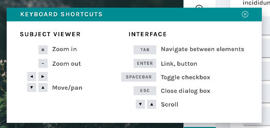
Keyboard shortcut modal
New modals
Many respondents to my 2017 design survey requested that they be able to use the keyboard to make classifications rather than having to click so many buttons. One volunteer actually called the classifier “a carpal-tunnel torturing device”. As a designer, that’s hard to hear – it’s never the goal to actively injure our volunteers.
We actually do support keyboard shortcuts! This survey helped us realize that we need to be better at sharing some of the tools our developers have built. The image above shows a newly designed Keyboard Shortcut information modal. This modal (or “popup”) is a great example of a few of the modals we’re building – you can leave it open and drag it around the interface while you work, so you’ll be able to quickly refer to it whenever you need.
This behavior will be mirrored in a few of the modals that are currently available to you:
Add to Favorites
Add to Collection / Create a New Collection
Subject Metadata
“Need Help?”
It will also be applied to a few new ones, including…
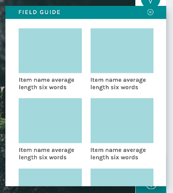
Field Guide
New field guide layout
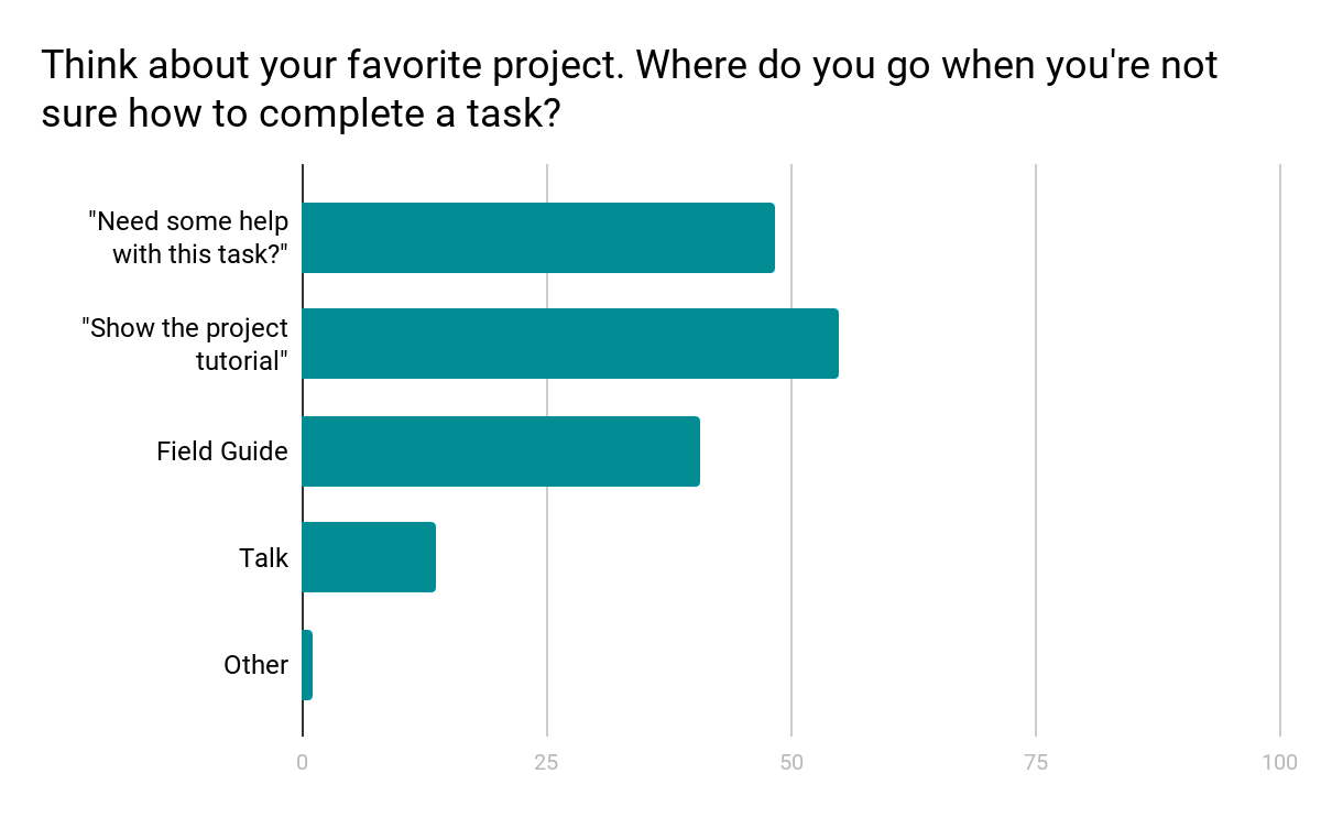
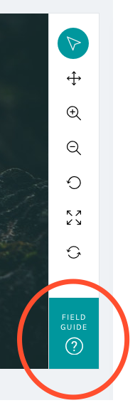
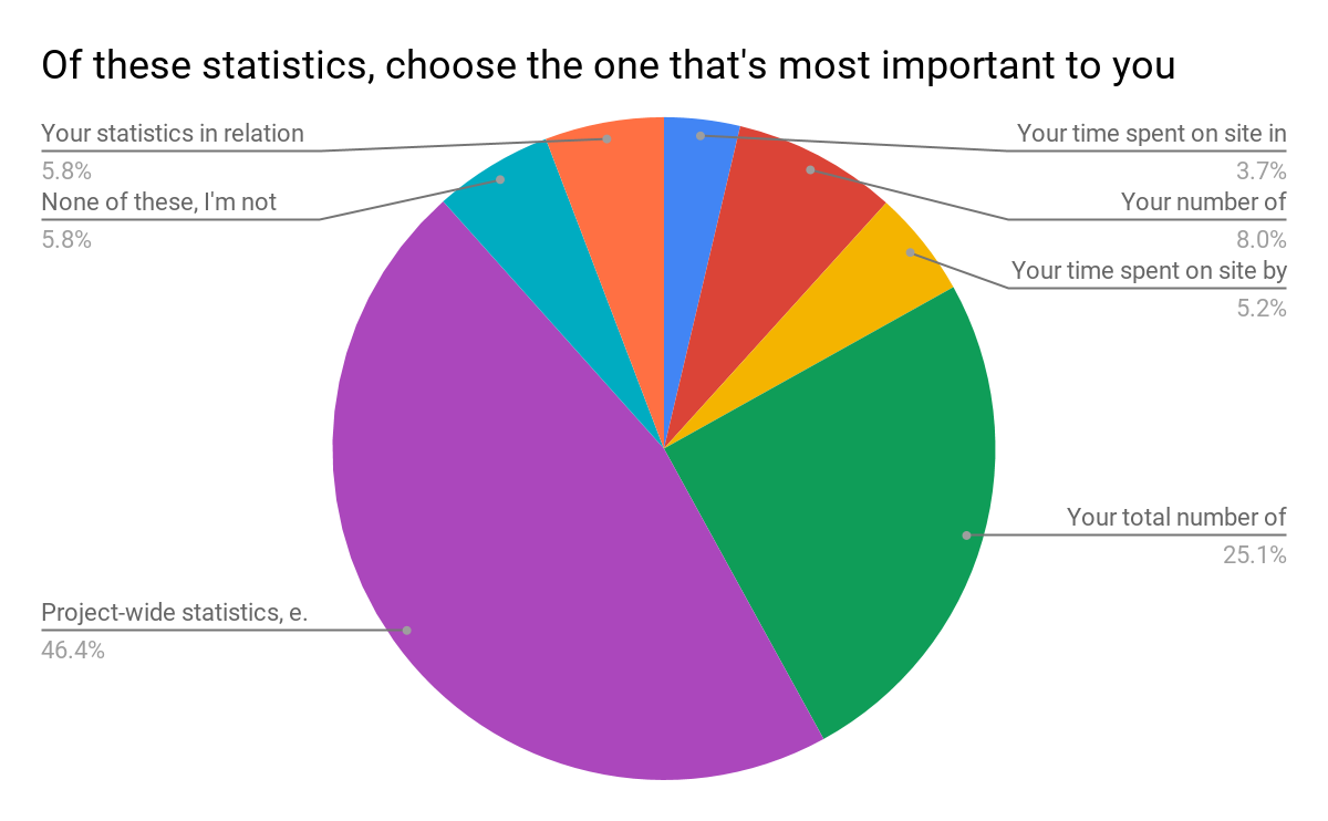
Another major finding from the design survey was that users did not have a clear idea where to go when they needed help with a task (see chart below).
Survey results show a mix of responses
We know research teams often put a lot of effort into their help texts, and we wanted to be sure that work was reaching the largest possible audience. Hence, we moved the Field Guide from a small button on the right-hand side of the screen – a place that can become obscured by the browser’s scrollbar – and created a larger, more prominent button in the updated toolbar:
By placing the Field Guide button in a more prominent position and allowing the modal to stay open during classifications, we hope this tool will be taken advantage of more than it currently is.
The layout was the result of the audit of every live project I conducted in spring 2017:
Field Guide
Mode item count
5
Mode label word count
2
Min item count
2
Min label word count
2
Max items count
45
Max label word count
765
Using the mode gave me the basis on which to design; however, there’s quite a disparity between min and max amounts. Because of this disparity, we’ll be giving project owners with currently active projects a lot of warning before switching to the new layout, and they’ll have the option to continue to use the current Field Guide design if they’d prefer.
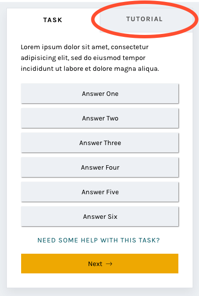
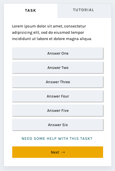
Tutorial
Another major resource Zooniverse offers its research teams and volunteers is the Tutorial. Often used to explain project goals, welcome new volunteers to the project, and point out what to look for in an image, the current tutorial is often a challenge because its absolute positioning on top of the subject image.
No more!
In this iteration of the classify interface, the tutorial opens once as a modal, just as it does now, and then lives in a tab in the task area where it’s much more easily accessible. You’ll be able to switch to the Tutorial tab in order to compare the example images and information with the subject image you’re looking at, rather than opening and closing the tutorial box many times.
A brand-new statistics section
Another major comment from the survey was that volunteers wanted more ways to interact with the Zooniverse. Thus, you’ll be able to scroll down to find a brand-new section! Features we’re adding will include:
Your previous classifications with Add to Favorites or Add to Collection buttons
Interesting stats, like the amount of classifications you’ve done and the amount of classifications your community have done
Links to similar projects you might be interested in
Links to the project’s blog and social media to help you feel more connected to the research team
Links to the project’s Talk boards, for a similar purpose
Possibly: A way to indicate that you’re finished for the day, giving you the option to share your experience on social media or find another project you’re interested in.
The statistics we chose were directly related to the responses from the survey:
Survey results
Respondents were able to choose more than one response; when asked to rank them in order of importance, project-wide statistics were chosen hands-down:
Project-wide statistics are the most important
We also heard that volunteers sometimes felt disconnected from research teams and the project’s accomplishments:
“In general there is too less information about the achievement of completed projects. Even simple facts could cause a bit of a success-feeling… how many pictures in this project over all have been classified? How much time did it take? How many hours were invested by all participating citizens? Were there any surprising things for the scientists? Things like that could be reported long before the task of a project is completely fullfilled.”
Research teams often spend hours engaged in dialog with volunteers on Talk, but not everyone who volunteers on Zooniverse is aware or active on Talk. Adding a module on the classify page showing recent Talk posts will bring more awareness to this amazing resource and hopefully encourage more engagement from volunteers.
Templates for different image sizes and dimensions
When the project builder was created, we couldn’t have predicted the variety of disparate topics that would become Zooniverse projects. Originally, the subject viewer was designed for one common image size, roughly 2×3, and other sizes have since been shoehorned in to fit as well as they can.
Now, we’d like to make it easier for subjects with extreme dimensions, multimedia subjects, and multi-image subjects to fit better within the project builder. By specifically designing templates and allowing project owners to choose the one that best fits their subjects, volunteers and project owners alike will have a better experience.
Very wide subjects will see their toolbar moved to the bottom of the image rather than on the right, to give the image as much horizontal space as possible. Tall subjects will be about the same width as they have been, but the task/tutorial box will stay fixed on the screen as the image scrolls, eliminating the need to scroll up and down as often when looking at the bottom of the subject.
Wide and tall subjects
Let’s get started!
I’m so excited for the opportunity to share a preview of these changes with you. Zooniverse is a collaborative project, so if there’s anything you’d like us to address as we implement this update, please use this survey to share your thoughts and suggestions. Since we’re rolling these out in pieces, it will be much easier for us to be able to iterate, test, and make changes.
We estimate that the updates will be mostly in place by early 2019, so there’s plenty of time to make sure we’re creating the best possible experience for everyone.
Thank you so much for your patience and understanding as we move forward. In the future, we’ll be as open and transparent as possible about this process.
Part two in a multi-part series exploring the visual and UX changes to the Zooniverse classify interface
The breakdown
Today and in the next post, we’ll take a look at the reasoning behind specific changes to the classifier that we’ve already started to roll out over the past few months. We’ve had good discussions on Talk about many of the updates, but I wanted to reiterate those conversations here so there’s just one source of information to refer back to in the future.
In case you missed it, the first blog post in this series previews the complete new classify layout.
As a reminder, if you have feedback about these changes or anything else on the site you’d like to see addressed, please use this survey link.
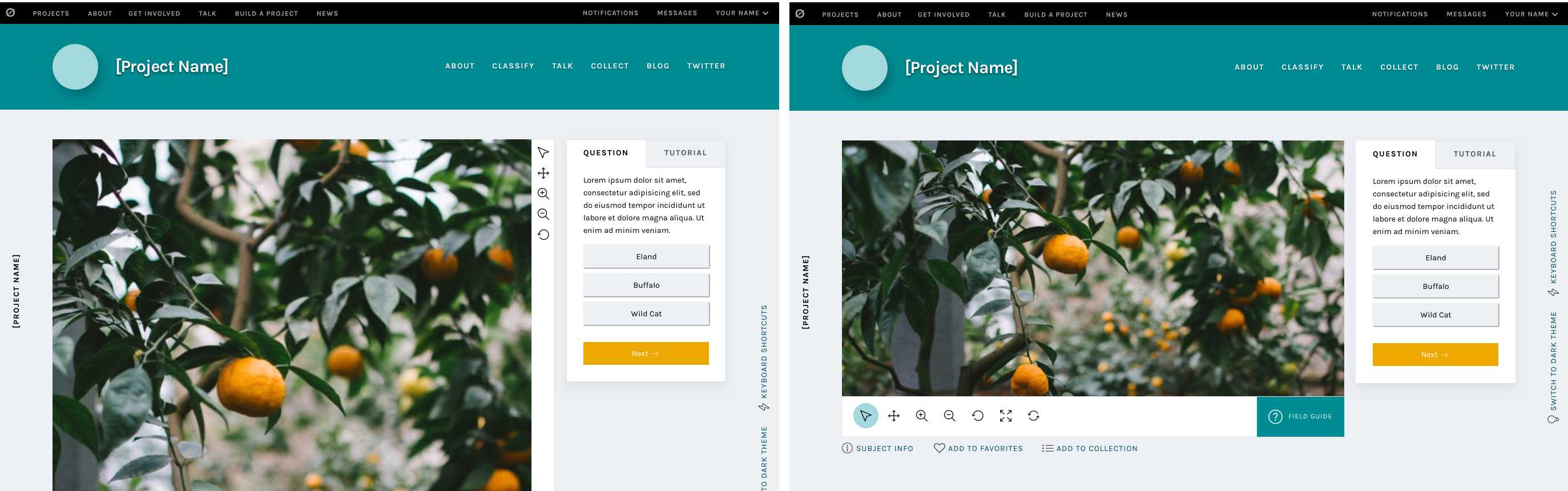
Navigation bar
Updated navigation bar
We started with a rethinking of each project’s navigation bar. The new design features cleaner typography, a more prominent project title, and visual distinction from the sitewide navigation. It also includes the project’s home page background image, giving the project visual distinction while keeping the classify interface itself clean and legible. It’s also responsive: on smaller screen heights, the height of the navigation bar adjusts accordingly.
The most important goal we solved in making this change was to separate the project navigation from the site navigation. During my initial site research and in talking to colleagues and volunteers, many found it difficult to distinguish between the two navigations. Adding a background, a distinct font style, and moving the options to the right side of the page accomplishes this goal.
Neutral backgrounds
Classify interface with neutral background
In conjunction with adding the background image to the navigation bar, the background image was removed from the main classify interface. It was replaced with a cool light grey, followed quickly by the dark grey of the Dark Theme.
Legibility is one of the main goals of any web designer, and it was the focus of this update. By moving to clean greys, all of the focus is now on the subject and task. There are some really striking subject images on Zooniverse, from images of the surface of Mars to zebras in their natural habitat. We want to make sure these images are front and center rather than getting lost within the background image.
The Dark Theme was a suggestion from a Zooniverse researcher – they pointed out that some subject images are similar in tone to the light grey, so a darker theme was added to make sure contrast would be enough to make the image “pop”. We love suggestions like this! While the team strives to be familiar with every Zooniverse project, the task is sometimes beyond us, so we rely on our researchers and volunteers to point out anomalies like this. If you find something like this, you can use this survey to bring it to my attention.
Another great suggestion from a Zooniverse volunteer was the addition of the project name on the left side of the screen. This hasn’t been implemented yet, but it’s a great way to help with wayfinding if the interface is scrolled to below the navigation bar.
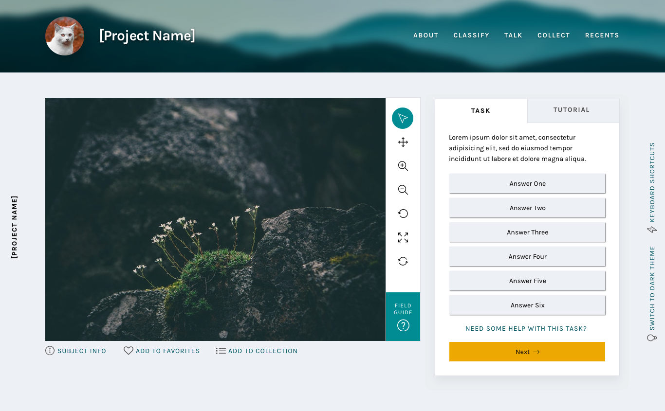
Updated task section
New task section
By enclosing the task and its responses in a box rather than leaving it floating in space, the interface gives a volunteer an obvious place to look for the task across every project. Adjusting the typography elevates the interface and helps it feel more professional.
One of the most frequent comments we heard in the 2017 survey was that the interface had far too much scrolling – either the subject image or the task area was too tall. The subject image height will be addressed at a later date, but this new task area was designed specifically with scrolling in mind.
I used the averages I found in my initial project audit and the average screen height (643 px) based on Google Analytics data from the same time period to design a task area that would comfortably fit on screen without scrolling. It’s important to note that there are always outliers in large-scale sites like Zooniverse. While using averages is the best way to design for most projects, we know we can’t provide the most optimal experience for every use case.
You’ll also notice the secondary “Tutorial” tab to the right of the “Task” label. This is a feature that’s yet to be implemented, and I’ll talk more about it in the next post.
And more to come
The next installments in this series will address the additional updates we have planned, like updated modals and a whole new stats section.
Part one in a multi-part series exploring the visual and UX changes to the Zooniverse classify interface
First, an introduction.
Zooniverse began in 2007, with a galaxy-classifying project called Galaxy Zoo. The project was wildly successful, and one of the lead researchers, Chris Lintott, saw an opportunity to help other researchers accomplish similar goals. He assembled a team of developers and set to work building custom projects just like Galaxy Zoo for researchers around the world.
And things were good.
But the team started to wonder: How can we improve the process to empower researchers to build their own Zooniverse projects, rather than relying on the team’s limited resources to build their projects for them?
In the first year of its inception, the number of projects available to citizen scientist volunteers nearly doubled. Popularity spread, the team grew, and things seemed to be going well.
That’s where I come in. * Record scratch *
Three years after the project builder’s debut, I was hired as the Zooniverse designer. With eight years’ experience in a variety of design roles from newspaper page design to user experience for mobile apps to web design, I approached the new project builder-built projects with fresh eyes, taking a hard look at what was working and what areas could be improved.
Over the next week, I’ll be breaking down my findings and observations, and talking through the design changes we’re making, shedding more light on the aims and intentions behind these changes and how they will affect your experience on the Zooniverse platform.
If you take one thing away from this series it’s that this design update, in following with the ethos of Zooniverse, is an iterative, collaborative process. These posts represent where we are now, in June 2018, but the final product, after testing and hearing your input, may be different. We’re learning as we go, and your input is hugely beneficial as we move forward.
Here’s a link to an open survey in case you’d like to share thoughts, experiences, or opinions at any point.
Let’s dive in.
Part one: Research
My first few weeks on the job were spent exploring Zooniverse, learning about the amazing world of citizen science, and examining projects with similar task types from across the internet.
I did a large-scale analysis of the site in general, going through every page in each section and identifying areas with inconsistent visual styles or confusing user experiences.
Current site map, March 2017Analysis of current template types
After my initial site analysis, I created a list of potential pages or sections that were good candidates for a redesign. The classify interface stood out as the best place to start, so I got to work.
Visual design research
First, I identified areas of the interface that could use visual updates. My main concerns were legibility, accessibility, and varying screen sizes. With an audience reaching to the tens of thousands per week, the demographic diversity makes for an interesting design challenge.
Next, I conducted a comprehensive audit of every project that existed on the Zooniverse in March 2017 (79 in total, including custom projects like Galaxy Zoo), counting question/task word count, the max number of answers, subject image dimensions, field guide content, and a host of other data points. That way, I could accurately design for the medians rather than choosing arbitrarily. When working on this scale, it’s important to use data like these to ensure that the largest possible group is well designed for.
Here are some selected data:
Task type: Drawing
20
Answers
Average number of possible answers
2
Answer average max word count
4.5
Min number
1
Answer max max word count
10
Max number
7
Answer min max word count
2
Median number
1
Answer median max word count
1
Number with thumbnail images
1
Task type: Question
9
Answers
Average number of possible answers
6
Answer average max word count
6
Min number
2
Answer max max word count
18
Max number
9
Answer min max word count
1
Median number
3.5
Answer median max word count
4
Number with thumbnail images
3
Task type: Survey
9
Answers
Average number of possible answers
31
Answer average max word count
4
Min number
6
Answer max max word count
7
Max number
60
Answer min max word count
3
Median number
29
Answer median max word count
4
Number with thumbnail images
9
Even More Research
Next, I focused on usability. To ensure that I understood issues from as many perspectives as possible, I sent a design survey to our beta testers mailing list, comprising about 100,000 volunteers (if you’re not already on the list, you can opt in via your Zooniverse email settings). Almost 1,200 people responded, and those responses informed the decisions I made and helped prioritize areas of improvement.
Here are the major findings from that survey:
No consensus on where to go when you’re not sure how to complete a task.
Many different destinations after finishing a task.
Too much scrolling and mouse movement.
Lack of keyboard shortcuts.
Would like the ability to view previous classifications.
Translations to more languages.
Need for feedback when doing classifications.
Finding new projects that might also be interesting.
Larger images.
In the next few blog posts, I’ll be breaking down specific features of the update and showing how these survey findings help inform the creation of many of the new features.
Without further ado
Basic classify template
Some of these updates will look familiar, as we’ve already started to implement style and layout adjustments. I’ll go into more detail in subsequent posts, but at a high level, these changes seek to improve your overall experience classifying on the site no matter where you are, what browser you’re using, or what type of project you’re working on.
Visually, the site is cleaner and more professional, a reflection of Zooniverse’s standing in the citizen science community and of the real scientific research that’s being done. Studieshaveshown that good, thoughtful design influences a visitor’s perceptions of a website or product, sometimes obviously, sometimes at a subliminal level. By making thoughtful choices in the design of our site, we can seek to positively affect audience perceptions about Zooniverse, giving volunteers and researchers even more of a reason to feel proud of the projects they’re passionate about.
It’s important to note that this image is a reflection of our current thought, in June 2018, but as we continue to test and get feedback on the updates, the final design may change. One benefit to rolling updates out in pieces is the ability to quickly iterate ideas until the best solution is found.
The timeline
We estimate that the updates will be mostly in place by early 2019.
This is due in part to the size of our team. At most, there are about three people working on these updates while also maintaining our commitments to other grant-funded projects and additional internal projects. The simple truth is that we just don’t have the resources to be able to devote anyone full-time to this update.
The timeline is also influenced in a large part by the other half of this update: A complete overhaul of the infrastructure of the classifier. These changes aren’t as visible, but you’ll notice an improvement in speed and functionality that is just as important as the “facelift” portion of the update.
Stay tuned!
We’ve seen your feedback on Talk, via email, and on Github, and we’re happy to keep a dialog going about subsequent updates. To streamline everything and make sure your comments don’t get missed, please only use this survey link to post thoughts moving forward.
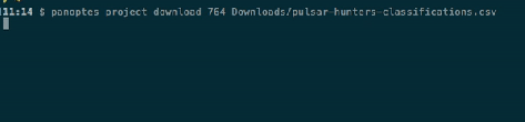
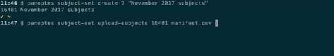
Following on from the release of Panoptes Client 1.0 for Python, we’ve just released version 1.0 of the Panoptes CLI. This is a command-line client for managing your projects, because some things are just easier in a terminal! The CLI lets you do common project management tasks, such as activating workflows, linking subject sets, downloading data exports, and uploading subjects. Let’s jump in with a few examples.
First, downloading a classification export (obviously you’d insert your own project ID and a filename of your choice):
You can also pipe the output from the CLI into other standard commands to do more powerful things, such as linking every subject set in your project to a workflow using the xargs command (where 1234 and 5678 are your project ID and workflow ID respectively):
I’m happy to announce that the Panoptes Client package for Python has finally reached version 1.0, after nearly a year and a half of development. With this package, you can automate the management of your projects, including uploading subjects, managing subject sets, and downloading data exports.
There’s still more work to do – I have lots of additional features and improvements planned for version 1.1 – but with the release of version 1.0, the Client has a stable set of core features which are useful for managing projects (both large and small).
I know a lot of people have already been using the 0.x versions while we’ve been working on them, so thanks to everyone who submitted feature requests, bug reports, and pull requests on GitHub. Please do upgrade to the latest version to make sure you have the latest bug fixes, and keep the requests and bug reports coming!
On Monday Internet security researches discovered a critical vulnerability in a piece of of software called OpenSSL. The so-called Heartbleed vulnerability affected numerous sites on the Internet that rely on OpenSSL to provide encrypted connections over HTTPS. This bug has been present in the library since March of 2012 and allows malicious users to gain direct access to the memory of a server terminating an HTTPS connection.
We want to let our users know that we were among almost 66% of sites on the Internet vulnerable to this bug, and your data (including your Zooniverse password) might have been compromised due to this exploit. As of now, all our infrastructure has been updated to secure against the Heartbleed vulnerability, and our SSL certificates have been changed.
Unfortunately given the nature of the vulnerability we cannot know what, if anything, may have been obtained, but as a precaution we are recommending that our users change their passwords on the Zooniverse just in case.
The world's largest and most popular platform for people-powered research. This research is made possible by volunteers—millions of people around the world who come together to assist professional researchers.