
Since the very first days of Galaxy Zoo, our projects have seen amazing contributions from volunteers who have gone beyond the main classification tasks. Many of these examples have led to scientific publications, including Hanny’s Voorwerp, the ‘green pea’ galaxies, and the circumbinary planet PH1b.
One common thread that runs through the many positive experiences we’ve had with the volunteers is the way in which they’ve interacted more deeply with the data. In Galaxy Zoo, much of this has been enabled by linking to the Sloan SkyServer website, where you can find huge amounts of additional information about galaxies on the site (redshift, spectra, magnitudes, etc). We’ve put in similar links on other projects now, linking to the Kepler database on Planet Hunters, or data on the location and water conditions in Seafloor Explorer.
The second part of this that we think is really important, however, is providing ways in which users can actually use and manipulate this data. Some users have been already been very resourceful in developing their own analysis tools for Zooniverse projects, or have done lots of offline work pulling data into Excel, IDL, Python, and lots of other programs (see examples here and here). We want to make using the data easier and available to more of our community, which has led to the development of Zoo Tools (http://tools.zooniverse.org). Zoo Tools is still undergoing some development, but we’d like to start by describing what it can do and what sort of data is available.
An Example
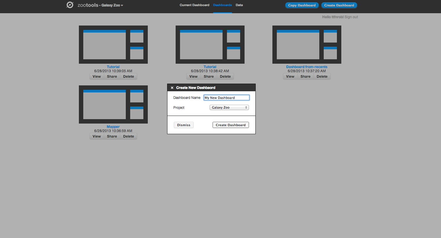
Zoo Tools works in an environment which we call the Dashboard – each Dashboard can be thought of as a separate project that you’re working on. You can create new Dashboards yourself, or work collaboratively with other people on the same Dashboard by sharing the URL.

Within the Dashboard, there are two main functions: selecting/importing data, and then using tools to analyze the data.
The first step for working with the Dashboard is to select the data you’d like to analyze. At the top left of the screen, there’s a tab named “Data”. If you click on this, you’ll see the different databases that Zoo Tools can query. For Galaxy Zoo, for example, it can query the Zooniverse database itself (galaxies that are currently being classified by the project), or you can also analyze other galaxies from the SDSS via their Sky Server website.

Clicking on the “Zooniverse” button, for example, you can select galaxies in one of four ways: a Collection (either your own or someone else’s), looking at your recently classified galaxies, galaxies that you’ve favorited, or specific galaxies via their Zooniverse IDs. Selecting any of these will import them as a dataset, which you can start to look at and analyze. In this example we’ll import 20 recent galaxies.
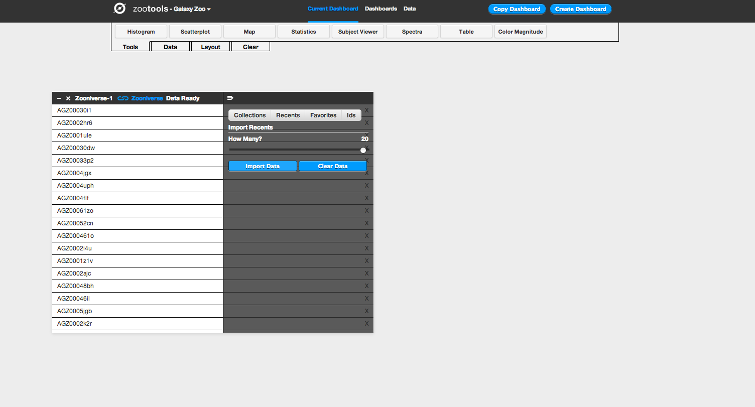
After importing your dataset, you can use any of the tools in Dashboard (which you can select under “Tools” at the top of the page) on your data. After selecting a tool, you choose the dataset that you’d like to work with from a dropdown menu, and then you can begin using it. For example: if I want to look at the locations of my galaxies on the sky, I can select the “Map” tool. I then select the data source I’d like to plot (in this case, “Zooniverse–1”) and the tool plots the coordinates of each galaxy on a map of the sky. I can select different wavelength options for the background (visible light, infrared, radio, etc), and could potentially use this to analyze whether my galaxies are likely to have more stars nearby based on their position with respect to the Milky Way.
The other really useful part is that the tools can talk to each other, and can pass data back and forth. For example: you could import a collection of galaxies and look at their colour in a scatterplot. You could then select only certain galaxies in that tool, and then plot the positions of those galaxies on the map. This is what we do in the screenshots below:
Making Data Analysis Social
You can also share Dashboards with other people. From the Zoo Tools home page you can access your existing dashboards as well as delete them and share them with others. You can share on Twitter and Facebook or just grab the URL directly. For example, the Dashboard above can be found here – with a few more tools added as a demonstration.

This means that once you have a Dashboard set up and ready to use, you can send it to somebody else to use too. Doing this will mean that they see the same tools in the same configuration, but on their own account. They can then either replicate or verify your work – or branch off and use what you were doing as a springboard for something new.
What ‘Tools’ Are There?
Currently, there are eight tools available for both regular Galaxy Zoo and the Galaxy Zoo Quench projects:
- Histogram: makes bar charts of a single data parameter
- Scatterplot: plot any two data parameters against each other
- Map: plot the position of objects on the sky, overplotted on maps of the sky at different wavelengths (radio, visible, X-ray, etc.)
- Statistics: compute some of the most common statistics on your data (eg, mean, minimum, maximum, etc).
- Subject viewer: examine individual objects, including both the image and all the metadata associated with that object
- Spectra: for galaxies in the SDSS with a spectrum, download and examine the spectrum.
- Table: List the metadata for all objects in a dataset. You can also use this tool to create new columns from the data that exists – for example, take the difference between magnitudes to define the color of a galaxy.
- Color-magnitude: look at how the color and magnitude of galaxies compare to the total population of Galaxy Zoo. A really nice way of visualizing and analyzing how unusual a particular galaxy might be.
We have one tool up and running for Space Warps called Space Warp Viewer. This lets users adjust the color and scale parameters of image to examine potential gravitational lenses in more detail.

Finally, Snapshot Serengeti has several of the same tools that Galaxy Zoo does, including Statistics, Subject Viewer, Table, and Histogram (aka Bar Graph). There’s also Image Gallery, where you can examine the still images from your datasets, and we’re working on an Image Player. There’s a few very cool and advanced tools we started developing last week – they’re not yet deployed, but we’re really excited to let you follow the activity over many seasons or by focusing on particular cameras. Stay tuned. You can see an example Serengeti Dashboard, showing the distribution of Cheetahs, here (it’s also shown in the screenshot above).
We hope that Zoo Tools will be an important part of all Zooniverse projects in the future, and we’re looking forward to you trying them out. More to come soon!
