
Below is a guest post from Dr Philip Fowler, who leads our award-winning bug-squishing project BashTheBug. This project aims to improve the diagnosis and treatment of tuberculosis, which remains one of the leading causes of death worldwide.
This project has a huge amount of data to get through, so Phil is working hard to make sure this is being done in the most efficient way possible. Read on to find out more.
– Helen
Focussing effort where it is needed: picking out the Bugs that are harder to Bash
BashTheBug has been running for a little over a year now and in that time 11,303 volunteers have classified 834,032 images of the bacterium that causes tuberculosis growing on 14 antibiotics at different strengths. These images correspond to a bit less than 4,000 different samples of M. tuberculosis since each image is shown, by default, to different 15 volunteers to generate a consensus.
The goal of the larger CRyPTIC project that BashTheBug belongs to is to match all this data with the genomes of each and every sample and thereby produce the most comprehensive and accurate catalogue of what genetic variants confer resistance to specific antibiotics. This is important because there is a shift towards using genomic methods to diagnose which antibiotics would be best to treat individual patient infections because genomics can be faster, cheaper and probably more accurate as well.
Too many new images?
The CRyPTIC project has produced a new dataset of 4,286 samples. These have been collected from people with tuberculosis from all over the world.
This dataset alone would need 900,060 classifications if we were to simply require each antibiotic lane to be seen by 15 different volunteers and, unless a lot more people joined the project, would take at least a year. Our problem is the project is producing around 1,000 samples a month, which would require 210,000 classifications a month, which our volunteers at present could not keep up with!
Ultimately the CRyPTIC project will collect at least 30,000 samples over the next few years, so we are only at the beginning!
Some images are easy…
What might help is we’ve found that some of the images of bacterial growth are easy to classify. For example, all 15 volunteers identify well number 2 as the first well in which there is growth.
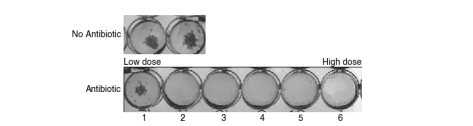
If the volunteers find this easy, a computer might also, so we wrote some computer software (called AMyGDA) that tries to measure the growth in each of the wells on the 96-well plate. It does a good job on these simple cases, but is confused by cases where this is little growth, or there are artefacts on the image, like air bubbles, contamination or shadows.
We can identify the “easier” images based on how much growth there is, and whether the computer software agrees with the single reading we have of each plate done by a laboratory scientist. On our new dataset of 4,286 samples, this approach identifies 84% of the antibiotic lanes as easy to classify.
If we only send the remaining 16% of images to the volunteers, that reduces the number of classifications we need to complete this dataset down to 144,000 with a monthly growth rate of 34,000 which is much more achievable!
…and some are hard.
But this means you will all be seeing images that are harder to interpret and classify and therefore should be more of a challenge.
This is an example of an image that is harder to classify.
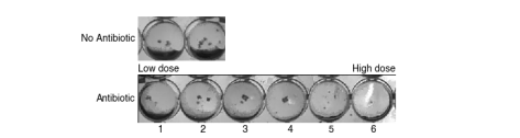
In our existing dataset, these images have typically elicited a range of answers. Some volunteers might say they cannot classify the image, whilst others would identify a range of wells as being the first with no growth. We can, of course, still form a consensus (I’d say well 5), but the variation is itself telling us something about how and why the image is hard to classify, which is potentially useful (for example, for training a machine learning classifier).
A few things to think about
Because the images should be, on average, more challenging now, you will have to make more frequent judgment calls about whether that blob in well 5 is an artefact or whether it “looks like” growth, and if you think it is, whether or not it is big enough to be relevant. Personally, I’d say for something to be growth it has to look like the growth in the positive control wells. If it is a lot smaller (like a dot) then I personally tend to ignore it. Don’t spend too long on individual images – rely on the collective power of the volunteers to allow us to extract a consensus from all your answers!
Focussing your efforts
In summary
– there are a lot of new images available to classify on our Zooniverse project page and
– they should be, on average, a lot more interesting and challenging
To get more frequent project updates,
– check for banners on the Zooniverse project page
– follow BashTheBug on Twitter, Instagram and Facebook
– check out our blog
Philip W Fowler
6 August 2018
